 View review
Logo score
Logo review ofBengali Script
Review the detailed scores below to see what is working and what should be refined first.
Legibility
Originality
Misread
Balance
Scale
Action plan
What to fix first
The most important fixes to handle before polishing the full presentation.
1
Fix possible misinterpretation
High priorityVertical bars might be misread as referencing imprisonment or restriction, depending on context.
Impact: High · Effort: Medium
Detailed review
Logo performance breakdown
Legibility
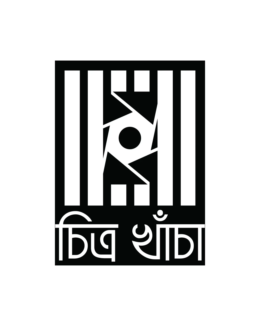
![]() The Bengali text is relatively clear in large formats.
The Bengali text is relatively clear in large formats.![]() Contrast between black and white supports visibility.
Contrast between black and white supports visibility.
![]() Thin letterforms and tight spacing in the Bengali script could reduce readability at small sizes.
Thin letterforms and tight spacing in the Bengali script could reduce readability at small sizes.![]() Unusual letter styling may not be immediately readable to all audiences, especially non-native readers.
Unusual letter styling may not be immediately readable to all audiences, especially non-native readers.
Originality
![]() Strong, creative integration of geometric abstraction with a cultural typeface.
Strong, creative integration of geometric abstraction with a cultural typeface.![]() Symbol reminiscent of a camera shutter or eye, providing nuanced visual connections to media or creativity.
Symbol reminiscent of a camera shutter or eye, providing nuanced visual connections to media or creativity.![]() Use of Bengali script adds distinctiveness.
Use of Bengali script adds distinctiveness.
![]() Angular mark in center feels derivative of generic 'camera aperture' icons.
Angular mark in center feels derivative of generic 'camera aperture' icons.![]() Vertical bar motif is not uncommon in modern logo design.
Vertical bar motif is not uncommon in modern logo design.
Color harmony
![]() Monochromatic palette ensures maximum clarity and contrast.
Monochromatic palette ensures maximum clarity and contrast.![]() No unnecessary use of additional colors keeps the design disciplined.
No unnecessary use of additional colors keeps the design disciplined.
Black
#000000
White
#FFFFFF
Balance alignment
![]() Symmetrical composition with evenly spaced bars and a centered focal point creates a sense of balance.
Symmetrical composition with evenly spaced bars and a centered focal point creates a sense of balance.![]() Text and logomark are confined within a unified rectangle.
Text and logomark are confined within a unified rectangle.
![]() Vertical bars dominate visual weight, causing a slightly top-heavy feel compared to the thinner script below.
Vertical bars dominate visual weight, causing a slightly top-heavy feel compared to the thinner script below.![]() Letter baseline alignment with the bottom edge feels slightly cramped.
Letter baseline alignment with the bottom edge feels slightly cramped.

Scalability
![]() Strong geometric shapes ensure design integrity at larger scales, such as posters or signage.
Strong geometric shapes ensure design integrity at larger scales, such as posters or signage.![]() High contrast black and white palette works across various backgrounds.
High contrast black and white palette works across various backgrounds.
![]() Thin script and narrow details in the symbol may not be legible when scaled down for favicons, business cards, or social icons.
Thin script and narrow details in the symbol may not be legible when scaled down for favicons, business cards, or social icons.![]() High detail in the geometric mark could get lost in embroidery or very small prints.
High detail in the geometric mark could get lost in embroidery or very small prints.
200x250 px
100×125 px
50×62 px
Misinterpretations
![]() Central symbol is abstract but doesn’t appear to have unintended negative implications at first glance.
Central symbol is abstract but doesn’t appear to have unintended negative implications at first glance.![]() Evokes metaphorical meanings (eye, aperture, film strip) without straying into inappropriate visuals.
Evokes metaphorical meanings (eye, aperture, film strip) without straying into inappropriate visuals.
![]() Vertical bars might be misread as referencing imprisonment or restriction, depending on context.
Vertical bars might be misread as referencing imprisonment or restriction, depending on context.
Try your own review
Review my logo
Wondering how your logo performs?
Get a clear logo score, key risks, and priority fix ideas before your client or audience sees it.
Keep exploring