 View review
Logo score
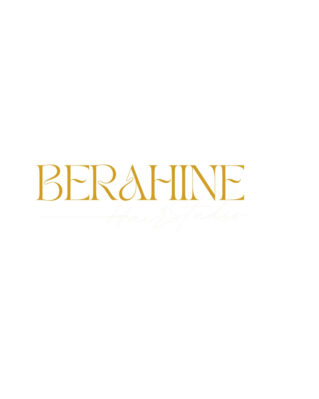
Logo review of
Berahine
Distinctive and elegant for fashion/luxury use, but benefits from small-scale testing and minor detail adjustments.
Legibility
Originality
Misread
Balance
Scale
Action plan
What to fix first
The most important fixes to handle before polishing the full presentation.
1
Refine the 'A' flourish for clarity at small sizes
High priorityDelicate details risk being lost, affecting legibility and recognition in digital or print uses.
Impact: The Logo Will Scale Better And Maintain Brand Presence In All Use-cases. · Effort: Medium
Detailed review
Logo performance breakdown
Legibility
 Distinctive, elegant letterforms Good contrast with background
 The ornate 'A' may create a brief pause in word recognition
Originality
Unique 'A' styling provides some personality
Overall serif style is broadly familiar within luxury/fashion space
Color harmony
Gold and white combination effectively signals luxury and quality
Single accent color may limit flexibility across diverse backgrounds
Gold
#C89D2C
White
#FFFFFF
Your palette is close. Refine the color roles and combinations before updating the logo.
Build brand colorsBalance alignment
Even spacing and solid alignment
The flourish on the 'A' pulls slight visual attention, creating a minor imbalance

Scalability
Clean lines support small-scale use
Thin areas and flourishes in the 'A' may not reproduce well at very small sizes
200x250 px
100×125 px
50×62 px
Misinterpretations
No misinterpretation issues found
Brief match
Luxury/fashion Positioning: The sophisticated serif wordmark and gold color align well with fashion or luxury branding.
Try your own review
Review my logo
Wondering how your logo performs?
Get a clear logo score, key risks, and priority fix ideas before your client or audience sees it.
Keep exploring