Wondering how your logo performs? 🧐
Get professional logo reviews in seconds and catch design issues in time.
Try it Now!Logo review of beyon lowcost
 Logo analysis by AI
Recognized style:
Logo type:
Detected symbol:
Detected text:
Review requested by Fabiofreire
**If AI can recognize or misinterpret it, so can people.
Structured logo review
Legibility
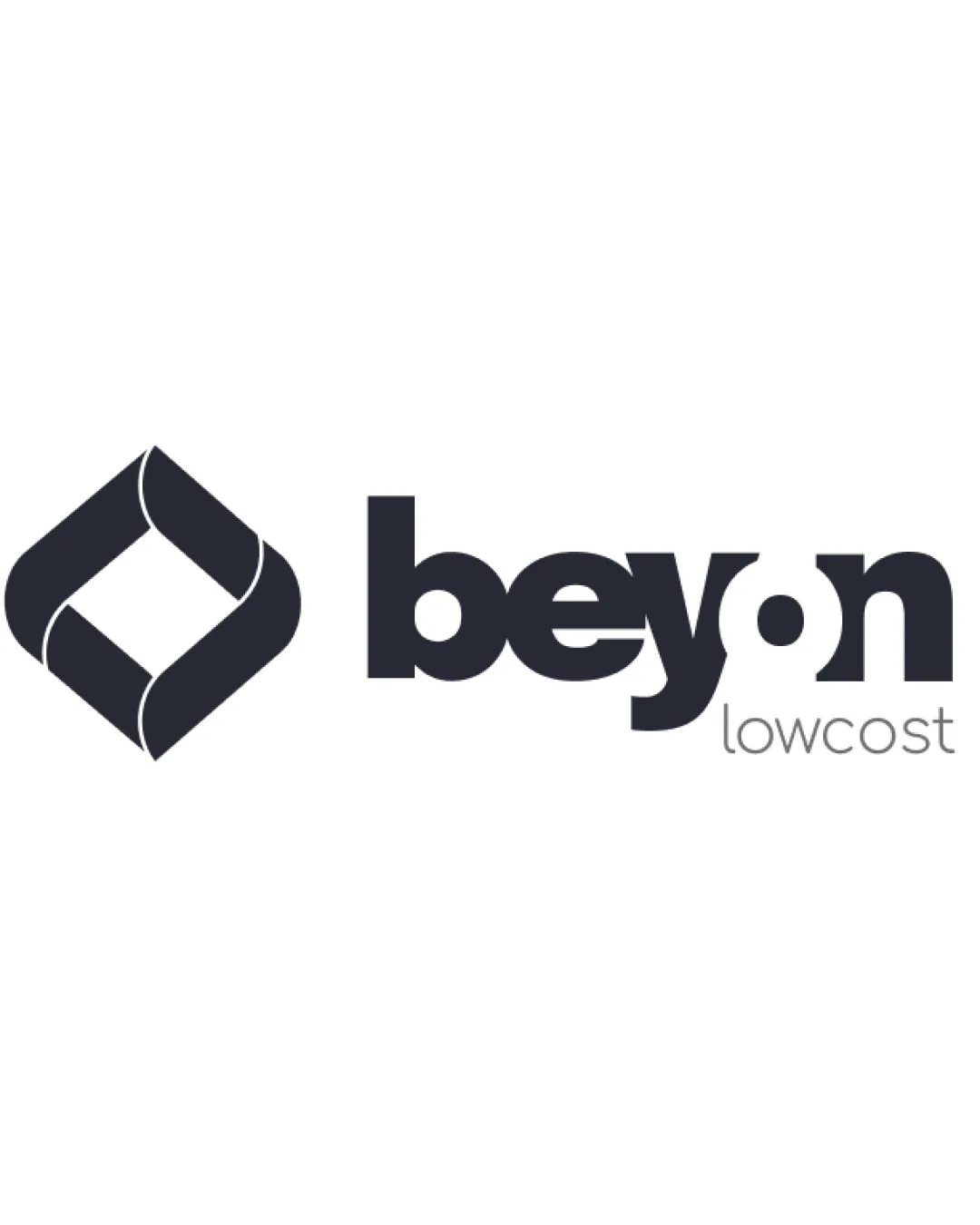
![]() I assume the business name is Beyon, with the tagline Lowcost.
I assume the business name is Beyon, with the tagline Lowcost.
![]() The overlap of the 'e' and 'y' is slightly confusing at first glance.
The overlap of the 'e' and 'y' is slightly confusing at first glance.
Scalability versatility
![]() The bold logomark ensures versatility across varying sizes.
The bold logomark ensures versatility across varying sizes.
200x250 px
100×125 px
50×62 px
Balance alignment
![]() The logomark and wordmark are well-balanced and aligned.
The logomark and wordmark are well-balanced and aligned.

Originality
![]() The unique twist in the geometric symbol adds originality.
The unique twist in the geometric symbol adds originality.
![]() The geometric style is somewhat common in modern logos.
The geometric style is somewhat common in modern logos.
Logomark wordmark fit
![]() The text and symbol complement each other, creating a cohesive unit.
The text and symbol complement each other, creating a cohesive unit.
Aesthetic look
![]() The logo looks aesthetic, giving a professional and modern appearance.
The logo looks aesthetic, giving a professional and modern appearance.
Cultural sensitivity dual meaning
![]() No cultural sensitivity issues detected.
No cultural sensitivity issues detected.
Color harmony
![]() The monochrome color scheme ensures clarity and professionalism.
The monochrome color scheme ensures clarity and professionalism.


