Concept & direction
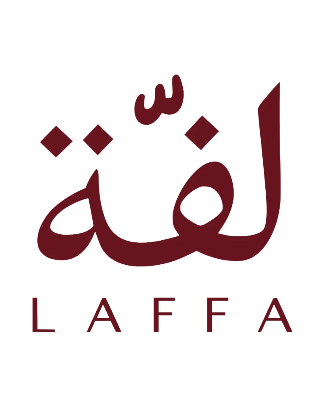
The logo pairs bold, contemporary Arabic lettering with a simple Latin wordmark to express cultural connection and modernity for the fashion resale space.
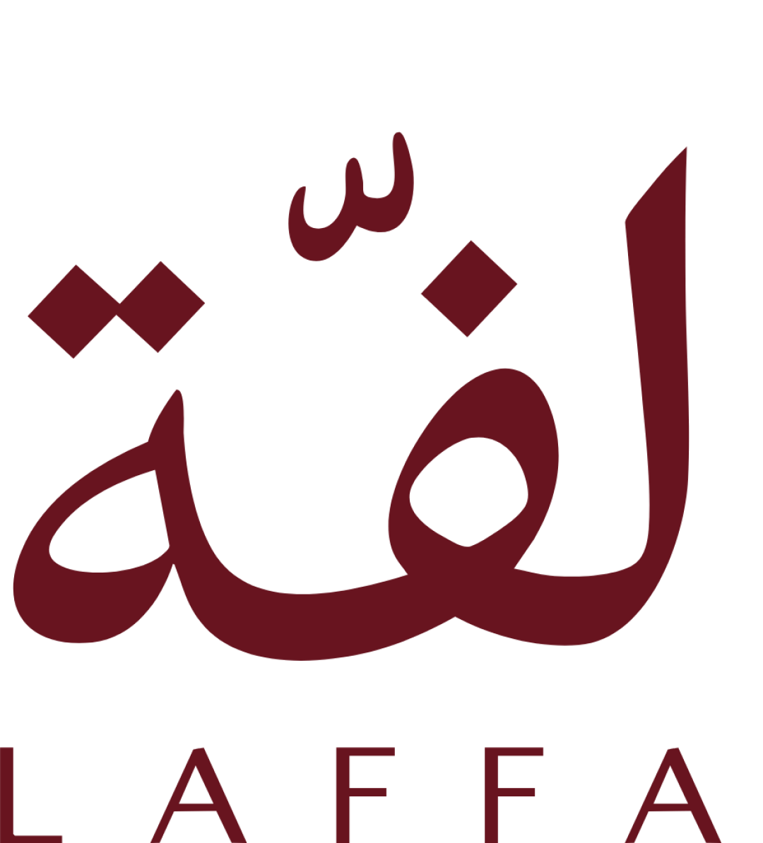
A well-structured bilingual typographic lockup; primary risk is small-detail legibility in the Arabic script at reduced scales.
This logo lockup has a workable foundation; improving distinctiveness is the clearest next step.
Focus on the changes that matter. Keep what makes the logo work.
The logo pairs bold, contemporary Arabic lettering with a simple Latin wordmark to express cultural connection and modernity for the fashion resale space.
wordmark (Arabic) dots and diacritics
Small dots and diacritics in Arabic may merge or blur at small sizes.
See the category reviewThe clear bilingual identity expresses marketplace inclusivity and cultural reach, with modern, legible typography; main improvement is testing for small-size Arabic legibility.
Wordmark 4/5 · Layout 4/5
Wordmark 3/5 · Layout 4/5
Small dots and diacritics in Arabic may merge or blur at small sizes.
Try: Test logo clarity at reduced sizes; adjust dot/diacritic weight if needed.
Wordmark 3/5 · Layout 3/5
Letter-spacing in 'LAFFA' is visually even but may appear loose compared to the denser Arabic script above, creating a modest disconnect.
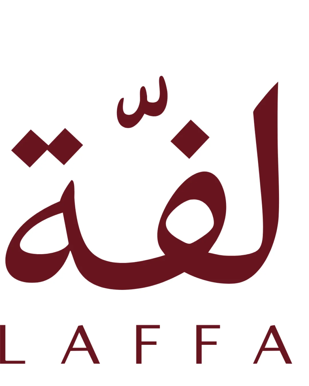

Inspect spacing with the guide. Optical balance may differ from geometric centering.
The styles of the Arabic and Latin scripts feel distinct (fluid calligraphy vs. geometric sans), which expresses cross-cultural reach but may reduce perceived brand unity.
Get a clear logo score, key risks, and priority fix ideas before your client or audience sees it.
More credits needed
Add credits to continue without losing your work.
Then $7/month. Cancel anytime.
Essential logo review with AI
Estimated progress