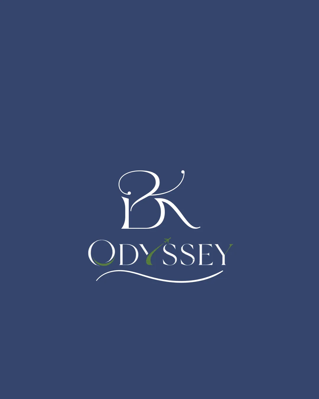
BK ODYSSEY logo review
3.2 / 5
Logo score
Logo review of

Bk Odyssey

Visually elegant but the complex monogram and delicate lines are significant drawbacks for real-world use.

Combination Mark Elegant Serif With Ornamental Flourishes Hospitality
3/5
Legibility
3/5
Originality
4/5
Misread
3.5/5
Balance
2.5/5
Scale
Action plan

What to fix first

The most important fixes to handle before polishing the full presentation.

1

Simplify the BK monogram to improve legibility and reduce excessive flourishes.

High priority

Complex upper monogram compromises brand recognition and readability.

Impact: High · Effort: Medium

2

Optimize fine details (swooshes, thin lines) for small-size usage and clarify visual hierarchy with wordmark.

Medium priority

Thin elements and flourishes will be lost or cluttered at small sizes, affecting versatility.

Impact: Medium · Effort: Medium

Detailed review

Logo performance breakdown

3/5

Legibility

Checkmark icon 'ODYSSEY' is mostly readable

Warning icon 'BK' monogram is difficult to distinguish due to excessive flourishes
Warning icon Some green letters or accents may reduce quick readability

3/5

Originality

Checkmark icon Custom monogram and integrated swoosh

Warning icon Serif + swoosh style is commonly seen in hospitality logos

4/5

Color harmony

Checkmark icon Blue and green palette is pleasant and relaxing

Warning icon Green accent is subtle and could be more pronounced or integrated

East Bay
#424E73

White
#FFFFFF

Fern Green
#4B6B36

Your palette is close. Refine the color roles and combinations before updating the logo.

Build brand colors
3.5/5

Balance alignment

Checkmark icon Symmetrical overall layout
Checkmark icon Good centering of elements

Warning icon Large upper monogram overpowers wordmark slightly
Warning icon Curves and swooshes create slight imbalance at the base

logo 200x250 pixels scalability test alignment grid overlay
2.5/5

Scalability

Checkmark icon Thick and thin contrasts create elegance

Warning icon Fine flourishes and lines may break at small sizes
Warning icon Small swooshes and details risk being lost when scaled down

logo 200x250 pixels scalability test

200x250 px

logo 100x125 pixels scalability test

100×125 px

logo 50x62 pixels scalability test

50×62 px

4/5

Misinterpretations

Checkmark icon No inappropriate or embarrassing shapes detected

3 / 5

Logo structure & brief match

Checkmark icon Ornamental style is consistent across both elements

Warning icon Monogram feels slightly disconnected visually from 'ODYSSEY'

Checkmark icon Elegant, Possibly Hospitality/leisure Brand: Elegant monogram and wordmark style fits upscale or boutique brand positioning.

Try your own review

Wondering how your logo performs?

Get a clear logo score, key risks, and priority fix ideas before your client or audience sees it.

Review my logo