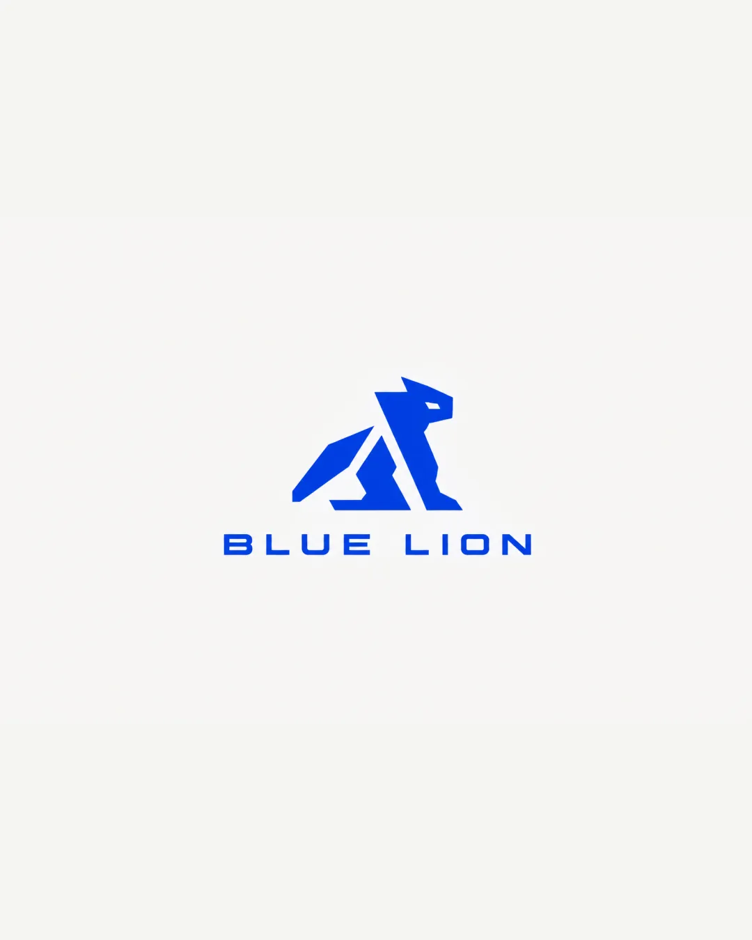
BLUE LION logo review
4/5
Logo score Combination category

BLUE LION

creative409153 Essential logo review

A stylish, professional indie retail logo that is strong but could further boost distinctiveness and tiny-size stability.

Combination Geometric Modern Retail/shop/ecommerce
5/5
Legibility
3.5/5
Originality
4/5
Balance
3/5
Scale
Your next steps

What to fix first

Focus on the changes that matter. Keep what makes the logo work.

1

Standalone mark

Test the logo at small sizes and optimize stroke thickness or simplify details if legibility is lost.

High priority Worth testing Medium effort

The geometric mark includes thin lines and small negative spaces, which may become less discernible at very small sizes.

See the category review

2

Standalone mark

Refine a feature or add a subtle proprietary detail to push distinctiveness.

Medium priority Optional refinement Low effort

The geometric style brings modernity, but angular animal marks are becoming more familiar and may not look truly unique unless further differentiated.

How to check

Compare against modern animal logos in the accessory retail sector.

See the category review
Detailed review

Logo performance breakdown

4/5

Brief & logo match

Expresses the brief with clear indie, youthful, and trustworthy traits, yet could lean further into originality.

5/5

Legibility

  • Wordmark is highly readable and spaced.
  • Mark silhouette is clear at normal sizes.
3.5/5

Originality

  • Modern geometric approach feels youthful.
  • Brings some unique stylization to the lion.
  • The geometric style brings modernity, but angular animal marks are becoming more familiar and may not look truly unique unless further differentiated.

    Optional refinement Standalone mark

    Try: Refine a feature or add a subtle proprietary detail to push distinctiveness.

    Check: Compare against modern animal logos in the accessory retail sector.

4/5

Balance alignment

  • Wordmark and mark are visually balanced and centered.
Uploaded logoAlignment guide overlay

Inspect spacing with the guide. Optical balance may differ from geometric centering.

3/5

Scalability

  • Monochrome ensures wide usability.
  • The geometric mark includes thin lines and small negative spaces, which may become less discernible at very small sizes.

    Worth testing Standalone mark

    Try: Test the logo at small sizes and optimize stroke thickness or simplify details if legibility is lost.

5/5

Misinterpretations

  • No unintended readings or negative shapes detected.
4/5

Symbol & text fit

  • Symbol and wordmark are visually and thematically aligned.
Try your own review

Wondering how your logo performs?

Get a clear logo score, key risks, and priority fix ideas before your client or audience sees it.

Review my logo