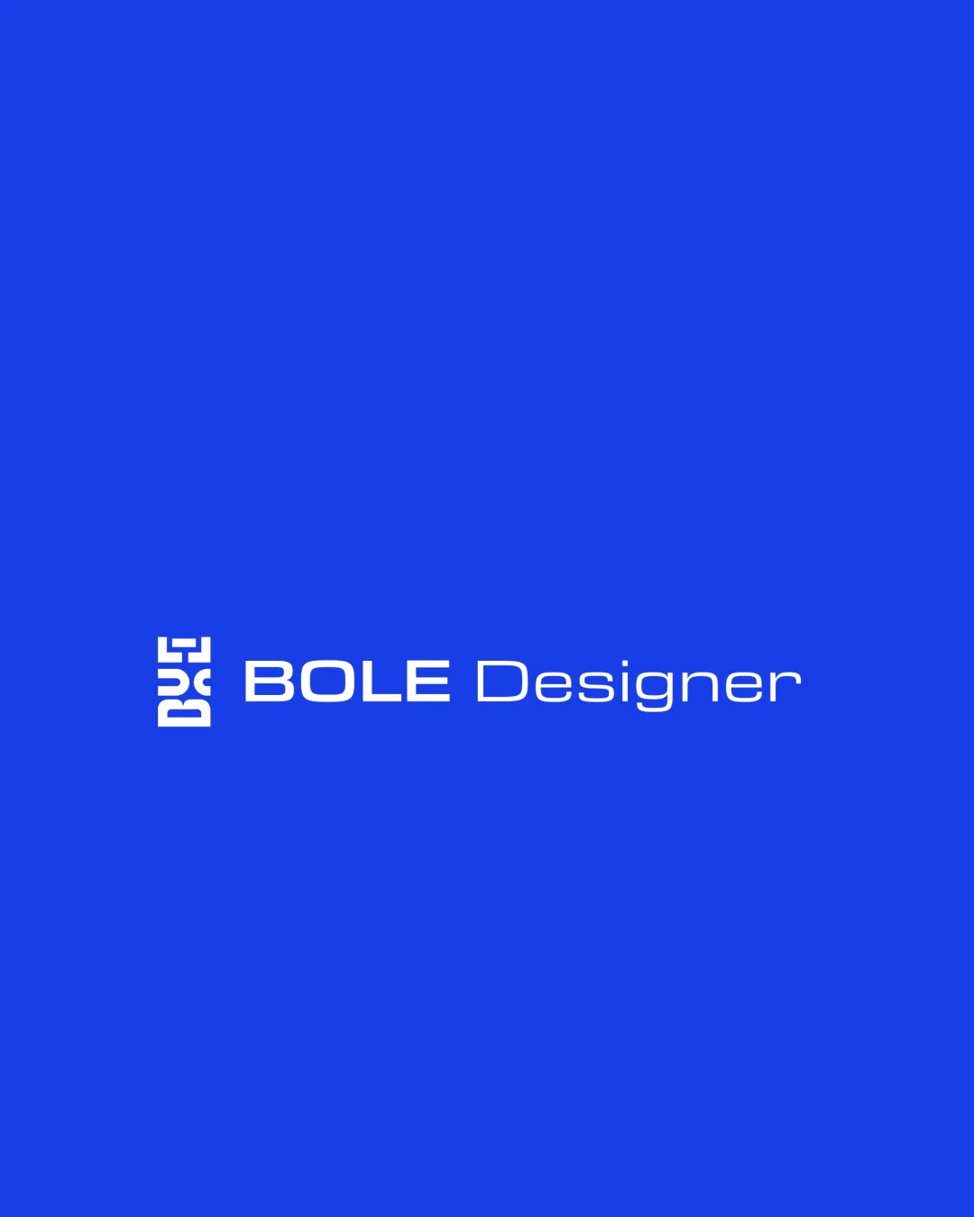
BOLE Designer logo review
4/5
Logo score
Logo review of

Bole Designer

A distinctive and professional combination mark with strong branding value, though minor tuning could further strengthen clarity and balance.

Combination Contemporary Geometric Design Services
4/5
Legibility
4/5
Originality
5/5
Misread
3/5
Balance
3/5
Scale
Your next steps

What to fix first

Focus on the changes that matter. Keep what makes the logo work.

1

monogram

Test monogram recognition at small scale or in isolation.

Worth testing Medium priority Medium effort
Area to inspectApproximate location

The stylized monogram could be ambiguous at small sizes or for unfamiliar viewers, as the letters are abstracted and rely on negative space.

How to check

Ask users unfamiliar with the brand to identify the monogram at reduced sizes.

See the category review
2

wordmark and monogram alignment

Consider adjusting the weight or positioning of the 'Designer' text for better balance.

Optional refinement Low priority Low effort
Area to inspectApproximate location

There is a slight visual tension between the block-heavy monogram and the much lighter 'Designer' text, affecting visual harmony.

How to check

Evaluate perception of visual weight and alignment across lockups.

See the category review
Detailed review

Logo performance breakdown

4/5

Brief & logo match

Based on your brief
Compared with

analiza este logotipo

The design strongly expresses contemporary professional branding appropriate for a design-focused context.

  • Contemporary Branding

    The geometric mark and modern type convey a contemporary sensibility which fits a design-focused brand.

  • Professionalism

    Blueprint-like blue and structured wordmark signal professionalism suited to creative/design services.

4/5

Legibility

  • Primary wordmark is readable at standard sizes.
  • Distinctive type for main brand name.
  • The stylized monogram could be ambiguous at small sizes or for unfamiliar viewers, as the letters are abstracted and rely on negative space.

    Worth testing monogram

    Try: Test monogram recognition at small scale or in isolation.

    Check: Ask users unfamiliar with the brand to identify the monogram at reduced sizes.
    Area to inspectApproximate location
4/5

Originality

  • Unique geometric monogram construction adds identity.
  • Clear integration of wordmark with symbol.
3/5

Balance alignment

  • Monogram and wordmark are aligned horizontally.
  • There is a slight visual tension between the block-heavy monogram and the much lighter 'Designer' text, affecting visual harmony.

    Optional refinement wordmark and monogram alignment

    Try: Consider adjusting the weight or positioning of the 'Designer' text for better balance.

    Check: Evaluate perception of visual weight and alignment across lockups.

    Area to inspectApproximate location
Uploaded logoAlignment guide overlay

Inspect spacing with the guide. Optical balance may differ from geometric centering.

3/5

Scalability

  • Wordmark scales well.
Uploaded logo at 200 pixels wide
200 × 250 px
Uploaded logo at 100 pixels wide
100 × 125 px
Uploaded logo at 50 pixels wide
50 × 63 px

Compare the detail at different sizes. Labels show the full image dimensions.

5/5

Misinterpretations

  • No clear risk of unintended readings.
4/5

Symbol & text fit

  • Visual connection present through geometric style.

Black & white

Does the shape still work without color?

These tests are available only for logos uploaded in vector (SVG) format.

Background contrast

Find the surfaces where your logo stays clear.

These tests are available only for logos uploaded in vector (SVG) format.

Blur & silhouette

A 3px blur softens fine details so you can check whether the overall shape stays recognizable. If key gaps close or elements merge, the logo may rely too heavily on detail.

These tests are available only for logos uploaded in vector (SVG) format.

Try your own review

Wondering how your logo performs?

Get a clear logo score, key risks, and priority fix ideas before your client or audience sees it.

Review my logo