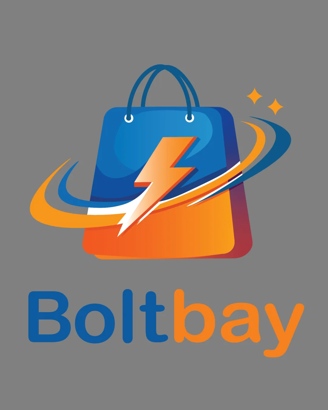
Boltbay logo review
4/5
Logo score
Logo review of

Boltbay

A strong, vibrant e-commerce logo that clearly signals fast and convenient shopping, with only minor refinement and versatility tests needed.

Combination Dynamic, Modern Gradient, Illustrative E-commerce
5/5
Legibility
3/5
Originality
5/5
Misread
4/5
Balance
3/5
Scale
Your next steps

What to fix first

Focus on the changes that matter. Keep what makes the logo work.

1

Standalone mark (shopping bag, lightning, swoosh)

Test in small and single-color sizes to ensure clarity is retained.

Worth testing High priority Medium effort
Area to inspectApproximate location

The detailed gradients, swoosh, and sparkles may lose clarity at small sizes or low resolutions.

How to check

Evaluate the logo's recognizability at small sizes and in simplified formats.

See the category review
2

wordmark and Standalone mark integration

Slightly adjust spatial relationship or type weight for stronger balance.

Optional refinement Medium priority Low effort
Area to inspectApproximate location

The vibrant mark slightly outweighs the simple wordmark, leading to minor visual imbalance.

How to check

Visually compare mark and text for cohesion and harmony.

See the category review
Detailed review

Logo performance breakdown

5/5

Brief & logo match

Based on your brief
Compared with

E-commerce, buyers, shopping convenience and fast delivery, East Africa inter border shopping

Logo strongly fits the brief, visually expressing e-commerce and speed for a broad market.

  • E-commerce Symbolism

    Shopping bag, lightning, and dynamic swoosh clearly communicate e-commerce, speed, and convenience.

  • Readability And Approachability

    The friendly wordmark and bright palette feel accessible for a wide audience, fitting regional e-commerce.

5/5

Legibility

  • Clear, readable wordmark with no confusion.
3/5

Originality

  • Dynamic mark, though built from familiar e-commerce imagery.
  • The combination of shopping bag, lightning, and swoosh is conceptually direct but familiar in e-commerce and delivery brands.

    Optional refinement Standalone mark (shopping bag + lightning)

    Try: Consider a unique graphic accent or integration technique for memorability.

    Check: Review similar segment marks for distinctiveness.

5/5

Color harmony

  • Blue and orange contrast well, creating a lively, appealing palette.
Blue#2456A6
Orange#FF9200
White#FFFFFF
Light Blue#7EC3FD
Yellow Orange#F9B948
Gray (background)#808080

Estimated colors. Use the original design file for exact values.

Create a full color palette using these colors

Create new palette
4/5

Balance alignment

  • Mark and wordmark work well together; bright palette draws eye.
  • The vibrant mark slightly outweighs the simple wordmark, leading to minor visual imbalance.

    Optional refinement wordmark and Standalone mark integration

    Try: Slightly adjust spatial relationship or type weight for stronger balance.

    Check: Visually compare mark and text for cohesion and harmony.

    Area to inspectApproximate location
Uploaded logoAlignment guide overlay

Inspect spacing with the guide. Optical balance may differ from geometric centering.

3/5

Scalability

  • Energetic shape, but heavy detail and gradients increase risk at small sizes.
  • The detailed gradients, swoosh, and sparkles may lose clarity at small sizes or low resolutions.

    Worth testing Standalone mark (shopping bag, lightning, swoosh)

    Try: Test in small and single-color sizes to ensure clarity is retained.

    Check: Evaluate the logo's recognizability at small sizes and in simplified formats.
    Area to inspectApproximate location
Uploaded logo at 200 pixels wide
200 × 250 px
Uploaded logo at 100 pixels wide
100 × 125 px
Uploaded logo at 50 pixels wide
50 × 63 px

Compare the detail at different sizes. Labels show the full image dimensions.

5/5

Misinterpretations

  • No plausible negative or confusing alternate readings.
4/5

Symbol & text fit

  • Symbol and text relate closely thematically.

Black & white

Does the shape still work without color?

These tests are available only for logos uploaded in vector (SVG) format.

Background contrast

Find the surfaces where your logo stays clear.

These tests are available only for logos uploaded in vector (SVG) format.

Blur & silhouette

A 3px blur softens fine details so you can check whether the overall shape stays recognizable. If key gaps close or elements merge, the logo may rely too heavily on detail.

These tests are available only for logos uploaded in vector (SVG) format.

Try your own review

Wondering how your logo performs?

Get a clear logo score, key risks, and priority fix ideas before your client or audience sees it.

Review my logo