What to preserve
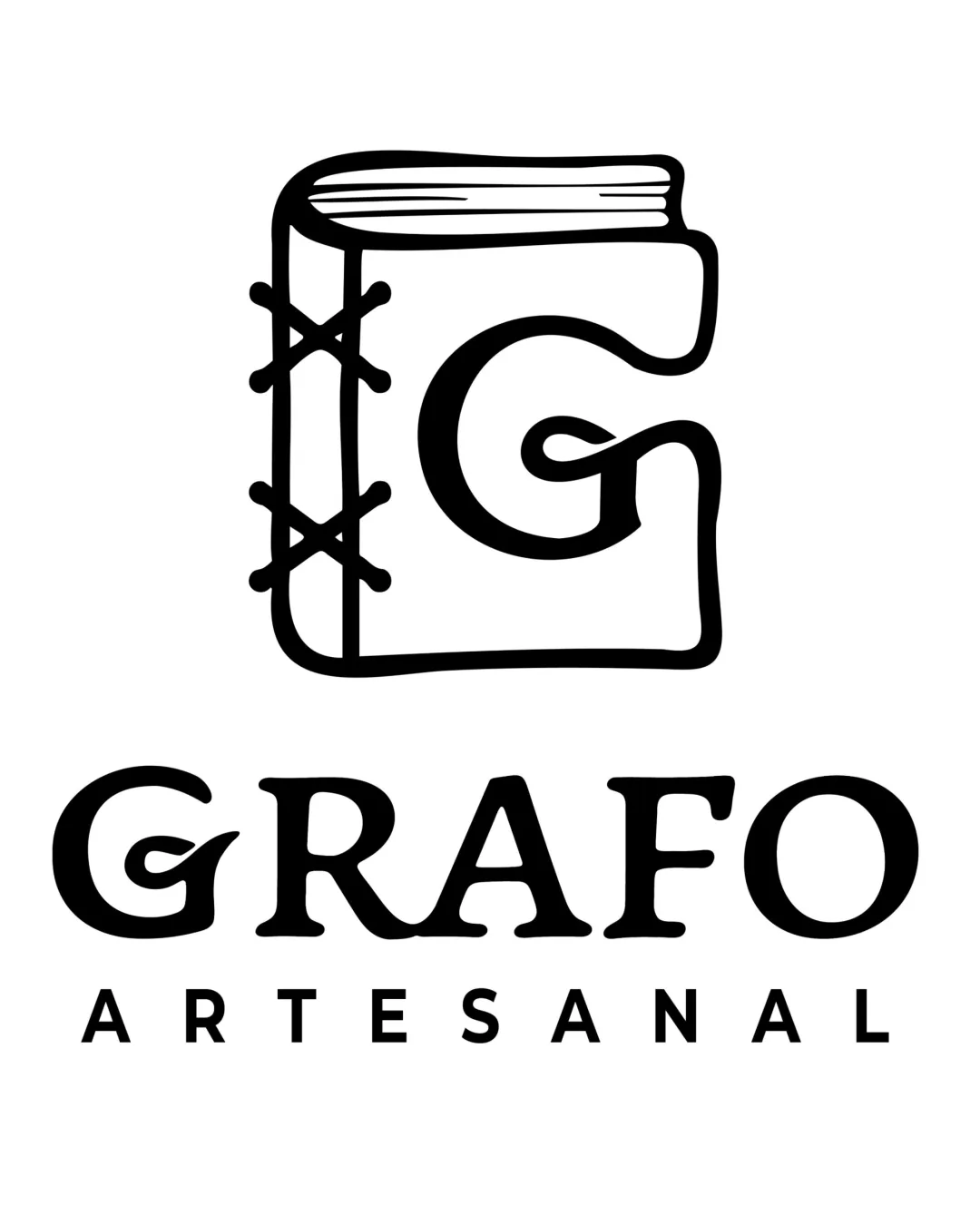
A tactile, hand-drawn stack-of-books mark effectively signals an independent, artisanal bookstore identity.

A distinctive and on-brief handmade mark with category-appropriate visual cues; confirm technical performance for smaller applications.
This emblem shows solid execution, supported by distinctive construction and visual balance; improving clarity at smaller sizes is the clearest next step.
Focus on the changes that matter. Keep what makes the logo work.
A tactile, hand-drawn stack-of-books mark effectively signals an independent, artisanal bookstore identity.
overall mark
Detailed lines and text within the stacked books may lose definition and readability at small sizes or in rough stamping/print use.
See the category reviewHandmade ink/stamp style and book-stack illustration perfectly align with the independent bookstore brief, with small-size clarity being the main functional consideration.
Slight natural irregularity in book shapes evokes hand-rendered feel but causes uneven negative space for the lowest book's text.

Inspect spacing with the guide. Optical balance may differ from geometric centering.
Detailed lines and text within the stacked books may lose definition and readability at small sizes or in rough stamping/print use.
Try: Test the logo at favicon/social icon sizes and under reproduction stress to confirm legibility.
Get a clear logo score, key risks, and priority fix ideas before your client or audience sees it.
More credits needed
Add credits to continue without losing your work.
Then $7/month. Cancel anytime.
Essential logo review with AI
Estimated progress