Wondering how your logo performs? 🧐
Get professional logo reviews in seconds and catch design issues in time.
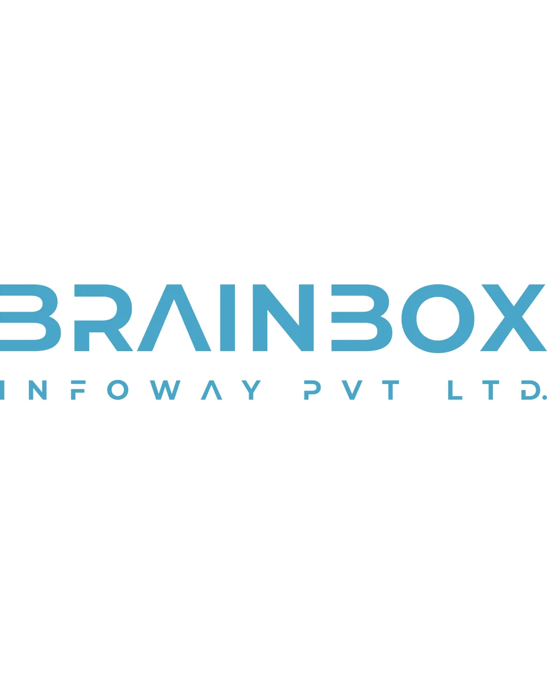
Try it Now!Logo review of BRAINBOX INFOWAY PVT LTD
 Logo analysis by AI
Logo type:
Style:
Detected symbol:
Negative space:
Detected text:
Business industry:
Review requested by Pd_virani__07
**If AI can recognize or misinterpret it, so can people.
Structured logo review
Legibility
![]() Main wordmark 'BRAINBOX' is mostly legible at large sizes
Main wordmark 'BRAINBOX' is mostly legible at large sizes![]() Secondary text 'INFOWAY PVT LTD' is clear and simple
Secondary text 'INFOWAY PVT LTD' is clear and simple
![]() Overly stylized 'B' and '3' for 'E' in 'BRAINBOX' can hinder instant readability
Overly stylized 'B' and '3' for 'E' in 'BRAINBOX' can hinder instant readability![]() Geometric letter 'A' may cause delays in reading, especially at small sizes
Geometric letter 'A' may cause delays in reading, especially at small sizes
Scalability versatility
![]() Simple geometric lines make it suitable for digital use and larger prints like billboards
Simple geometric lines make it suitable for digital use and larger prints like billboards![]() Minimal color palette makes adaptation easier
Minimal color palette makes adaptation easier
![]() Thin lines and excessive spacing may lose clarity at very small sizes or on embroidery
Thin lines and excessive spacing may lose clarity at very small sizes or on embroidery![]() Stylized elements could become unreadable as a favicon or app icon
Stylized elements could become unreadable as a favicon or app icon
200x250 px
100×125 px
50×62 px
Balance alignment
![]() Consistent geometric spacing and alignment between letters
Consistent geometric spacing and alignment between letters![]() Overall horizontal alignment maintained
Overall horizontal alignment maintained
![]() Letter 'A' and custom 'E' throw off rhythm and make the wordmark look disjointed
Letter 'A' and custom 'E' throw off rhythm and make the wordmark look disjointed

Originality
![]() Creative use of geometry in letterforms, especially the transformation of 'E' into '3'
Creative use of geometry in letterforms, especially the transformation of 'E' into '3'![]() Distinctive typographic style sets it apart from basic sans-serif wordmarks
Distinctive typographic style sets it apart from basic sans-serif wordmarks
![]() No original logomark or visual symbol—relies solely on customized letters
No original logomark or visual symbol—relies solely on customized letters![]() The geometric approach is becoming more common in tech-related branding
The geometric approach is becoming more common in tech-related branding
Aesthetic look
![]() Clean, modern aesthetic consistent with tech industry standards
Clean, modern aesthetic consistent with tech industry standards![]() Cyan blue is eye-catching and contemporary
Cyan blue is eye-catching and contemporary
![]() Wordmark feels a bit forced with the excessive geometrization—edges on unaesthetic for non-tech audiences
Wordmark feels a bit forced with the excessive geometrization—edges on unaesthetic for non-tech audiences
Dual meaning and misinterpretations
![]() No inappropriate or misleading imagery detected
No inappropriate or misleading imagery detected
Color harmony
![]() Harmonious and professional color use
Harmonious and professional color use![]() High contrast between text and background
High contrast between text and background
Cyan
#55B6DB
White
#FFFFFF


