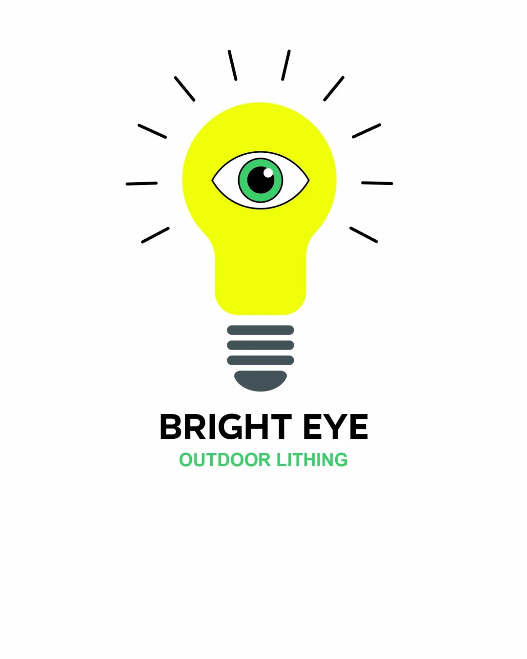
BRIGHT EYE
OUTDOOR LITHING logo review
3.2/5
Logo score
Logo review of

Bright Eye Outdoor Lithing

A functional, visually clear logo with one critical text issue and moderate distinctiveness.

Combination Modern Illustrative Lighting/illumination
3/5
Legibility
3/5
Originality
5/5
Misread
4/5
Balance
3/5
Scale
Your next steps

What to fix first

Focus on the changes that matter. Keep what makes the logo work.

1

tagline (OUTDOOR LITHING)

Correct 'LITHING' to 'LIGHTING' in the tagline.

Visible issue High priority Low effort
Area to inspectApproximate location

The word 'LITHING' is likely a spelling error, which reduces professionalism and clarity.

How to check

Review and update tagline text for accuracy.

See the category review
2

Standalone mark (lightbulb with eye)

Explore subtle mark refinements to further differentiate the logo.

Optional refinement Medium priority Medium effort
Area to inspectApproximate location

The eye-in-bulb approach is clever but relies on two frequently used symbols, making it moderately distinctive rather than truly unique.

How to check

Compare key art with competitive logos to confirm distinctiveness.

See the category review
Detailed review

Logo performance breakdown

3/5

Brief & logo match

Based on an inferred industry
Compared with

lighting/illumination brand inferred from logo content; no specific brief provided.

Logo captures the core idea of lighting, but generic elements and a text error limit professional readiness.

  • Category Appropriation

    Lightbulb and eye directly suggest lighting and clarity, supporting the likely industry.

  • Emphasis On 'outdoor Lighting'

    Logo conveys brightness but no obvious outdoor cues; context may rely on tagline.

3/5

Legibility

  • Main wordmark is clear and bold.
  • The word 'LITHING' is likely a spelling error, which reduces professionalism and clarity.

    Visible issue tagline (OUTDOOR LITHING)

    Try: Correct 'LITHING' to 'LIGHTING' in the tagline.

    Check: Review and update tagline text for accuracy.
    Area to inspectApproximate location
3/5

Originality

  • Integration of eye with bulb conveys meaning directly.
  • The eye-in-bulb approach is clever but relies on two frequently used symbols, making it moderately distinctive rather than truly unique.

    Optional refinement Standalone mark (lightbulb with eye)

    Try: Explore subtle mark refinements to further differentiate the logo.

    Check: Compare key art with competitive logos to confirm distinctiveness.

    Area to inspectApproximate location
4/5

Color harmony

  • Bright yellow is energetic, with good contrast against dark text.
Yellow#FFFF33
Dark Gray#222C31
Green#51E396
Black#000000
White#FFFFFF

Estimated colors. Use the original design file for exact values.

Create a full color palette using these colors

Create new palette
4/5

Balance alignment

  • Wordmark, tagline, and mark are evenly stacked.
  • Artwork and text are visually centered.
Uploaded logoAlignment guide overlay

Inspect spacing with the guide. Optical balance may differ from geometric centering.

3/5

Scalability

  • Simple forms and limited color count.
  • Thin lines for the rays and fine eye details may become unclear at small sizes.

    Worth testing Standalone mark (eye details)

    Try: Test logo at reduced scale; consider thicker lines if needed.

    Check: Print and view icon at favicon and business card size.

Uploaded logo at 200 pixels wide
200 × 250 px
Uploaded logo at 100 pixels wide
100 × 125 px
Uploaded logo at 50 pixels wide
50 × 63 px

Compare the detail at different sizes. Labels show the full image dimensions.

5/5

Misinterpretations

4/5

Symbol & text fit

  • Mark and text relate conceptually and are visually balanced.

Black & white

Does the shape still work without color?

These tests are available only for logos uploaded in vector (SVG) format.

Background contrast

Find the surfaces where your logo stays clear.

These tests are available only for logos uploaded in vector (SVG) format.

Blur & silhouette

A 3px blur softens fine details so you can check whether the overall shape stays recognizable. If key gaps close or elements merge, the logo may rely too heavily on detail.

These tests are available only for logos uploaded in vector (SVG) format.

Try your own review

Wondering how your logo performs?

Get a clear logo score, key risks, and priority fix ideas before your client or audience sees it.

Review my logo