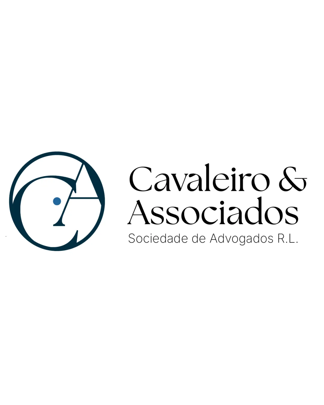
Cavaleiro & Associados Sociedade de Advogados R.L. logo review
4/5
Logo score
Logo review of

Cavaleiro & Associados Sociedade De Advogados R.l.

A professional, credible logo with strong sector fit, benefiting from subtle stylistic refinement for added uniqueness.

Combination Mark Modern Serif Wordmark With Geometric Monogram Legal Services
4.5/5
Legibility
3.5/5
Originality
5/5
Misread
4/5
Balance
4/5
Scale
Action plan

What to fix first

The most important fixes to handle before polishing the full presentation.

1

Unify monogram and wordmark style further

Medium priority

Visual connection between the geometric mark and organic wordmark can help the brand feel even more signature.

Impact: Improved Harmony And Cohesiveness · Effort: Medium

2

Consider tagline readability at small sizes

Low priority

Using a slightly bolder or more condensed font for the tagline can preserve clarity when scaled down.

Impact: Functional Use In Small Applications · Effort: Low

Detailed review

Logo performance breakdown

4.5/5

Legibility

Checkmark icon Primary wordmark is highly legible
Checkmark icon Tagline uses clear, spaced font

Warning icon Monogram may take a moment to decipher for new viewers

3.5/5

Originality

Checkmark icon Monogram combines initials in a creative way
Checkmark icon Serif wordmark adds a premium feel

Warning icon Circle-monogram is a common legal and corporate motif

4/5

Color harmony

Checkmark icon Deep blue communicates trust and authority
Checkmark icon Good contrast with white and black

Warning icon Palette is safe, not distinctive

Dark Blue
#15323D

Black
#000000

White
#FFFFFF

Your palette is close. Refine the color roles and combinations before updating the logo.

Build brand colors
4/5

Balance alignment

Checkmark icon Good proportion between symbol and wordmark
Checkmark icon Clear alignment maintains professionalism

Warning icon Slight tension between dense monogram and open wordmark

logo 200x250 pixels scalability test alignment grid overlay
4/5

Scalability

Checkmark icon Strong, simple lines in the monogram support small and large sizes
Checkmark icon Wordmark is clear at multiple scales

Warning icon Tagline may become illegible at very small sizes

logo 200x250 pixels scalability test

200x250 px

logo 100x125 pixels scalability test

100×125 px

logo 50x62 pixels scalability test

50×62 px

5/5

Misinterpretations

Checkmark icon No obvious negative or confusing alternate readings

4/5

Logo structure & brief match

Checkmark icon Monogram style matches wordmark elegance

Warning icon Monogram geometric style differs slightly from organic wordmark

Checkmark icon Industry Fit: Classic serif and monogram approach matches expectations of legal sector professionalism.
Checkmark icon Distinction: Visual clarity supports credibility but could be more distinctive from other law firms.

Try your own review

Wondering how your logo performs?

Get a clear logo score, key risks, and priority fix ideas before your client or audience sees it.

Review my logo