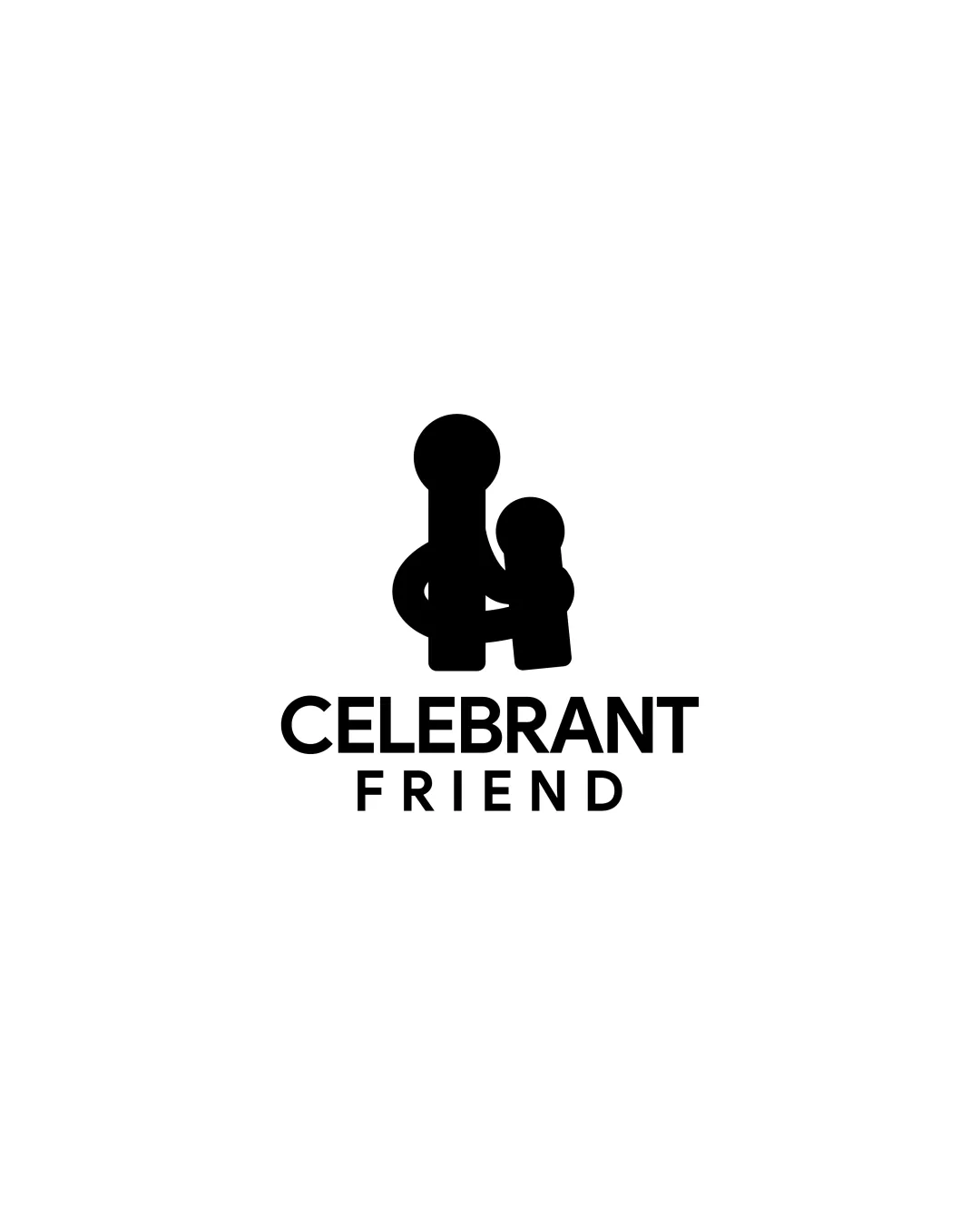
CELEBRANT FRIEND logo review
1.7 / 5
Logo score
Logo review of

Celebrant Friend

High-risk visual misinterpretation detected. Resolve this before presenting the logo.

Combination Mark Minimalist Geometric Concierge / Luxury Services
5/5
Legibility
2/5
Originality
1/5
Misread
4/5
Balance
5/5
Scale
Action plan

What to fix first

The most important fixes to handle before polishing the full presentation.

1

Fix possible misinterpretation

High priority

Primary symbol can be strongly misread as phallic or explicit body part due to the shape and overlap; high risk of embarrassing misinterpretation
Impact: High · Effort: Medium

2

Reoptimize symbol's visual weight for better optical centering with the text

Medium priority

Minor adjustment, improves balance but only after dual-meaning issue is resolved

Impact: Medium · Effort: Low

Detailed review

Logo performance breakdown

5/5

Legibility

Checkmark icon Clear, simple sans-serif font
Checkmark icon Strong text contrast against background

2/5

Originality

Checkmark icon Abstract depiction of figures is distinctive

Warning icon Mark strongly resembles inappropriate/embarrassing imagery; potential unintended dual meaning

4/5

Color harmony

Checkmark icon Classic black/white scheme, versatile across applications

Warning icon All-black may be severe or less welcoming for some luxury contexts

Black
#000000

White
#FFFFFF

Your palette is close. Refine the color roles and combinations before updating the logo.

Build brand colors
4/5

Balance alignment

Checkmark icon Good central alignment of mark and text
Checkmark icon Even spacing between lines

Warning icon Symbol slightly heavy on left due to overlap, could be better optically centered

logo 200x250 pixels scalability test alignment grid overlay
5/5

Scalability

Checkmark icon Bold symbol with clear silhouette
Checkmark icon No excessive detail; works at small size

logo 200x250 pixels scalability test

200x250 px

logo 100x125 pixels scalability test

100×125 px

logo 50x62 pixels scalability test

50×62 px

1/5

Misinterpretations

Warning icon Primary symbol can be strongly misread as phallic or explicit body part due to the shape and overlap; high risk of embarrassing misinterpretation

Beta

No AI design signals found

Likely designed by a human

The design appears intentional and geometric, with no obvious AI generation artifacts.

  • Consistent construction and proportion in icon and typography

Visual assessment; not definitive proof of authorship.

4 / 5

Logo structure & brief match

Checkmark icon Mark visual is stylistically matched to font; harmonious look

Warning icon Some tension between serious modern font and playful symbol style

Checkmark icon Trust/luxury/concierge/caring For Celebration Center: The embracing figure idea fits caring concept, but the high misinterpretation risk undermines trust and suitability for a luxury service

Try your own review

Wondering how your logo performs?

Get a clear logo score, key risks, and priority fix ideas before your client or audience sees it.

Review my logo