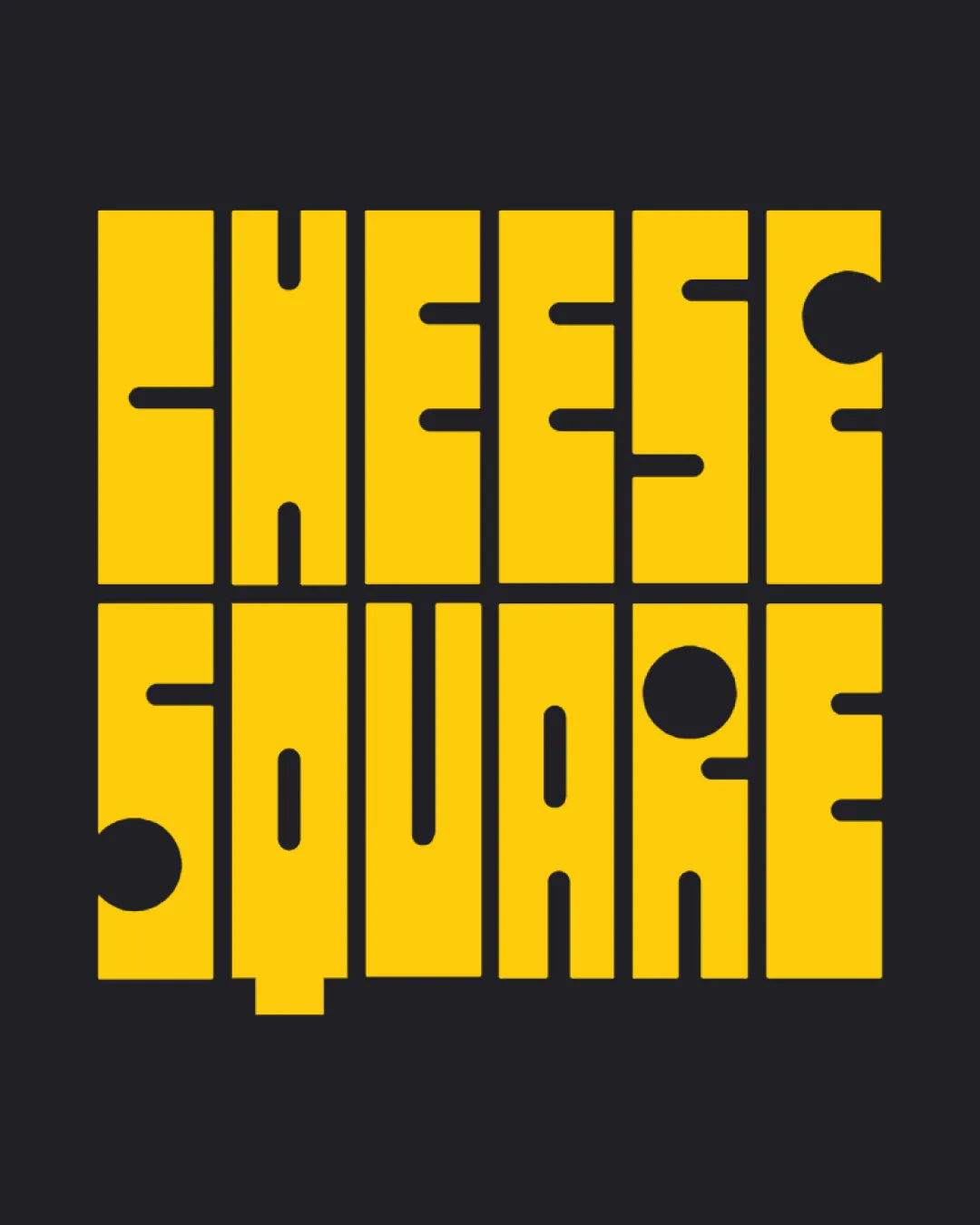
CHEESE SQUARE logo review
4/5
Logo score
Logo review of

Cheese Square

This is a strong, memorable wordmark with an effective cheese theme, but would benefit from spacing and detail adjustments to boost usability and legibility.

Wordmark Geometric Modular Food
3/5
Legibility
4/5
Originality
5/5
Misread
4/5
Balance
3/5
Scale
Your next steps

What to fix first

Focus on the changes that matter. Keep what makes the logo work.

1

entire wordmark

Relax some spacing or differentiate letter shapes more clearly to aid rapid reading.

Visible issue High priority Medium effort
Area to inspectApproximate location

The very tight letter spacing and geometric construction may reduce legibility at smaller sizes or at first glance.

How to check

Print or display the logo at reduced sizes to confirm all letters are distinguishable in context.
See the category review
2

entire wordmark

Test the logo at reduced sizes and on various backgrounds to ensure all details remain clear.

Worth testing Medium priority Low effort

Small interior cutouts and modular stroke widths may fill in or blur when scaled down significantly.

How to check

Check the logo's clarity at favicon and social media icon sizes.

See the category review
Detailed review

Logo performance breakdown

4/5

Brief & logo match

Based on an inferred industry
Compared with

The design clearly targets the food/cheese industry using modular cheese-like typography as a central idea.

Conceptually and visually, the logo fits a modern cheese or food-related brand with minor practical usability concerns.

  • Cheese And Food Connotations

    Yellow squares with holes immediately evoke cheese and food industry relevance.

  • Bold, Modern Presence

    The modular, geometric construction gives the logo a trendy and bold feel, differentiating it from more traditional type treatments.

3/5

Legibility

  • Bold forms and high contrast color ensure baseline readability.
  • Conceptual use of cutouts visually links to cheese theme.
  • The very tight letter spacing and geometric construction may reduce legibility at smaller sizes or at first glance.

    Visible issue entire wordmark

    Try: Relax some spacing or differentiate letter shapes more clearly to aid rapid reading.

    Check: Print or display the logo at reduced sizes to confirm all letters are distinguishable in context.


    Area to inspectApproximate location
4/5

Originality

  • Distinctive cheese motif is cleverly integrated with the modular type.
  • Memorable graphic approach with thematic link.
4/5

Balance alignment

  • Grid-based construction is visually consistent.
  • Overall structure is harmonious and aligned.
  • The geometric alignment is consistent, but the lower-case 'q' tail and circular cutouts create some weight imbalance in 'SQUARE'.

    Optional refinement entire wordmark

    Try: Slightly adjust the 'q' tail and balance of cheese holes for uniform density without losing character.

    Check: Visually compare both rows for evenness in visual weight and rhythm.

Uploaded logoAlignment guide overlay

Inspect spacing with the guide. Optical balance may differ from geometric centering.

3/5

Scalability

  • Solid fills aid application scalability.
  • Monochrome palette simplifies production.
  • Small interior cutouts and modular stroke widths may fill in or blur when scaled down significantly.

    Worth testing entire wordmark

    Try: Test the logo at reduced sizes and on various backgrounds to ensure all details remain clear.

    Check: Check the logo's clarity at favicon and social media icon sizes.

Uploaded logo at 200 pixels wide
200 × 250 px
Uploaded logo at 100 pixels wide
100 × 125 px
Uploaded logo at 50 pixels wide
50 × 63 px

Compare the detail at different sizes. Labels show the full image dimensions.

5/5

Misinterpretations

  • No misleading shapes or negative space detected.

Black & white

Does the shape still work without color?

Preparing artwork...

Background contrast

Find the surfaces where your logo stays clear.

Compare the mark and lettering on each surface.

Blur & silhouette

A 3px blur softens fine details so you can check whether the overall shape stays recognizable. If key gaps close or elements merge, the logo may rely too heavily on detail.

Original
3px blur

Look for clear separation between shapes and a distinctive outline.

Try your own review

Wondering how your logo performs?

Get a clear logo score, key risks, and priority fix ideas before your client or audience sees it.

Review my logo