Wondering how your logo performs? 🧐
Get professional logo reviews in seconds and catch design issues in time.
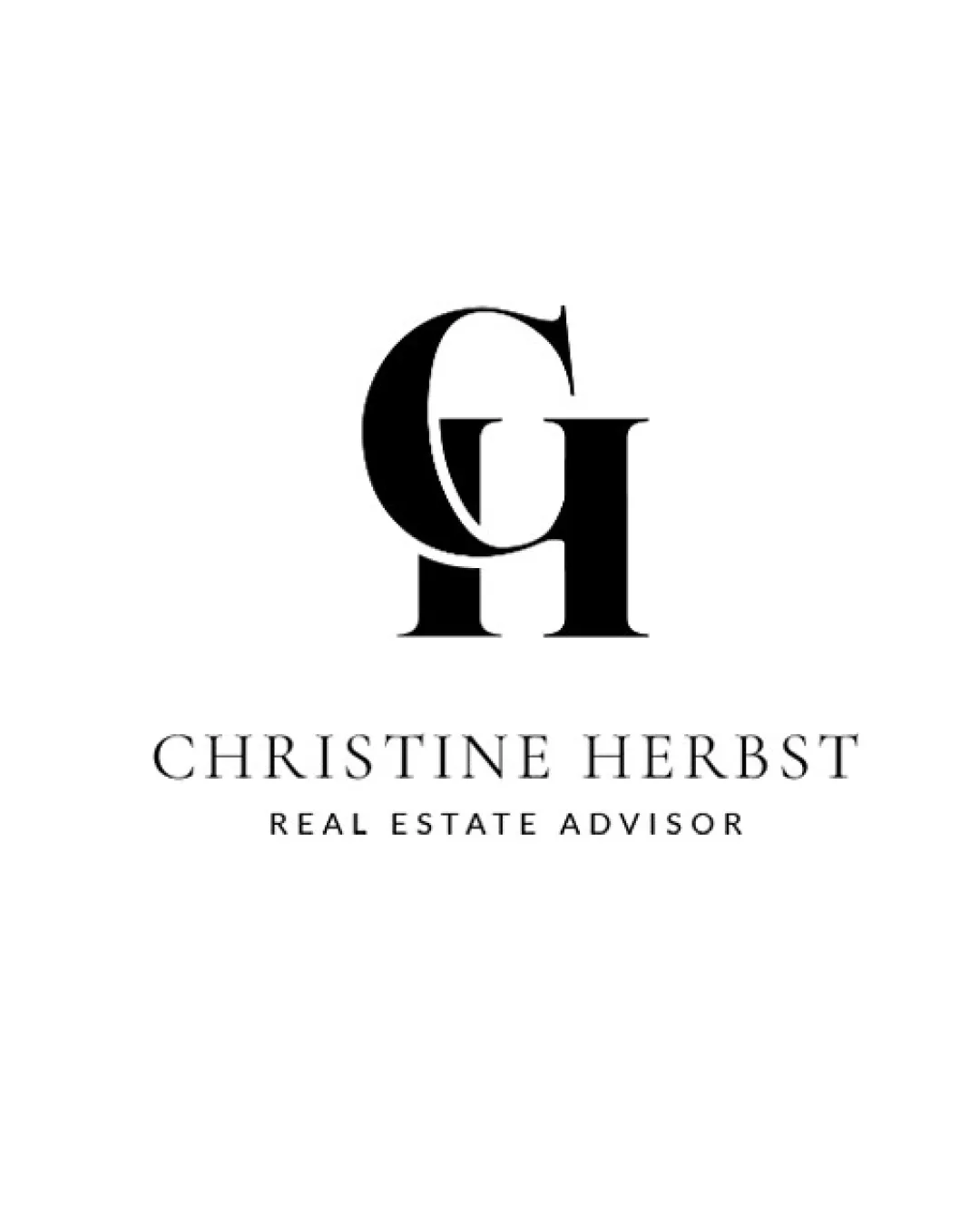
Try it Now!Logo review of CHRISTINE HERBST REAL ESTATE ADVISOR
 Logo analysis by AI
Logo type:
Style:
Detected symbol:
Detected text:
Business industry:
Review requested by Agentimage
**If AI can recognize or misinterpret it, so can people.
Structured logo review
Legibility
![]() Primary business name and tagline are set in a clear serif and sans-serif font, which maintains high legibility.
Primary business name and tagline are set in a clear serif and sans-serif font, which maintains high legibility.![]() No decorative distortions or unnecessary effects on the text.
No decorative distortions or unnecessary effects on the text.
Scalability versatility
![]() Strong contrast and simple letterforms preserve clarity at small sizes.
Strong contrast and simple letterforms preserve clarity at small sizes.![]() Monogram can function independently as a compact brand identifier.
Monogram can function independently as a compact brand identifier.![]() Minimal detail aids performance across digital, print, and signage applications.
Minimal detail aids performance across digital, print, and signage applications.
![]() Some fine overlaps in the monogram may lose definition when heavily reduced, such as in small favicons or embroidery.
Some fine overlaps in the monogram may lose definition when heavily reduced, such as in small favicons or embroidery.
200x250 px
100×125 px
50×62 px
Balance alignment
![]() Monogram is visually centered above the wordmark, creating a balanced vertical structure.
Monogram is visually centered above the wordmark, creating a balanced vertical structure.![]() Horizontal alignment between the logomark and text feels considered.
Horizontal alignment between the logomark and text feels considered.
![]() Slight visual heaviness on the left side of the monogram due to the 'C', which may create a subtle imbalance.
Slight visual heaviness on the left side of the monogram due to the 'C', which may create a subtle imbalance.

Originality
![]() Monogram creates a custom arrangement for the client's initials, which is appropriate for a professional brand.
Monogram creates a custom arrangement for the client's initials, which is appropriate for a professional brand.![]() Overlapping approach adds a touch of uniqueness.
Overlapping approach adds a touch of uniqueness.
![]() Use of classic serif monogram is a popular trope in real estate and luxury branding, lacking strong distinctiveness.
Use of classic serif monogram is a popular trope in real estate and luxury branding, lacking strong distinctiveness.![]() No unique visual metaphor or unexpected twist in the monogram structure.
No unique visual metaphor or unexpected twist in the monogram structure.
Logomark wordmark fit
![]() Serif style of the monogram aligns stylistically with the elegant wordmark, showing cohesive branding.
Serif style of the monogram aligns stylistically with the elegant wordmark, showing cohesive branding.![]() Proportion between the mark and wordmark is aesthetically pleasing.
Proportion between the mark and wordmark is aesthetically pleasing.
![]() Monogram is visually bolder compared to the lighter business name; increasing wordmark weight slightly could improve synergy.
Monogram is visually bolder compared to the lighter business name; increasing wordmark weight slightly could improve synergy.
Aesthetic look
![]() Minimalist sophistication and professional tone appropriate for the real estate sector.
Minimalist sophistication and professional tone appropriate for the real estate sector.![]() Elegant serif choice and ample negative space create visual appeal.
Elegant serif choice and ample negative space create visual appeal.
![]() Generic monogram approach may be easily confused with similar brands in high-end service industries.
Generic monogram approach may be easily confused with similar brands in high-end service industries.
Dual meaning and misinterpretations
![]() No inappropriate dual meanings or accidental forms detected within this logo.
No inappropriate dual meanings or accidental forms detected within this logo.
Color harmony
![]() Timeless black-and-white palette ensures maximum legibility and versatility.
Timeless black-and-white palette ensures maximum legibility and versatility.![]() Consistent, restrained use of color supports brand professionalism.
Consistent, restrained use of color supports brand professionalism.
Black
#000000
White
#FFFFFF


