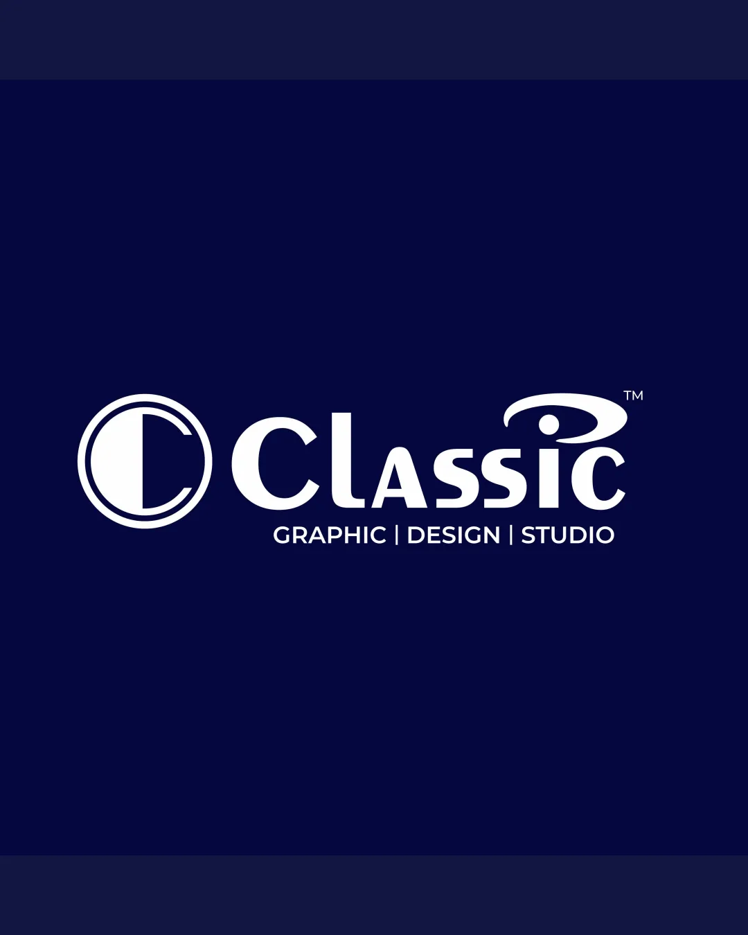
Classic GRAPHIC | DESIGN | STUDIO logo review
3.8 / 5
Logo score
Logo review of

Classic Graphic | Design | Studio

Strong client-grade logo; can be improved for polish and versatility.

Combination Mark Modern Sans-serif Wordmark With Geometric Mark Graphic Design
5/5
Legibility
3/5
Originality
5/5
Misread
4/5
Balance
4/5
Scale
Action plan

What to fix first

The most important fixes to handle before polishing the full presentation.

1

Refine the logomark to increase optical harmony with wordmark, possibly adjusting weight or connection.

High priority

Mark currently slightly outweighs the logotype.

Impact: Improves Visual Unity And Professional Polish. · Effort: Medium

2

Consider slightly increasing tagline text size or adjusting contrast for better clarity at smaller sizes.

Medium priority

Tagline may be hard to read when reduced.

Impact: Increases Usability For Small-scale Or Digital Applications. · Effort: Low

Detailed review

Logo performance breakdown

5/5

Legibility

Checkmark icon All text is very clear and easy to read.
Checkmark icon Good contrast with dark background.

3/5

Originality

Checkmark icon Custom elements in the 'i' and circular 'C' mark.

Warning icon The overall composition is fairly typical for design studios, not highly unique.

4/5

Color harmony

Checkmark icon Dark blue with white provides a trustworthy and premium feel.

Warning icon One-color palette may limit vibrancy across diverse backgrounds.

Prussian Blue
#101C4B

White
#FFFFFF

Your palette is close. Refine the color roles and combinations before updating the logo.

Build brand colors
4/5

Balance alignment

Checkmark icon Even horizontal alignment between mark and wordmark.
Checkmark icon Consistent baseline and spacing.

Warning icon Logomark is slightly heavier than wordmark, marginally affecting optical balance.

logo 200x250 pixels scalability test alignment grid overlay
4/5

Scalability

Checkmark icon Mark and wordmark are simple and bold, scalable for most sizes.

Warning icon Small text in tagline may become less readable at small scale.

logo 200x250 pixels scalability test

200x250 px

logo 100x125 pixels scalability test

100×125 px

logo 50x62 pixels scalability test

50×62 px

5/5

Misinterpretations

Checkmark icon No evident inappropriate or confusing shape associations.

Beta

No AI design signals found

Likely designed by a human

Logo design appears intentional and well-crafted with no obvious generative artifacts.

  • Geometric letter construction is coherent and deliberate.
  • Consistent typographic treatment throughout.

Visual assessment; not definitive proof of authorship.

4 / 5

Logo structure & brief match

Checkmark icon 'C' symbol and wordmark are clearly related and cohesive.

Warning icon Abstract mark feels only loosely integrated with word flow.

Checkmark icon Clean, Unique Style Typography: Typography is clean and visually distinct, aided by stylized 'i' and geometric 'C'.
Checkmark icon C Letter Mark, Strong Icon: C in circle is recognizable and bold, fitting the brief for a memorable 'C' icon.
Checkmark icon Dark Blue, Trustable Premium Creative Message: Palette and styling communicate premium and trustworthy qualities.

Try your own review

Wondering how your logo performs?

Get a clear logo score, key risks, and priority fix ideas before your client or audience sees it.

Review my logo