CLUB logo review
3.8 / 5
Logo score
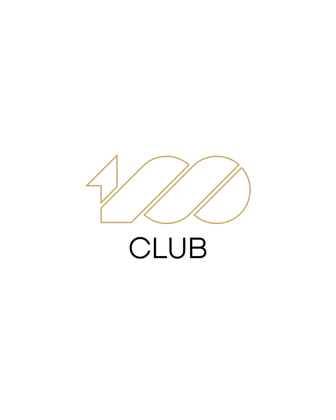
Logo review of

Club

Solid concept with effective symbolism; final tweaks to styling and scalability recommended before client presentation.

Combination Mark Minimalist Geometric Membership/achievement
5/5
Legibility
3/5
Originality
5/5
Misread
4/5
Balance
4/5
Scale
Action plan

What to fix first

The most important fixes to handle before polishing the full presentation.

1

Increase mark stroke thickness for improved low-size and background versatility.

High priority

Thin lines may disappear when scaled down or on complex backgrounds.

Impact: Improves Clarity Across Uses · Effort: Low

2

Explore a variation where the wordmark shares the same outline or gold color treatment as the mark for cohesion.

Medium priority

Reduces the stylistic gap between outlined mark and filled text.

Impact: Strengthens Visual Unity · Effort: Medium

Detailed review

Logo performance breakdown

5/5

Legibility

Checkmark icon 'CLUB' is clear and readable in a straightforward font
Checkmark icon Numbers in the mark are distinguishable

3/5

Originality

Checkmark icon Arrow integrated into '100' is a differentiator

Warning icon Numerical badge-style marks are common; execution is not highly distinctive

5/5

Color harmony

Checkmark icon Minimal palette is elegant and appropriate

Pale Gold
#C5A56D

Black
#000000

4/5

Balance alignment

Checkmark icon Mark and text are well-centered and visually balanced

Warning icon Slight visual weight bias to the left due to the arrow

logo 200x250 pixels scalability test alignment grid overlay
4/5

Scalability

Checkmark icon Simple lines ensure clarity at small scale
Checkmark icon Mark can be used standalone

Warning icon Thin gold stroke may lose visibility on very small or colored backgrounds

logo 200x250 pixels scalability test

200x250 px

logo 100x125 pixels scalability test

100×125 px

logo 50x62 pixels scalability test

50×62 px

5/5

Misinterpretations

Checkmark icon No confusion or inappropriate shapes detected

Beta

No AI design signals found

Likely designed by a human

Logo shows intentional construction, precise geometry, and clear forms typical of deliberate human design.

  • Consistent spacing and construction without irregular generative artifacts

Visual assessment; not definitive proof of authorship.

4 / 5

Logo structure & brief match

Checkmark icon Word and mark feel cohesive; balanced distance between elements

Warning icon Stylistic disconnect as mark is outlined, text is filled

Checkmark icon Symbolism: The arrow and '100' motif fit a club that signals achievement or exclusivity.

Try your own review

Wondering how your logo performs?

Get a clear logo score, key risks, and priority fix ideas before your client or audience sees it.

Review my logo