Wondering how your logo performs? 🧐
Get professional logo reviews in seconds and catch design issues in time.
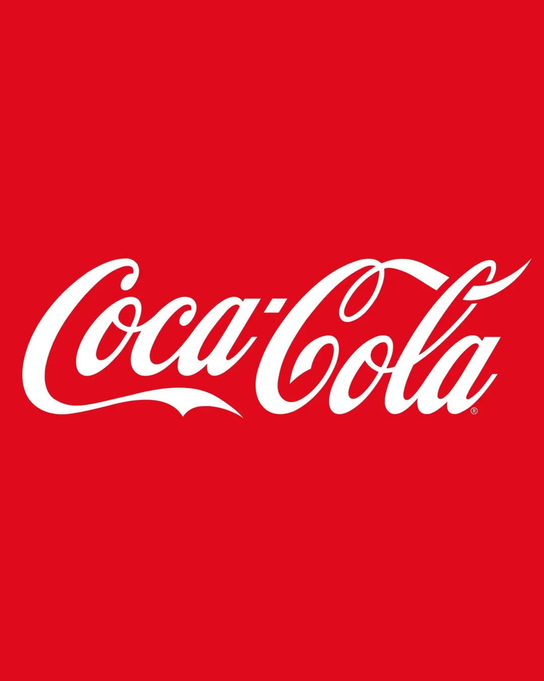
Try it Now!Logo review of CocaCola
 Logo analysis by AI
Logo type:
Style:
Detected text:
Business industry:
Review requested by Jo.mr.gdf
**If AI can recognize or misinterpret it, so can people.
Structured logo review
Legibility
![]() Text is highly recognizable due to distinctive script style.
Text is highly recognizable due to distinctive script style.![]() Contrast between white text and red background aids quick reading.
Contrast between white text and red background aids quick reading.
![]() Elaborate swashes and flourishes make certain letters less legible at small sizes.
Elaborate swashes and flourishes make certain letters less legible at small sizes.
Scalability versatility
![]() Simple two-color palette reproduces well on a range of packaging and merchandise.
Simple two-color palette reproduces well on a range of packaging and merchandise.![]() Readable at medium-to-large sizes on billboards, cans, and bottles.
Readable at medium-to-large sizes on billboards, cans, and bottles.
![]() Ornate script flourishes lose detail and become muddled at very small scales such as favicons or embroidery.
Ornate script flourishes lose detail and become muddled at very small scales such as favicons or embroidery.![]() Not ideal for single-color applications or micro-format usage without simplification.
Not ideal for single-color applications or micro-format usage without simplification.
200x250 px
100×125 px
50×62 px
Balance alignment
![]() Visual weight is expertly distributed through the sweeping baseline and rhythm of the letterforms.
Visual weight is expertly distributed through the sweeping baseline and rhythm of the letterforms.![]() Wordmark feels cohesive and intentional, with well-planned spacing.
Wordmark feels cohesive and intentional, with well-planned spacing.

Originality
![]() Custom script wordmark with instantly recognizable, ownable style.
Custom script wordmark with instantly recognizable, ownable style.![]() Unique flourishes contribute to identity distinctiveness and memorability.
Unique flourishes contribute to identity distinctiveness and memorability.
Aesthetic look
![]() Classic and elegant with a strong, vintage appeal.
Classic and elegant with a strong, vintage appeal.![]() Swashes and color contrast produce a vibrant, energetic, and attractive appearance.
Swashes and color contrast produce a vibrant, energetic, and attractive appearance.
![]() Ornate design can feel visually heavy or cluttered in contemporary minimalist contexts.
Ornate design can feel visually heavy or cluttered in contemporary minimalist contexts.
Dual meaning and misinterpretations
![]() No inappropriate or ambiguous hidden imagery in the design.
No inappropriate or ambiguous hidden imagery in the design.
Color harmony
![]() Very strong, iconic contrast with a simple, bold red-and-white color scheme.
Very strong, iconic contrast with a simple, bold red-and-white color scheme.![]() Color instantly connects to the brand and attracts attention.
Color instantly connects to the brand and attracts attention.
White
#FFFFFF
Red
#E41A1C