Coleg Gŵyr Abertawe Gower College Swansea Green H.. logo review
3.2/5
Logo score
Logo review of

Coleg Gŵyr Abertawe Gower College Swansea Green H..

A competent bilingual academic and eco-themed logo that could benefit from clearer hierarchy and a more distinctive mark.

Combination Modern Academic/environmental Badge Education
4/5
Legibility
2.5/5
Originality
5/5
Misread
3/5
Balance
3/5
Scale
Your next steps

What to fix first

Focus on the changes that matter. Keep what makes the logo work.

1

overall badge

Clarify visual hierarchy and add more breathing room between sections.

Visible issue High priority Medium effort
Area to inspectApproximate location

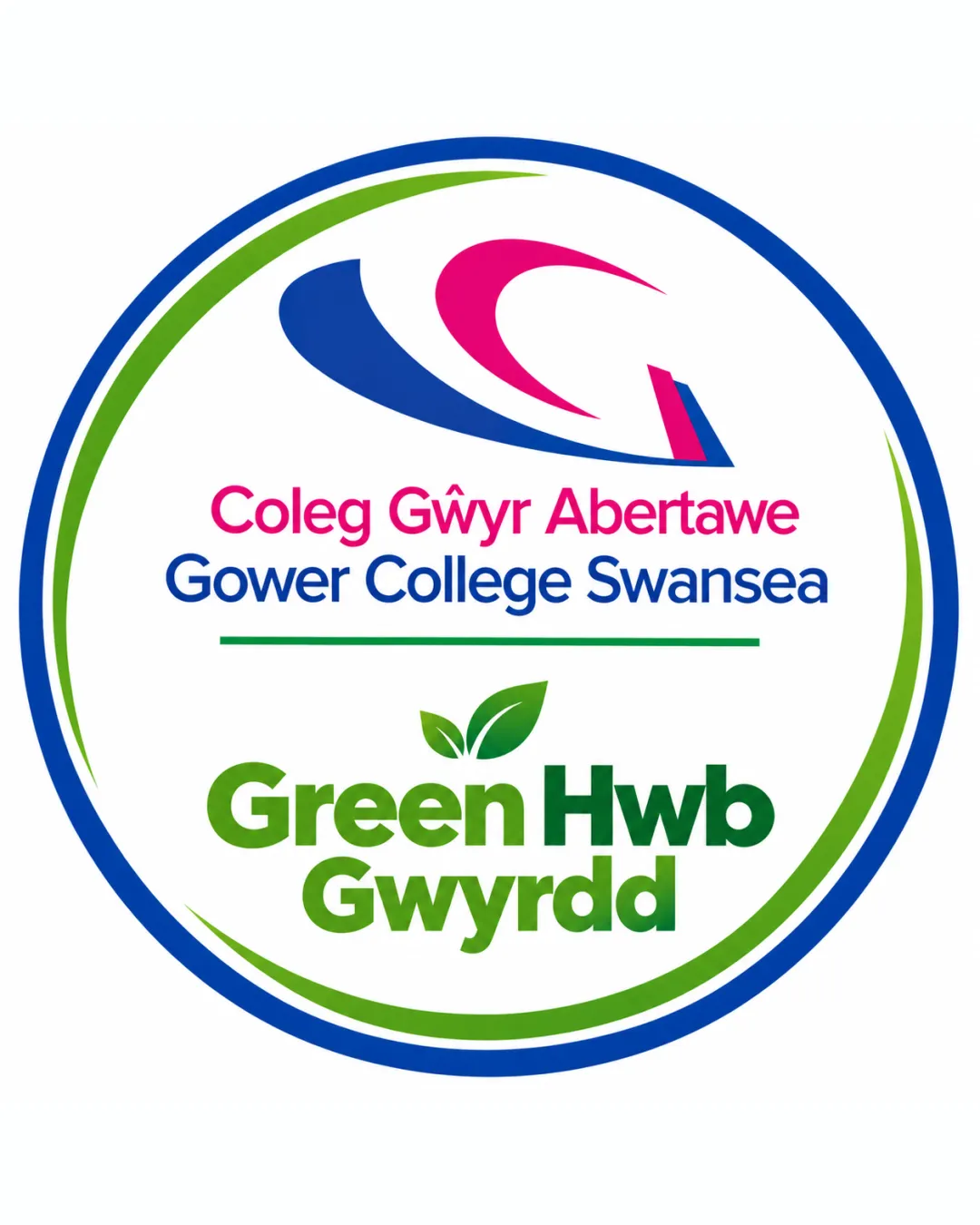
The logo layout is visually dense, with several text elements and two distinct focal points (abstract mark and green section) that compete for attention, reducing hierarchy.

How to check

Test with reduced elements or adjusted spacing to improve flow.

See the category review
2

Standalone mark and badge form

Explore more distinctive badge silhouette or integrate elements in a unique way.

Worth testing Medium priority Medium effort
Area to inspectApproximate location

The abstract swoosh and circular badge are fairly conventional for colleges and green initiatives; risk of blending into similar institutional designs.

How to check

Present alongside peer logos to see if it stands out clearly.

See the category review
Detailed review

Logo performance breakdown

4/5

Brief & logo match

Based on an inferred industry
Compared with

Higher education institution with bilingual communication and environmental initiative focus.

Effectively signals an academic and green focus, though symbol and structure are somewhat generic.

  • Bilingual Academic Identity

    The logo presents both Welsh and English college names clearly and with equal emphasis, supporting inclusive communication.

  • Green/sustainability Initiative

    Green Hwb Gwyrdd section and leaf motif visually emphasize an eco-friendly message appropriate for a sustainability program.

4/5

Legibility

  • Text is bilingual and clear in print size.
  • Distinct color separation aids quick reading.
2.5/5

Originality

  • Contemporary abstract mark.
  • The abstract swoosh and circular badge are fairly conventional for colleges and green initiatives; risk of blending into similar institutional designs.

    Worth testing Standalone mark and badge form

    Try: Explore more distinctive badge silhouette or integrate elements in a unique way.

    Check: Present alongside peer logos to see if it stands out clearly.

    Area to inspectApproximate location
4/5

Color harmony

  • Green, blue, and magenta create a fresh, positive palette.
Blue#083391
Green#3C8A36
Magenta#E3166A
Black#000000
White#FFFFFF

Estimated colors. Use the original design file for exact values.

Create a full color palette using these colors

Create new palette
3/5

Balance alignment

  • Text baselines are orderly.
  • The logo layout is visually dense, with several text elements and two distinct focal points (abstract mark and green section) that compete for attention, reducing hierarchy.

    Visible issue overall badge

    Try: Clarify visual hierarchy and add more breathing room between sections.

    Check: Test with reduced elements or adjusted spacing to improve flow.
    Area to inspectApproximate location
Uploaded logoAlignment guide overlay

Inspect spacing with the guide. Optical balance may differ from geometric centering.

3/5

Scalability

  • Simple shapes aid reduction.
  • Small text and multiple thin lines may lose clarity at small sizes or on busy backgrounds.

    Worth testing lower text and green leaf section

    Try: Test at minimum and single-color sizes, increasing weight or simplifying details if needed.

    Check: Verify legibility/impact in small digital and print contexts.

Uploaded logo at 200 pixels wide
200 × 250 px
Uploaded logo at 100 pixels wide
100 × 125 px
Uploaded logo at 50 pixels wide
50 × 63 px

Compare the detail at different sizes. Labels show the full image dimensions.

5/5

Misinterpretations

4/5

Symbol & text fit

  • Abstract mark relates visually to the energetic, academic theme.

Black & white

Does the shape still work without color?

These tests are available only for logos uploaded in vector (SVG) format.

Background contrast

Find the surfaces where your logo stays clear.

These tests are available only for logos uploaded in vector (SVG) format.

Blur & silhouette

A 3px blur softens fine details so you can check whether the overall shape stays recognizable. If key gaps close or elements merge, the logo may rely too heavily on detail.

These tests are available only for logos uploaded in vector (SVG) format.

Try your own review

Wondering how your logo performs?

Get a clear logo score, key risks, and priority fix ideas before your client or audience sees it.

Review my logo