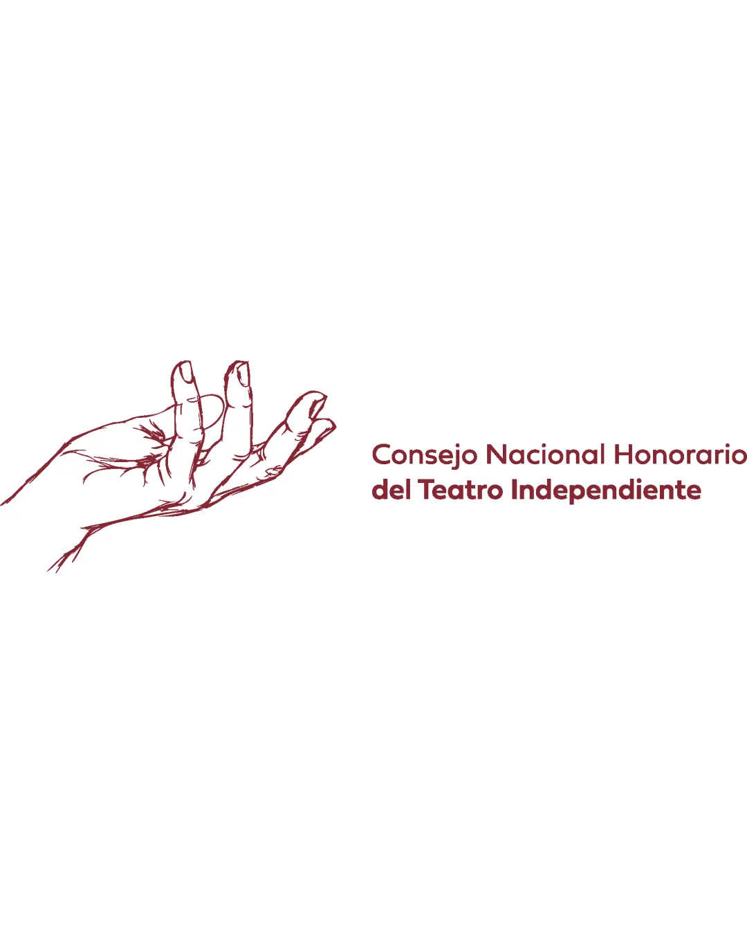
Consejo Nacional Honorario del Teatro Independient.. logo review
3.7 / 5
Logo score
Logo review of

Consejo Nacional Honorario Del Teatro Independient..

Not yet client-ready for broad rollout; needs integration and scalability refinement.

Combination Mark Hand-drawn Illustrative Arts
5/5
Legibility
4/5
Originality
5/5
Misread
3/5
Balance
3/5
Scale
Action plan

What to fix first

The most important fixes to handle before polishing the full presentation.

1

Increase integration between the hand illustration and the text to create a stronger, unified brand impression (e.g., overlap, connected elements, or composition adjustment).

High priority

Current separation dilutes visual impact and memorability.

Impact: Creates A More Memorable And Cohesive Logo That Reads As One Unit Rather Than Two Unrelated Parts. · Effort: Medium

2

Simplify the hand illustration for better scalability or create a bolder version for small uses.

Medium priority

Thin details risk disappearing in certain applications.

Impact: Improves Clarity And Ensures The Logo Retains Character At Small Sizes And In Print. · Effort: Medium

Detailed review

Logo performance breakdown

5/5

Legibility

Checkmark icon Text is clear and easily readable
Checkmark icon Good contrast with the background

4/5

Originality

Checkmark icon Hand-drawn style adds distinct character

Warning icon Hand symbol is somewhat common in arts/nonprofit fields

5/5

Color harmony

Checkmark icon Single accent color is consistent and harmonious with theme

Merlot
#82262A

White
#FFFFFF

3/5

Balance alignment

Checkmark icon Text and graphic are horizontally aligned

Warning icon The hand and text feel visually disconnected, lacking integration

logo 200x250 pixels scalability test alignment grid overlay
3/5

Scalability

Checkmark icon Simple color palette aids in reproduction

Warning icon Hand sketch has fine detail that may be lost at small sizes
Warning icon Thin lines could blur or disappear when scaled down

logo 200x250 pixels scalability test

200x250 px

logo 100x125 pixels scalability test

100×125 px

logo 50x62 pixels scalability test

50×62 px

5/5

Misinterpretations

Checkmark icon No inappropriate or unintended visual resemblance detected

3 / 5

Logo structure & brief match

Checkmark icon Both elements are visually separated for clarity

Warning icon No direct visual link or conceptual interaction between the hand and text

Checkmark icon Arts/culture/theater: Hand-drawn illustration supports a creative and artisanal image, and the hand gesture can suggest performance, teaching, or communication in theater.

Try your own review

Wondering how your logo performs?

Get a clear logo score, key risks, and priority fix ideas before your client or audience sees it.

Review my logo