costa ENERGIA logo review
4.5/5
Logo score
Logo review of

Costa Energia

This logo stands out as a polished, relevant mark that thoughtfully balances enduring trust and forward-thinking sustainability for an energy brand.

Combination Mark Modern Geometric With Clean Sans-serif Type Energy/utilities/renewables
5/5
Legibility
3/5
Originality
5/5
Misread
5/5
Balance
4/5
Scale
Your next steps

What to fix first

Focus on the changes that matter. Keep what makes the logo work.

1

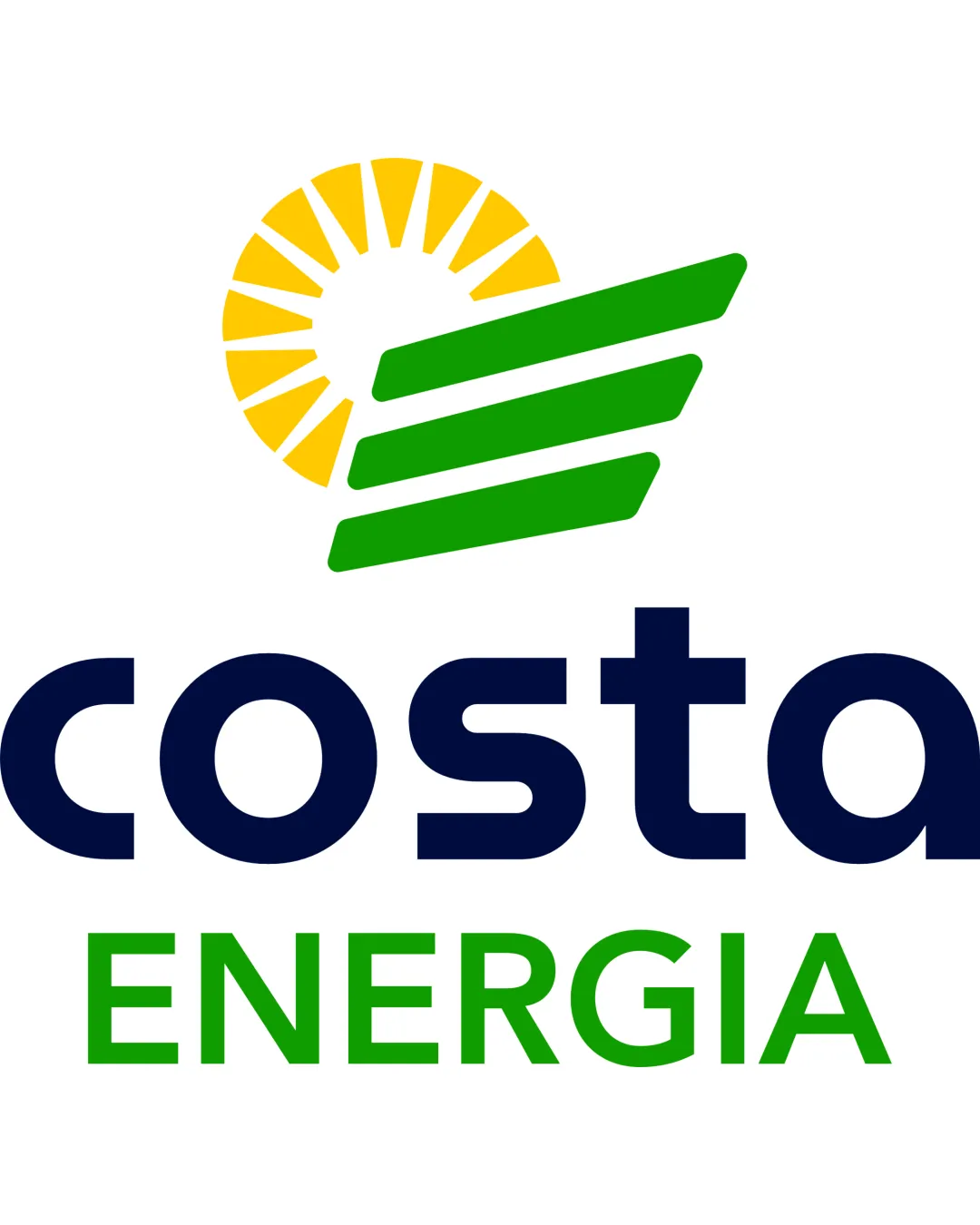
sunburst and green stripes symbol

Test the mark at smaller scales and in monochrome to ensure legibility and recognizable shapes are maintained.

Worth testing Medium priority Low effort
Area to inspectApproximate location

The thin yellow rays and negative space in the sunburst might lose clarity at very small sizes or in single-color applications.

How to check

Print the logo at 1cm wide and inspect the sunburst rays and green stripes for clarity.

See the category review
Detailed review

Logo performance breakdown

5/5

Brief & logo match

Based on your brief
Compared with

The logo is intended for a brand that combines proven traditional reliability with a forward-looking focus on sustainable innovation and environmental leadership.

The logo convincingly blends traditional reliability (solid shapes, sun motif) with future-focused sustainability (green color, dynamic lines), matching both sides of the brief.

  • Blend Of Heritage And Vision

    The logo juxtaposes a 'timeless' sun (tradition/reliability) with dynamic, angled green shapes evoking energy and forward motion (vision/future).

  • Sustainable Innovation Focus

    Green sunrays and stripes symbolize clean energy and growth, strongly aligning with environmental stewardship.

5/5

Legibility

  • Very readable sans-serif typeface
  • Good hierarchy between company and descriptor text
3/5

Originality

  • Combines multiple clean, industry-appropriate motifs
  • The combination of a sunburst and dynamic stripes is effective, but relies on commonly used industry motifs.

    Optional refinement overall symbol

    Try: Explore subtle customizations or negative space storytelling to further distinguish the mark from generic energy logos.

    Check: Review leading energy sector marks and test if the combination stands out clearly from competitors.

5/5

Color harmony

  • Green and yellow reinforce sustainability; navy type adds professionalism
Yellow#FFD000
Green#43B02A
Navy Blue#162447

Estimated colors. Use the original design file for exact values.

Create a full color palette using these colors

Create new palette
5/5

Balance alignment

  • Strong optical alignment between mark and text
  • Proportions are harmonious and unified
Uploaded logoAlignment guide overlay

Inspect spacing with the guide. Optical balance may differ from geometric centering.

4/5

Scalability

  • Simple shapes scale well
  • Symbol has inherent clarity in most sizes
  • The thin yellow rays and negative space in the sunburst might lose clarity at very small sizes or in single-color applications.

    Worth testing sunburst and green stripes symbol

    Try: Test the mark at smaller scales and in monochrome to ensure legibility and recognizable shapes are maintained.

    Check: Print the logo at 1cm wide and inspect the sunburst rays and green stripes for clarity.
    Area to inspectApproximate location
Uploaded logo at 200 pixels wide
200 × 250 px
Uploaded logo at 100 pixels wide
100 × 125 px
Uploaded logo at 50 pixels wide
50 × 63 px

Compare the detail at different sizes. Labels show the full image dimensions.

5/5

Misinterpretations

  • No plausible misreadings or unintended symbolism
5/5

Symbol & text fit

  • Mark visually echoes values in the brand name and sector
  • Color logic ties wordmark and mark together

Black & white

Does the shape still work without color?

These tests are available only for logos uploaded in vector (SVG) format.

Background contrast

Find the surfaces where your logo stays clear.

These tests are available only for logos uploaded in vector (SVG) format.

Blur & silhouette

A 3px blur softens fine details so you can check whether the overall shape stays recognizable. If key gaps close or elements merge, the logo may rely too heavily on detail.

These tests are available only for logos uploaded in vector (SVG) format.

Try your own review

Wondering how your logo performs?

Get a clear logo score, key risks, and priority fix ideas before your client or audience sees it.

Review my logo