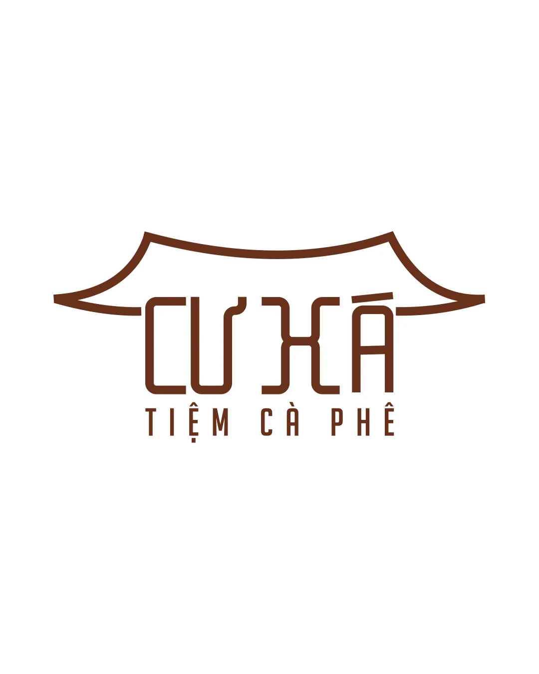
Cư Xá TIỆM CÀ PHÊ logo review
4.0 / 5
Logo score
Logo review of

Cư Xá Tiệm Cà Phê

Strong culturally relevant concept with only minor tweaks needed for broad application.

Combination Mark Minimalist Geometric Cafes & Restaurants
4/5
Legibility
4/5
Originality
5/5
Misread
4/5
Balance
4/5
Scale
Action plan

What to fix first

The most important fixes to handle before polishing the full presentation.

1

Increase stroke weight of the rooftop outline and primary letters slightly for optimal clarity at all scales.

High priority

Thin lines risk losing definition at small sizes, critical for signage and mobile use.

Impact: Improves Readability And Scalability, Addressing Main Usability Risk. · Effort: Low

2

Slightly adjust proportions between rooftop mark and text to balance visual weight.

Medium priority

Visual harmony will be improved, making the logo look more refined.

Impact: Enhances Professional Look And Corrects Minor Imbalance Without Altering Concept. · Effort: Low

Detailed review

Logo performance breakdown

4/5

Legibility

Checkmark icon Main text is mostly clear and custom letterforms are consistent.

Warning icon Decorative diacritics and unconventional shapes of 'Cư Xá' may slow readability at first glance.

4/5

Originality

Checkmark icon Rooftop silhouette with custom type adds cultural uniqueness.

Warning icon Combining a roof/awning shape with a wordmark is somewhat common in cafe/restaurant industries.

5/5

Color harmony

Checkmark icon Warm brown is inviting and fits coffee/cafe theme; very limited palette aids versatility.

Brown
#69351B

White
#FFFFFF

4/5

Balance alignment

Checkmark icon Horizontal alignment is strong, and top symbol anchors the layout.

Warning icon Top symbol feels slightly heavy compared to the lighter wordmark, slight optical imbalance.

logo 200x250 pixels scalability test alignment grid overlay
4/5

Scalability

Checkmark icon Simple lines and limited detail support good scalability.

Warning icon Thin strokes may lose clarity at very small sizes, especially the rooftop linework.

logo 200x250 pixels scalability test

200x250 px

logo 100x125 pixels scalability test

100×125 px

logo 50x62 pixels scalability test

50×62 px

5/5

Misinterpretations

Checkmark icon No inappropriate or ambiguous visual readings detected.

4 / 5

Logo structure & brief match

Checkmark icon Rooftop outline visually integrates and conceptually fits with the wordmark.

Warning icon Roof and text are still visually distinct rather than fully unified.

Checkmark icon Detected Industry: The design references Vietnamese traditions and coffee culture, fitting for a cafe target audience.

Try your own review

Wondering how your logo performs?

Get a clear logo score, key risks, and priority fix ideas before your client or audience sees it.

Review my logo