 View review
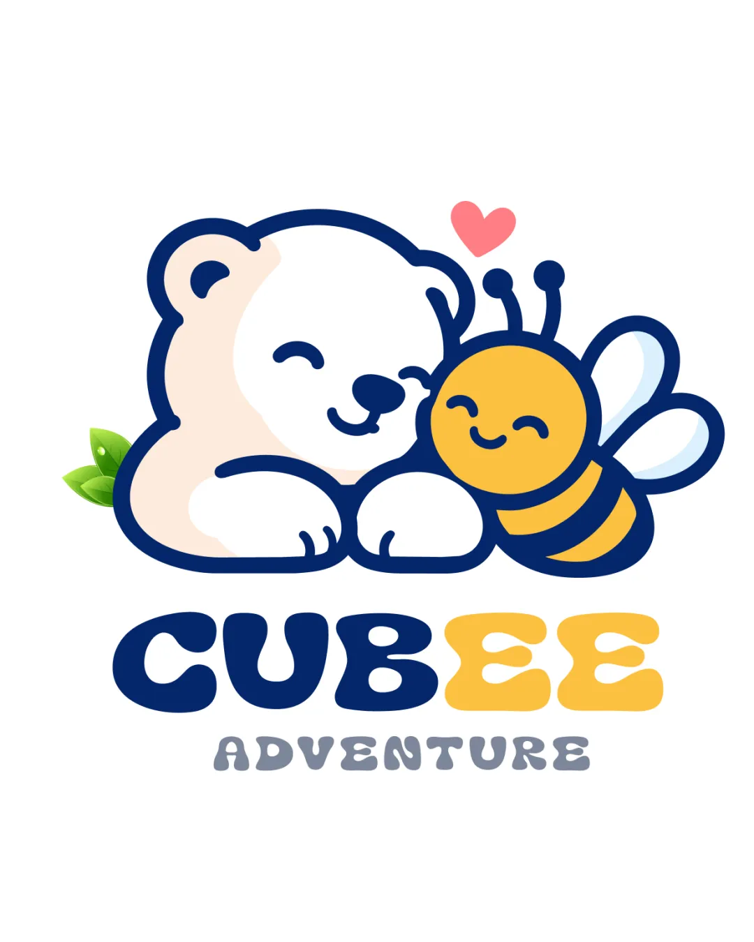
Logo score
Logo review of
Cubee Adventure
A charming, distinctive mascot logo with broad child/family appeal and strong brand fit. Only minor refinements needed.
Legibility
Originality
Misread
Balance
Scale
Action plan
What to fix first
The most important fixes to handle before polishing the full presentation.
1
Increase tagline thickness or contrast for improved readability at small sizes.
Medium priorityTagline fades at reduced sizes.
Impact: Boosts Scalability And Ease Of Recognition In Mini Formats. · Effort: Low
Detailed review
Logo performance breakdown
Legibility
 Wordmark is clear, playful, and easily readable. Distinct color for 'BEE' enhances brand recognition.
 The tagline 'ADVENTURE' is slightly less bold, reducing small-size readability.
Originality
Unique pairing of bear and bee; playful and memorable integration.
Style follows common children's mascot aesthetics.
Color harmony
Bright, appealing palette for children. Contrast aids readability and character separation.
Yellow bee body over white may have lower contrast on light backgrounds.
Navy
#18316F
Yellow
#FFD966
Cream
#F7E9DD
Green
#77BC43
Pink
#FE6C81
White
#F5F5F5
Grey
#414046
Your palette is close. Refine the color roles and combinations before updating the logo.
Build brand colorsBalance alignment
Balanced composition between mascot and wordmark. Playful, aligned layout with good weight distribution.
Tagline spacing could be slightly refined for improved hierarchy.

Scalability
Mascot and wordmark retain clarity at smaller sizes due to bold lines and simple forms.
Fine details in leaves/heart might be lost at very small scale.
200x250 px
100×125 px
50×62 px
Misinterpretations
Symbol is innocent and charming; no harmful double meanings.
Logo structure & brief match
Symbol and wordmark feel highly integrated and harmonious.
Industry Fit: Excellent match for children's adventure or educational brand.
Try your own review
Review my logo
Wondering how your logo performs?
Get a clear logo score, key risks, and priority fix ideas before your client or audience sees it.
Keep exploring