Wondering how your logo performs? 🧐
Get professional logo reviews in seconds and catch design issues in time.
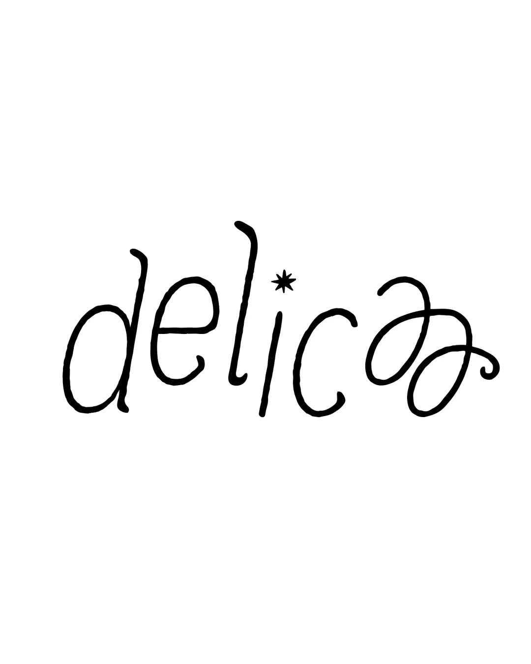
Try it Now!Logo review of delica*
 Logo analysis by AI
Logo type:
Style:
Detected symbol:
Detected text:
Business industry:
Review requested by Malikalsyaa
**If AI can recognize or misinterpret it, so can people.
Structured logo review
Legibility
![]() Most letters are distinguishable at medium to large sizes.
Most letters are distinguishable at medium to large sizes.![]() The playful, handwritten feel adds personality.
The playful, handwritten feel adds personality.
![]() The final 'a' is overly stylized and may be confused with an 'o' or decorative flourish, impacting fast readability.
The final 'a' is overly stylized and may be confused with an 'o' or decorative flourish, impacting fast readability.![]() The asterisk as the dot on the 'i' slightly disrupts simple reading.
The asterisk as the dot on the 'i' slightly disrupts simple reading.![]() Thin and inconsistent line thickness reduces clarity at small sizes.
Thin and inconsistent line thickness reduces clarity at small sizes.
Scalability versatility
![]() Simple color scheme enhances potential for versatile application.
Simple color scheme enhances potential for versatile application.
![]() Thin line weight will struggle on small surfaces like business cards, pens, or embroidery.
Thin line weight will struggle on small surfaces like business cards, pens, or embroidery.![]() Excessively stylized 'a' may lose definition at smaller scales or in print.
Excessively stylized 'a' may lose definition at smaller scales or in print.![]() Not suitable for favicon or mobile app icon due to lack of boldness and minute details.
Not suitable for favicon or mobile app icon due to lack of boldness and minute details.
200x250 px
100×125 px
50×62 px
Balance alignment
![]() Loose alignment supports the playful style.
Loose alignment supports the playful style.
![]() The exaggerated heights (especially the 'l'), the uneven baselines, and the oversized final 'a' make the logo feel unbalanced.
The exaggerated heights (especially the 'l'), the uneven baselines, and the oversized final 'a' make the logo feel unbalanced.![]() Visual weight is too heavy on the right side due to the oversized 'a' flourish.
Visual weight is too heavy on the right side due to the oversized 'a' flourish.

Originality
![]() Distinctive handwritten character and use of the asterisk for the 'i' dot adds a unique twist.
Distinctive handwritten character and use of the asterisk for the 'i' dot adds a unique twist.![]() Swash on the 'a' is memorable despite legibility tradeoff.
Swash on the 'a' is memorable despite legibility tradeoff.
![]() Handwritten wordmarks are commonly used in the food industry for 'friendly' brands.
Handwritten wordmarks are commonly used in the food industry for 'friendly' brands.![]() No additional creative use of negative space or multilevel symbolism.
No additional creative use of negative space or multilevel symbolism.
Aesthetic look
![]() Playful, light-hearted style fits food/restaurant branding aiming for approachability.
Playful, light-hearted style fits food/restaurant branding aiming for approachability.![]() Monochrome delivers a clean and modern aesthetic.
Monochrome delivers a clean and modern aesthetic.
![]() Excessive swirl and inconsistency in letterforms add a chaotic, unfinished look.
Excessive swirl and inconsistency in letterforms add a chaotic, unfinished look.![]() Overly casual execution may make it appear unprofessional for higher-end applications.
Overly casual execution may make it appear unprofessional for higher-end applications.
Dual meaning and misinterpretations
![]() No obvious inappropriate double meanings or problematic shapes are present.
No obvious inappropriate double meanings or problematic shapes are present.
Color harmony
![]() Only a single color (black) is used, making for strong contrast and universal applicability.
Only a single color (black) is used, making for strong contrast and universal applicability.![]() Works on both light and dark backgrounds.
Works on both light and dark backgrounds.
Black
#000000
White
#FFFFFF


