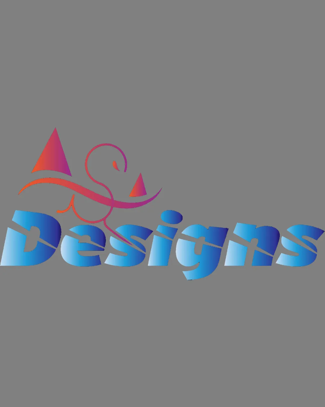
Designs logo review
2.5/5
Logo score
Logo review of

Designs

The logo expresses creative energy but legibility and color cleanliness require rework before professional use.

Combination Colorful, Abstract, Modern Design/creative Services
2.5/5
Legibility
3.5/5
Originality
4/5
Misread
3/5
Balance
2.5/5
Scale
Your next steps

What to fix first

Focus on the changes that matter. Keep what makes the logo work.

1

wordmark

Reduce the strength or frequency of the cut/split effect across the text for improved clarity.

Visible issue High priority Medium effort
Area to inspectApproximate location

The split effect across the word 'Designs' reduces legibility, especially at smaller sizes or for quick recognition.

How to check

Test legibility at small scale and from a distance.

See the category review
2

logo overall

Harmonize the color treatment; consider limiting gradients or using a more unified palette for a cleaner look.

Visible issue Medium priority Medium effort

The color palette is bold and vibrant, but the mixture of gradients in both the mark and wordmark can appear visually noisy and reduces cohesion.

How to check

Compare simplified palette options for improved harmony and focus.

See the category review
Detailed review

Logo performance breakdown

3/5

Brief & logo match

Based on an inferred industry
Compared with

Logo appears tailored to a generic design/creative agency, based on the word 'Designs' and abstract colorful mark.

The logo signals creativity but loses clarity and polish, with only a partial fit for a professional creative brand.

  • Creativity

    Abstract swooping mark and gradients convey a creative, energetic vibe suitable for a design context.

  • Readability

    Legibility is hindered by the wordmark's cut/split effect, reducing accessibility.

2.5/5

Legibility

  • Large, bold letterforms.
  • The split effect across the word 'Designs' reduces legibility, especially at smaller sizes or for quick recognition.

    Visible issue wordmark

    Try: Reduce the strength or frequency of the cut/split effect across the text for improved clarity.

    Check: Test legibility at small scale and from a distance.
    Area to inspectApproximate location
3.5/5

Originality

  • Distinct custom swoop/triangle symbol adds identity.
2.5/5

Color harmony

  • Vivid, modern palette.
  • The color palette is bold and vibrant, but the mixture of gradients in both the mark and wordmark can appear visually noisy and reduces cohesion.

    Visible issue logo overall

    Try: Harmonize the color treatment; consider limiting gradients or using a more unified palette for a cleaner look.

    Check: Compare simplified palette options for improved harmony and focus.

Rose#FF4E9E
Orange#F16B22
SkyBlue#14D9EE
Blue#4261EF
Gray#808080

Estimated colors. Use the original design file for exact values.

Create a full color palette using these colors

Create new palette
3/5

Balance alignment

  • Mark and wordmark are visually balanced top-to-bottom.
Uploaded logoAlignment guide overlay

Inspect spacing with the guide. Optical balance may differ from geometric centering.

2.5/5

Scalability

  • Simple structure overall.
  • Fine gradient transitions and the thin lines in the symbol may lose clarity or punch at small sizes or in single-color reproduction.

    Worth testing logo overall

    Try: Test logo at small sizes and in black-and-white formats; ensure key elements remain distinct.

    Check: Print and digital reduction and single-color mockups.

Uploaded logo at 200 pixels wide
200 × 250 px
Uploaded logo at 100 pixels wide
100 × 125 px
Uploaded logo at 50 pixels wide
50 × 63 px

Compare the detail at different sizes. Labels show the full image dimensions.

4/5

Misinterpretations

  • No obvious misreadings or confusion.
3/5

Symbol & text fit

  • Element sits contextually above the wordmark.

Black & white

Does the shape still work without color?

These tests are available only for logos uploaded in vector (SVG) format.

Background contrast

Find the surfaces where your logo stays clear.

These tests are available only for logos uploaded in vector (SVG) format.

Blur & silhouette

A 3px blur softens fine details so you can check whether the overall shape stays recognizable. If key gaps close or elements merge, the logo may rely too heavily on detail.

These tests are available only for logos uploaded in vector (SVG) format.

Try your own review

Wondering how your logo performs?

Get a clear logo score, key risks, and priority fix ideas before your client or audience sees it.

Review my logo