Concept & direction
The mark creatively fuses the letters 'D' and 'Y' into a geometric, box-like shape, visually referencing packaging and the brand initials.
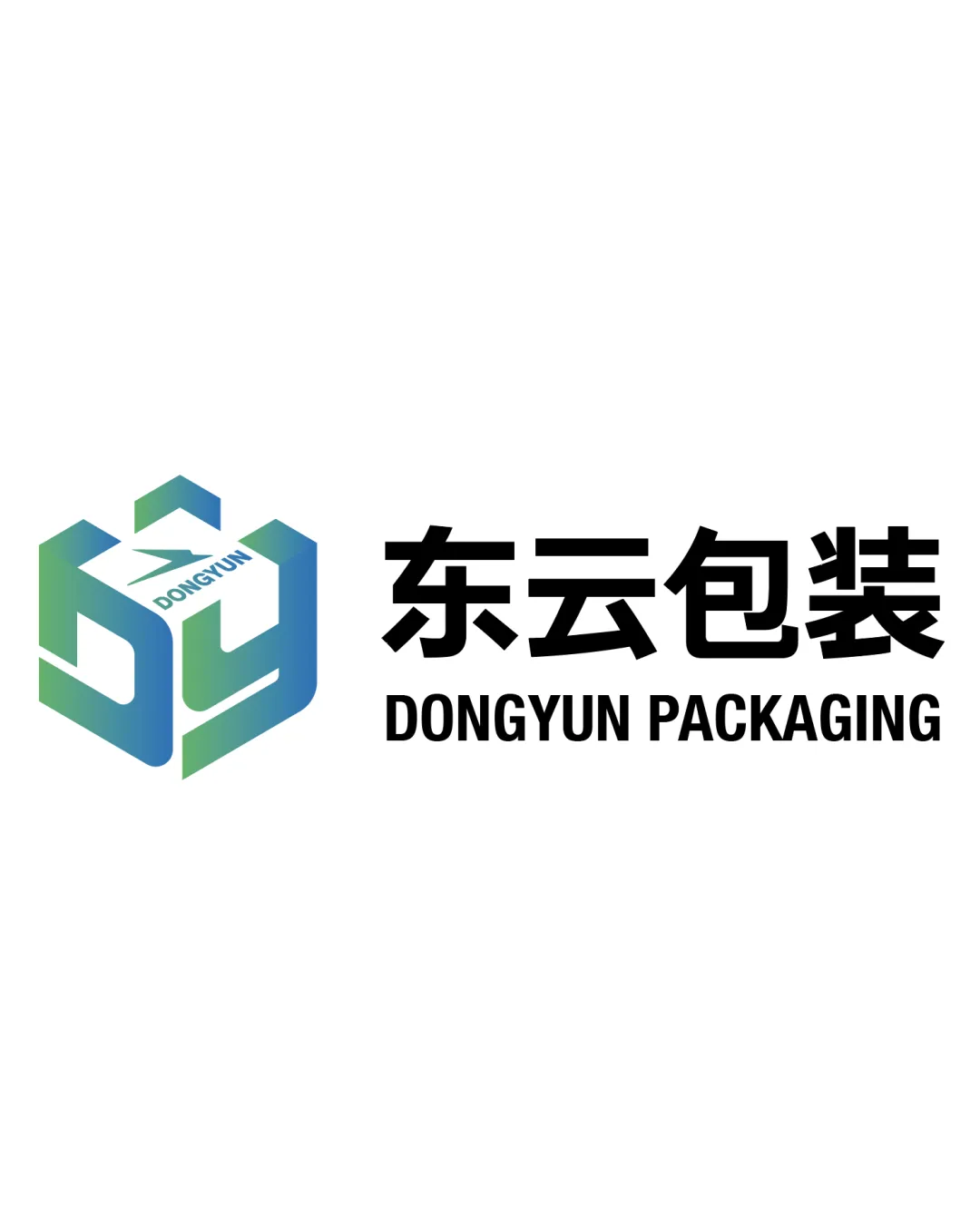
A competent, relevant logo that strongly communicates the brand's field, but could further unify the symbol and text styles for top-tier polish.
This logo lockup shows solid execution, supported by visual balance and text readability; improving distinctiveness is the clearest next step.
Focus on the changes that matter. Keep what makes the logo work.
The mark creatively fuses the letters 'D' and 'Y' into a geometric, box-like shape, visually referencing packaging and the brand initials.
overall
The gradient 3D-style monogram mark feels more dimensional and modern than the heavy, flat wordmark, creating minor stylistic tension between the two elements.
Compare the detail and dimensionality of the symbol and wordmark at different scales.
The geometric DY monogram and box motif clearly suit a packaging company, though the construction is familiar and could benefit from stronger individuality.
Monogram 4/5 · Wordmark 5/5 · Layout 4/5
Monogram 4/5 · Wordmark 5/5 · Layout 4/5
Monogram 4/5 · Wordmark 4/5
Estimated colors. Use the original design file for exact values.
Create a full color palette using these colors
Create new paletteMonogram 4/5 · Wordmark 4/5 · Layout 4/5

Inspect spacing with the guide. Optical balance may differ from geometric centering.
Monogram 3/5 · Wordmark 3/5
The abstract DY monogram as a box-shaped motif is visually relevant but not highly distinctive within packaging and logistics sectors, where similar constructions are present.
The gradient 3D-style monogram mark feels more dimensional and modern than the heavy, flat wordmark, creating minor stylistic tension between the two elements.
Try: Test the mark and wordmark in varied lockups and colorways to confirm sufficient cohesion.
Check: Compare the detail and dimensionality of the symbol and wordmark at different scales.
Get a clear logo score, key risks, and priority fix ideas before your client or audience sees it.
More credits needed
Add credits to continue without losing your work.
Then $7/month. Cancel anytime.
Essential logo review with AI
Estimated progress