Wondering how your logo performs? 🧐
Get professional logo reviews in seconds and catch design issues in time.
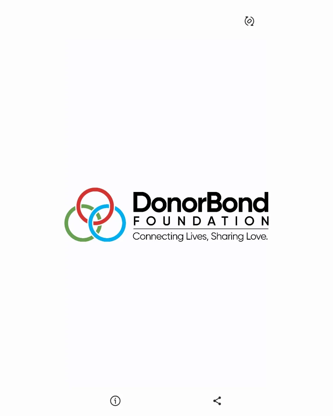
Try it Now!Logo review of DonorBond FOUNDATION Connecting Lives, Sharing Lov..
 Logo analysis by AI
Logo type:
Style:
Detected symbol:
Negative space:
Detected text:
Business industry:
Review requested by Josiah
**If AI can recognize or misinterpret it, so can people.
Structured logo review
Legibility
![]() Excellent text clarity; both the brand name and tagline are crisp and readable.
Excellent text clarity; both the brand name and tagline are crisp and readable.![]() High contrast between the black text and the white background.
High contrast between the black text and the white background.
Scalability versatility
![]() Simple geometric shapes scale well for most print and digital applications.
Simple geometric shapes scale well for most print and digital applications.![]() Text remains legible even at smaller sizes, especially the primary name.
Text remains legible even at smaller sizes, especially the primary name.
![]() Tagline may become illegible at small scale (e.g., business cards, favicons).
Tagline may become illegible at small scale (e.g., business cards, favicons).![]() Thin outlines in circles could fade on embroidery or small promotional items.
Thin outlines in circles could fade on embroidery or small promotional items.
200x250 px
100×125 px
50×62 px
Balance alignment
![]() Symbol and text are nicely aligned, with good horizontal spacing.
Symbol and text are nicely aligned, with good horizontal spacing.![]() Visual weight mostly balanced between symbol and wordmark.
Visual weight mostly balanced between symbol and wordmark.
![]() Slight heaviness on the right due to dense text; circles could be scaled up or better integrated to balance.
Slight heaviness on the right due to dense text; circles could be scaled up or better integrated to balance.

Originality
![]() Use of interlocking rings is a well-known but always positive metaphor for connection.
Use of interlocking rings is a well-known but always positive metaphor for connection.
![]() Overlapping circles are quite generic and frequently used across nonprofit and community brands.
Overlapping circles are quite generic and frequently used across nonprofit and community brands.![]() No unique visual twist or custom elements to make the brand stand out.
No unique visual twist or custom elements to make the brand stand out.
Logomark wordmark fit
![]() Modern geometric symbol fits the letterforms’ clean, sans-serif style.
Modern geometric symbol fits the letterforms’ clean, sans-serif style.
![]() Symbol feels secondary to the large wordmark; better integration could unify the composition.
Symbol feels secondary to the large wordmark; better integration could unify the composition.
Aesthetic look
![]() Clean, modern, and approachable aesthetic; conveys trust and connection.
Clean, modern, and approachable aesthetic; conveys trust and connection.![]() Colors are vibrant but not overwhelming; forms are visually pleasing.
Colors are vibrant but not overwhelming; forms are visually pleasing.
![]() Overall look is slightly conventional and expected for the sector.
Overall look is slightly conventional and expected for the sector.
Dual meaning and misinterpretations
![]() No inappropriate or ambiguous symbolism detected.
No inappropriate or ambiguous symbolism detected.![]() Visual clearly signals unity and connection, reinforcing the mission.
Visual clearly signals unity and connection, reinforcing the mission.
Color harmony
![]() Triadic color scheme is harmonious and friendly.
Triadic color scheme is harmonious and friendly.![]() Good differentiation between the colors; strong contrast with the black typography.
Good differentiation between the colors; strong contrast with the black typography.
Red
#E94F37
Green
#6AB187
Blue
#2DB7F5
Black
#000000
White
#FFFFFF


