THE DOROTHY PROJECT logo review
4.3/5
Logo score Combination mark (wordmark + symbol) category

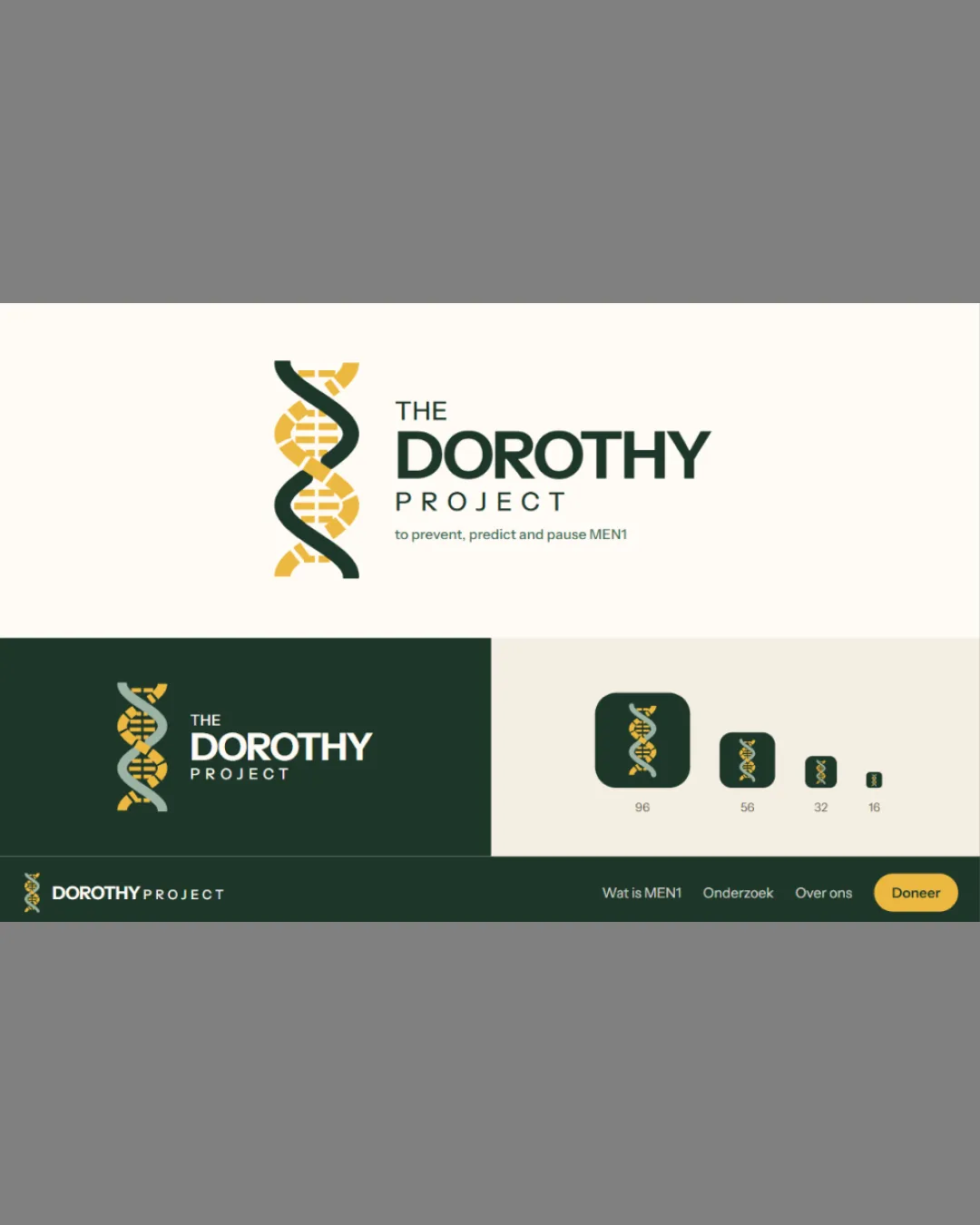
THE DOROTHY PROJECT

creative241139 Essential logo review

A well-integrated and distinctive mark suitable for medical research, with minor adjustments for tiny-scale deployment strongly recommended.

This logo set shows strong execution, supported by visual balance and distinctive construction; improving clarity at smaller sizes is the clearest next step.

Combination Mark (wordmark + Symbol) Modern, Flat Medical Research/science
5/5
Legibility
4/5
Originality
4/5
Balance
4/5
Scale
5/5
Color
5/5
Style consistency
Your next steps

What to fix first

Focus on the changes that matter. Keep what makes the logo work.

1

Standalone mark (small sizes)

Test the symbol at very small sizes and consider a simplified variant if necessary.

High priority Worth testing Low effort

In tiny favicon/miniature sizes, the DNA symbol's strand and internal details may blur or merge, risking loss of clarity.

See the category review
Detailed review

Logo performance breakdown

4/5

Brief & logo match

The logo effectively signals a research or genetics project through its clear DNA symbol and professional typographic approach, though the DNA concept is familiar and could be further differentiated.

5/5

Legibility

Wordmark 5/5 · Layout 5/5

  • All text is crisply legible, including the small tagline in intended uses.
5/5

Color harmony

Symbol 5/5 · Wordmark 5/5

  • Palette is cohesive and professional; green/yellow contrast is effective.
green#335039
golden yellow#E1C46C
white#FFFFFF

Estimated colors. Use the original design file for exact values.

Create a full color palette using these colors

Create new palette
5/5

Misinterpretations

  • No evidence of unintended or negative readings; clear scientific imagery.
5/5

Style consistency

  • Symbol and wordmark are thematically and stylistically integrated.
4/5

Originality

Symbol 4/5 · Wordmark 4/5

  • DNA is a common motif, but layered geometric execution with color and symbol-text integration adds distinction.
4/5

Balance alignment

Symbol 4/5 · Wordmark 4/5 · Layout 4/5

Available in Advanced logo reviews
4/5

Scalability

Symbol 3/5 · Wordmark 5/5 · Layout 4/5

Available in Advanced logo reviews
Try your own review

Wondering how your logo performs?

Get a clear logo score, key risks, and priority fix ideas before your client or audience sees it.

Review my logo