Wondering how your logo performs? 🧐
Get professional logo reviews in seconds and catch design issues in time.
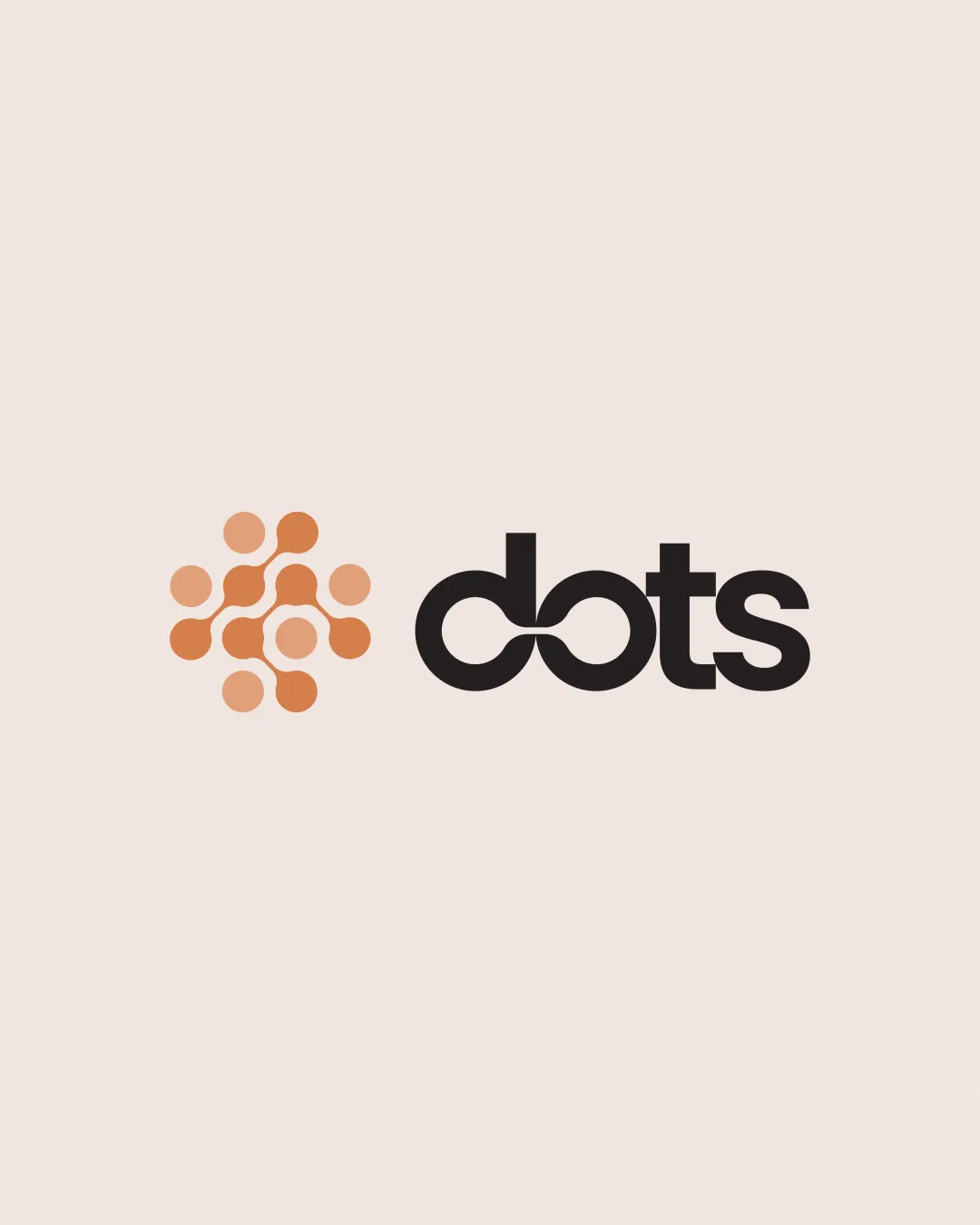
Try it Now!Logo review of dots
 Logo analysis by AI
Logo type:
Style:
Detected symbol:
Detected text:
Business industry:
Review requested by MID
**If AI can recognize or misinterpret it, so can people.
Structured logo review
Legibility
![]() The 'dots' wordmark is clear and uses a thick, sans-serif font for strong readability.
The 'dots' wordmark is clear and uses a thick, sans-serif font for strong readability.![]() Letter spacing is even and visually balanced.
Letter spacing is even and visually balanced.
![]() The stylized connected 'd' and 'o' slightly interrupts instant readability for first-time viewers.
The stylized connected 'd' and 'o' slightly interrupts instant readability for first-time viewers.
Scalability versatility
![]() Logo mark and text use bold lines which reproduce well on various scales such as apparel, app icons, or web banners.
Logo mark and text use bold lines which reproduce well on various scales such as apparel, app icons, or web banners.![]() Simplicity makes it suitable for large use cases like billboards and digital screens.
Simplicity makes it suitable for large use cases like billboards and digital screens.
![]() The connected 'd' and 'o' may lose legibility at very small sizes.
The connected 'd' and 'o' may lose legibility at very small sizes.![]() The interconnected dot symbol may appear muddled on embroidery or favicons due to detail density.
The interconnected dot symbol may appear muddled on embroidery or favicons due to detail density.
200x250 px
100×125 px
50×62 px
Balance alignment
![]() Excellent horizontal balance between the logomark and the wordmark.
Excellent horizontal balance between the logomark and the wordmark.![]() Visual weight of the symbol matches well with the boldness of the text.
Visual weight of the symbol matches well with the boldness of the text.

Originality
![]() Creative interpretation of the business name with interconnected dots and stylized letter connection.
Creative interpretation of the business name with interconnected dots and stylized letter connection.![]() Distinct approach to combining symbol and wordmark features.
Distinct approach to combining symbol and wordmark features.
![]() The use of dot pattern motifs is common in tech and network logos, slightly reducing uniqueness.
The use of dot pattern motifs is common in tech and network logos, slightly reducing uniqueness.
Logomark wordmark fit
![]() Styles harmonize effectively due to consistent line thickness and geometric elements.
Styles harmonize effectively due to consistent line thickness and geometric elements.![]() Color palette connects both mark and wordmark for cohesive appearance.
Color palette connects both mark and wordmark for cohesive appearance.
Aesthetic look
![]() Palette is tasteful and modern.
Palette is tasteful and modern.![]() Minimal style aligns with current design trends.
Minimal style aligns with current design trends.
![]() The central connection between 'd' and 'o' introduces minor visual tension, making the wordmark appear slightly forced.
The central connection between 'd' and 'o' introduces minor visual tension, making the wordmark appear slightly forced.
Dual meaning and misinterpretations
![]() No inappropriate or unintended symbolism detected in overall composition.
No inappropriate or unintended symbolism detected in overall composition.
Color harmony
![]() Excellent harmony between the orange mark, black wordmark, and neutral background.
Excellent harmony between the orange mark, black wordmark, and neutral background.![]() Simple color scheme keeps design professional and focused.
Simple color scheme keeps design professional and focused.
Seashell
#E1CFCF
Tumbleweed
#E29B60
Ebony
#221F20