e.yesarc VISUALS and tagline logo logo review
3.6/5
Logo score Combination mark category

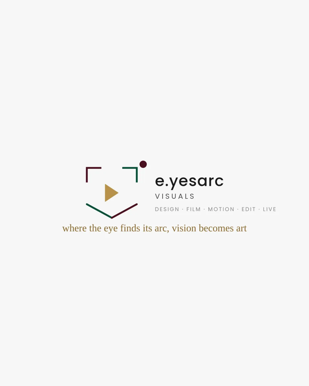
e.yesarc VISUALS and tagline logo

creative408846 Essential logo review

Distinctive and relevant for a film/media identity; strong mark concept and clear text, but slightly loose arrangement and scale details need refinement for best versatility.

This logo lockup shows solid execution, supported by text readability and text hierarchy; improving distinctiveness is the clearest next step.

Combination Mark Minimal Geometric, Contemporary, Multicolor Accent Film/media/creative
4/5
Legibility
3.6/5
Originality
3.5/5
Balance
3.4/5
Scale
4/5
Color
3/5
Style consistency
Your next steps

What to fix first

Focus on the changes that matter. Keep what makes the logo work.

1

main lockup

Tighten horizontal proximity between the mark and wordmark.

Medium priority Visible issue Low effort

The spacing between the mark and wordmark feels slightly wide, which may compromise visual cohesion.

See the category review

Detailed review

Logo performance breakdown

4/5

Brief & logo match

The logo leverages film and visual framing motifs to create a memorable, contemporary presence for a media-oriented brand, with only minor versatility and spatial caveats.

5/5

Misinterpretations

  • No visible misinterpretations or negative dual meanings.
4/5

Legibility

Wordmark 4/5 · Layout 4/5

  • Clear brand name; only tagline risks at small scale.
4/5

Color harmony

Symbol 4/5 · Wordmark 4/5

  • Rich but balanced palette with visual interest; mostly harmonious.
  • Three accent colors (burgundy, gold, teal) are contemporary and lively, but risk appearing less unified compared to a restricted or more closely harmonized palette.

    Optional refinement abstract mark color palette
burgundy#4D1743
teal green#22715F
gold#B29153
black#222221

Estimated colors. Use the original design file for exact values.

Create a full color palette using these colors

Create new palette
3.6/5

Originality

Symbol 4/5 · Wordmark 3/5

  • Unusual interplay of the play icon and framing elements; distinctive arrangement.
3.5/5

Balance alignment

Symbol 4/5 · Wordmark 3/5 · Layout 3/5

  • Core components are aligned, but spatial separation is slightly loose.
  • The spacing between the mark and wordmark feels slightly wide, which may compromise visual cohesion.

    Visible issue main lockup

    Try: Tighten horizontal proximity between the mark and wordmark.

Uploaded logoAlignment guide overlay

Inspect spacing with the guide. Optical balance may differ from geometric centering.

3.4/5

Scalability

Symbol 4/5 · Wordmark 3/5 · Layout 3/5

Available in Advanced logo reviews
3/5

Style consistency

Available in Advanced logo reviews
Try your own review

Wondering how your logo performs?

Get a clear logo score, key risks, and priority fix ideas before your client or audience sees it.

Review my logo