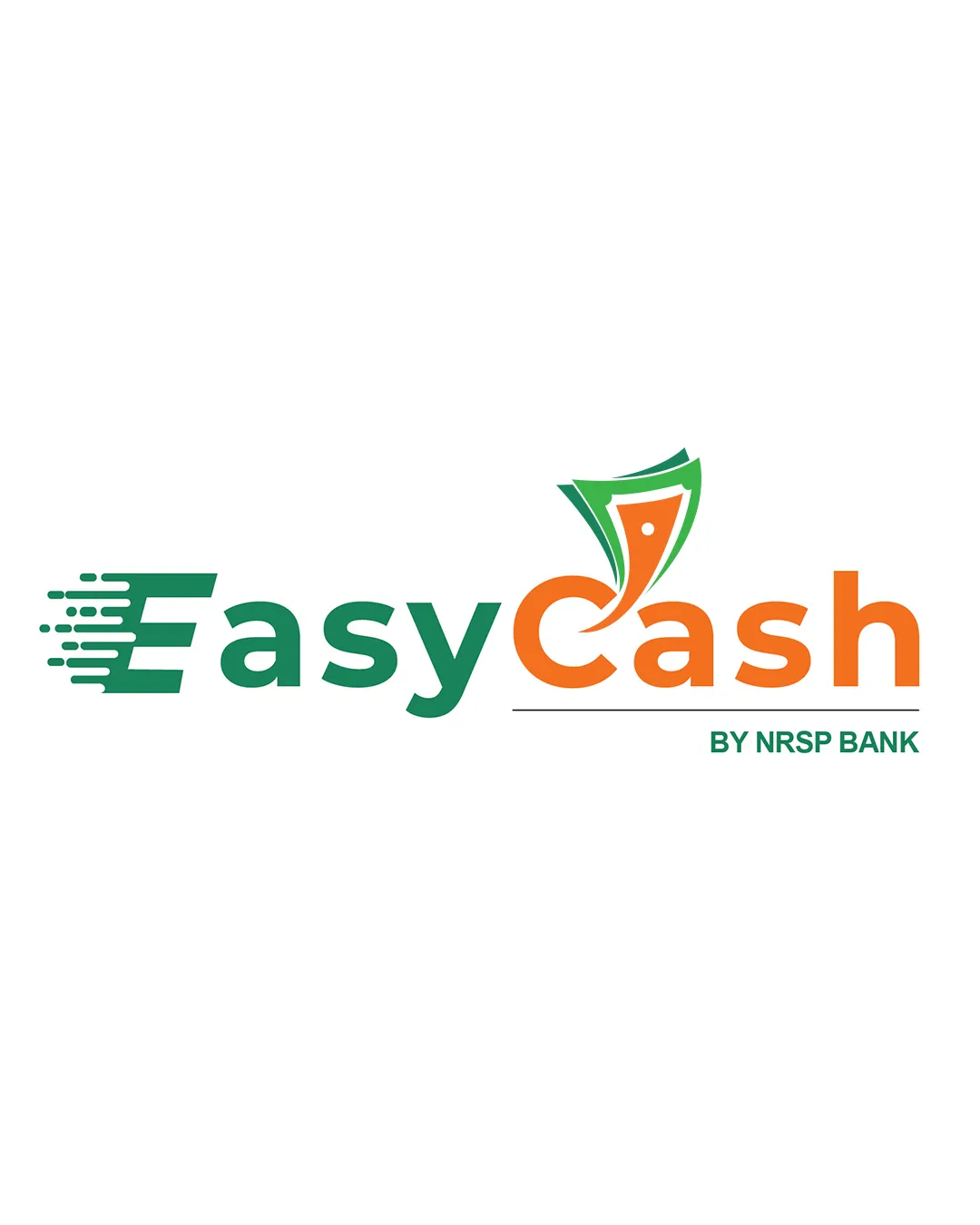
EasyCash BY NRSP BANK logo review
3.5/5
Logo score
Logo review of

Easycash By Nrsp Bank

A competent and approachable banking logo with strong clarity but limited distinctive character.

Combination Modern Banking, Digital, Approachable, Clean Banking/financial Services
5/5
Legibility
3/5
Originality
5/5
Misread
3/5
Balance
3/5
Scale
Your next steps

What to fix first

Focus on the changes that matter. Keep what makes the logo work.

1

Standalone mark

Refine the standalone symbol for a more distinctive visual identity.

Visible issue Medium priority Medium effort

The banknote-like symbol is conventional and the motion 'E' concept is common in fintech/logistics branding.

How to check

Gather market samples and iterate toward a more unique motif.

See the category review
2

Primary lockup

Explore refined color transitions or typographic treatments for better integration between word parts.

Optional refinement Medium priority Medium effort
Area to inspectApproximate location

The weight and character of the green 'Easy' and orange 'Cash' differ visually, and the two-color approach splits the word, reducing cohesion.

How to check

Test with single-color variants and review typographic balance.

See the category review
Detailed review

Logo performance breakdown

4/5

Brief & logo match

Based on your brief
Compared with

Banking

Logo clearly signals fintech banking and ease, though originality could be stronger.

  • Banking Association

    Banknote and motion visuals clearly reference finance and digital transactions.

  • Accessibility/Ease

    Word 'Easy' and upbeat palette support the idea of approachable banking; 'motion' motif suggests convenience.

5/5

Legibility

  • Excellent readability of brand and tagline.
  • Contrast supports clear text.
3/5

Originality

  • Mark conceptually ties finance and digital.
  • The banknote-like symbol is conventional and the motion 'E' concept is common in fintech/logistics branding.

    Visible issue Standalone mark

    Try: Refine the standalone symbol for a more distinctive visual identity.

    Check: Gather market samples and iterate toward a more unique motif.
4/5

Color harmony

  • Fresh, optimistic green/orange palette.
Green#219653
Orange#F2994A
White#FFFFFF

Estimated colors. Use the original design file for exact values.

Create a full color palette using these colors

Create new palette
3/5

Balance alignment

  • Core layout is stable with good spacing.
  • The weight and character of the green 'Easy' and orange 'Cash' differ visually, and the two-color approach splits the word, reducing cohesion.

    Optional refinement Primary lockup

    Try: Explore refined color transitions or typographic treatments for better integration between word parts.

    Check: Test with single-color variants and review typographic balance.

    Area to inspectApproximate location
Uploaded logoAlignment guide overlay

Inspect spacing with the guide. Optical balance may differ from geometric centering.

3/5

Scalability

  • Main elements are relatively simple.
  • The mark includes thin lines and details (dots, outlines) that may not hold up at smaller sizes or in single color.

    Worth testing Standalone mark

    Try: Test mark at reduced scales and in one color to confirm clarity and simplicity.

    Check: Print and render at small sizes to confirm key details remain visible.

Uploaded logo at 200 pixels wide
200 × 250 px
Uploaded logo at 100 pixels wide
100 × 125 px
Uploaded logo at 50 pixels wide
50 × 63 px

Compare the detail at different sizes. Labels show the full image dimensions.

5/5

Misinterpretations

  • No negative or unintended readings.
4/5

Symbol & text fit

  • Symbol and wordmark integrate contextually via banknote theme and color.

Black & white

Does the shape still work without color?

These tests are available only for logos uploaded in vector (SVG) format.

Background contrast

Find the surfaces where your logo stays clear.

These tests are available only for logos uploaded in vector (SVG) format.

Blur & silhouette

A 3px blur softens fine details so you can check whether the overall shape stays recognizable. If key gaps close or elements merge, the logo may rely too heavily on detail.

These tests are available only for logos uploaded in vector (SVG) format.

Try your own review

Wondering how your logo performs?

Get a clear logo score, key risks, and priority fix ideas before your client or audience sees it.

Review my logo