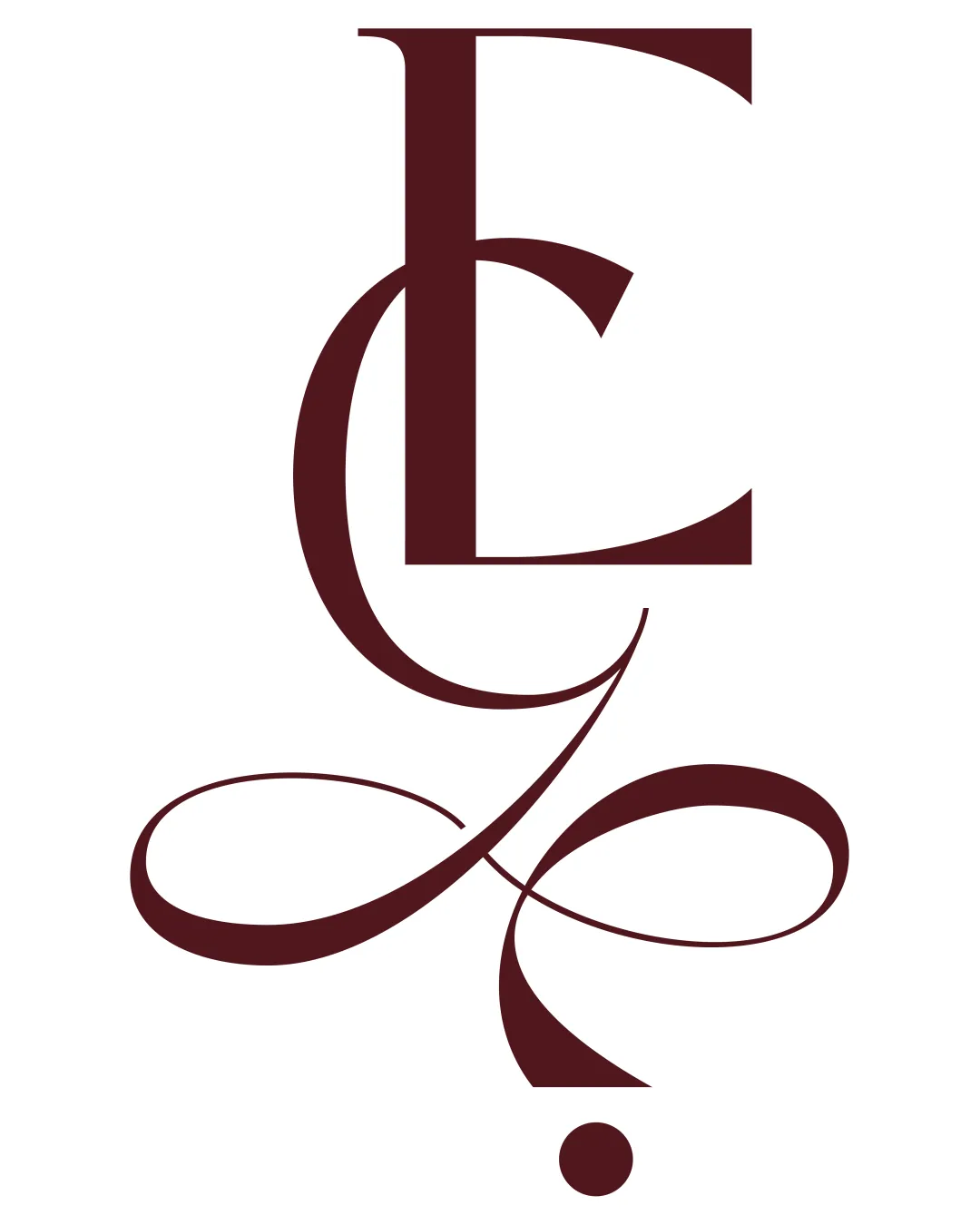
ECJ logo review
3.5/5
Logo score
Logo review of

Ecj

Ornate and on-brand for a beauty salon, but clarity and versatility need targeted improvement before professional deployment.

Monogram Elegant Serif, Ornamental, High-contrast Beauty Salon
3/5
Legibility
4/5
Originality
5/5
Misread
4/5
Balance
2.5/5
Scale
Action plan

What to fix first

The most important fixes to handle before polishing the full presentation.

1

Balance legibility with decoration—consider lightening or simplifying flourishes to make 'C' and 'J' more instantly readable

High priority

Currently, only the 'E' is clear at a glance

Impact: Improves Name Recognition And Practical Usage · Effort: Medium

2

Develop a simpler secondary version for small-size applications

Medium priority

Thin details and heavy ornament won't reproduce well small

Impact: Ensures Clarity Across All Touchpoints · Effort: Low

Detailed review

Logo performance breakdown

3/5

Legibility

Checkmark icon 'E' is immediately readable

Warning icon 'C' and especially 'J' require effort to distinguish due to ornamental overlaps and flourishes

4/5

Originality

Checkmark icon Distinctive monogram construction and ornate flourishes
Checkmark icon Evokes classic luxury branding

Warning icon Ornamental letter monograms are a familiar genre in beauty/luxury

4/5

Balance alignment

Checkmark icon Overall composition feels visually centered and cohesive
Checkmark icon Well-controlled flow of curves

Warning icon Lower portion is more visually heavy, feels bottom-weighted

logo 200x250 pixels scalability test alignment grid overlay
2.5/5

Scalability

Checkmark icon Distinct at larger sizes

Warning icon Thin swashes and complexity will lose clarity at small sizes; some flourishes risk merging into blobs when scaled down

logo 200x250 pixels scalability test

200x250 px

logo 100x125 pixels scalability test

100×125 px

logo 50x62 pixels scalability test

50×62 px

5/5

Misinterpretations

Checkmark icon No apparent negative or confusing shapes

Brief match

Checkmark icon Industry Aesthetic: Elegant, flowing typography is a strong fit for a beauty salon seeking a premium or personalized image

Try your own review

Wondering how your logo performs?

Get a clear logo score, key risks, and priority fix ideas before your client or audience sees it.

Review my logo