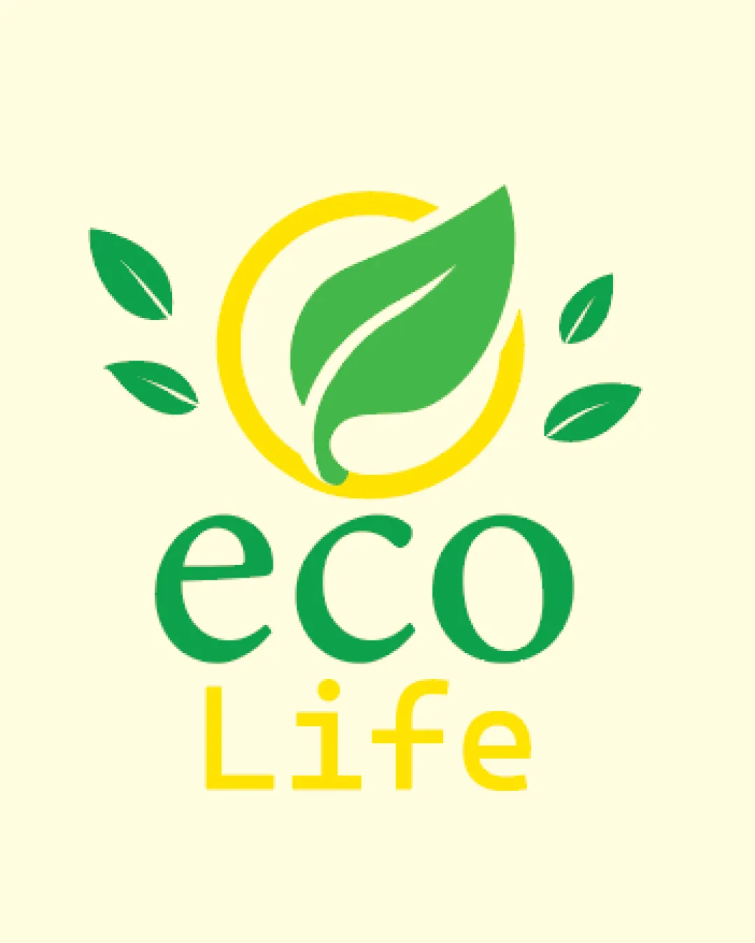
eco Life logo review
4/5
Logo score

eco Life

Review the detailed scores below to see what is working and what should be refined first.

Combination Mark Modern, Flat Environment
5/5
Legibility
2/5
Originality
4/5
Balance
3/5
Scale
Detailed review

Logo performance breakdown

5/5

Legibility

  • Both 'eco' and 'Life' are easy to read at various sizes.
  • High color contrast between the text and background.
2/5

Originality

  • Color scheme effectively communicates eco-friendliness.
  • Leaf-in-circle concept is highly generic and overused within the environmental sector.
  • No creative twist or unique letterform present.
4/5

Color harmony

  • Well-coordinated nature-inspired color palette.
  • Effective use of green and yellow establish a bright, natural identity.
  • Yellow text may have reduced visibility on light backgrounds.
Pacific Green#6DC066
Sunglow#FBE456
Milky#F8F7DA

Estimated colors. Use the original design file for exact values.

Create a full color palette using these colors

Create new palette

4/5

Balance alignment

  • Central symbol and flanking leaves are generally well-aligned.
  • Good relationship between logomark and wordmark.
  • The four external leaves make the top visually heavier than the bottom, causing slight imbalance.
Uploaded logoAlignment guide overlay

Inspect spacing with the guide. Optical balance may differ from geometric centering.

3/5

Scalability

  • Simple shapes and minimal detail support clarity in large formats like eco product packaging and signage.
  • Limited use of thin lines enhances legibility at reduced sizes.
  • Multiple small leaves could lose clarity on embroidery or very small applications such as favicons or pens.
  • Yellow text may blend on lighter backgrounds, reducing versatility.
5/5

Misinterpretations

  • No inappropriate shapes or negative connotations are apparent.
5/5

Symbol & text fit

  • The organic shapes of the logomark complement the rounded typeface.
  • Color integration between logo and text is consistent.

Black & white

Does the shape still work without color?

These tests are available only for logos uploaded in vector (SVG) format.

Background contrast

Find the surfaces where your logo stays clear.

These tests are available only for logos uploaded in vector (SVG) format.

Blur & silhouette

A 3px blur softens fine details so you can check whether the overall shape stays recognizable. If key gaps close or elements merge, the logo may rely too heavily on detail.

These tests are available only for logos uploaded in vector (SVG) format.

Try your own review

Wondering how your logo performs?

Get a clear logo score, key risks, and priority fix ideas before your client or audience sees it.

Review my logo



