What to preserve
The logo unites the initials 'E' and 'L' in a geometric hexagon with integrated compass and gear cues, symbolizing precision engineering and direction well-suited for a technical contractor.
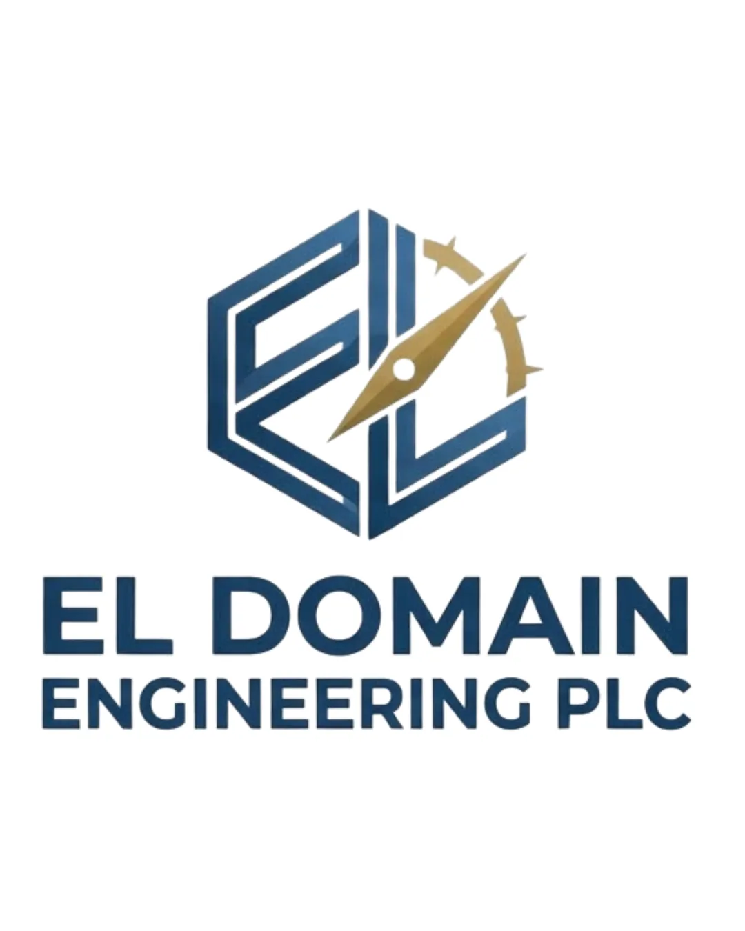
Well-constructed and authoritative with technical cues, but scaling/detail risks warrant minor mark refinement for universal application.
This logo lockup shows solid execution, supported by text readability and text hierarchy; improving visual balance is the clearest next step.
Focus on the changes that matter. Keep what makes the logo work.
The logo unites the initials 'E' and 'L' in a geometric hexagon with integrated compass and gear cues, symbolizing precision engineering and direction well-suited for a technical contractor.
Logo preview unavailable. The written feedback is still available on this card.
Standalone mark
Fine gold gear teeth and compass tip may blur or merge when scaled for PPE or small vehicle branding.
See the category reviewThe logo projects technical authority and reliability via geometric forms and precision cues, but busy detailing may challenge clarity for PPE and small formats.
Wordmark 5/5 · Layout 5/5
Symbol 5/5 · Wordmark 5/5
Estimated colors. Use the original design file for exact values.
Create a full color palette using these colors
Create new paletteSymbol 3/5 · Wordmark 5/5 · Layout 4/5
Fine gold gear teeth and compass tip may blur or merge when scaled for PPE or small vehicle branding.
Try: Test the mark at smallest intended sizes; simplify gear/needle detail if needed.
Logo preview unavailable. The written feedback is still available on this card.
Symbol 4/5 · Wordmark 3/5
Hexagonal monograms and compass-gear hybrids are somewhat frequent in engineering/construction identities, though the combination is distinctive.
Symbol 3/5 · Wordmark 4/5 · Layout 4/5
The diagonal gold compass/gauge arm disrupts the dominance and symmetry of the 'EL' hexagon, making the mark slightly right-leaning and busier at small sizes.
Spacing between 'EL DOMAIN' and 'ENGINEERING PLC' is slightly wide, risking wordmark separation.

Inspect spacing with the guide. Optical balance may differ from geometric centering.
Get a clear logo score, key risks, and priority fix ideas before your client or audience sees it.
More credits needed
Add credits to continue without losing your work.
Then $7/month. Cancel anytime.
Essential logo review with AI
Estimated progress