What to preserve
A dynamic, circular abstract symbol paired with a modern, bold wordmark, suggesting creativity and energy appropriate for a studio focused on color separation.
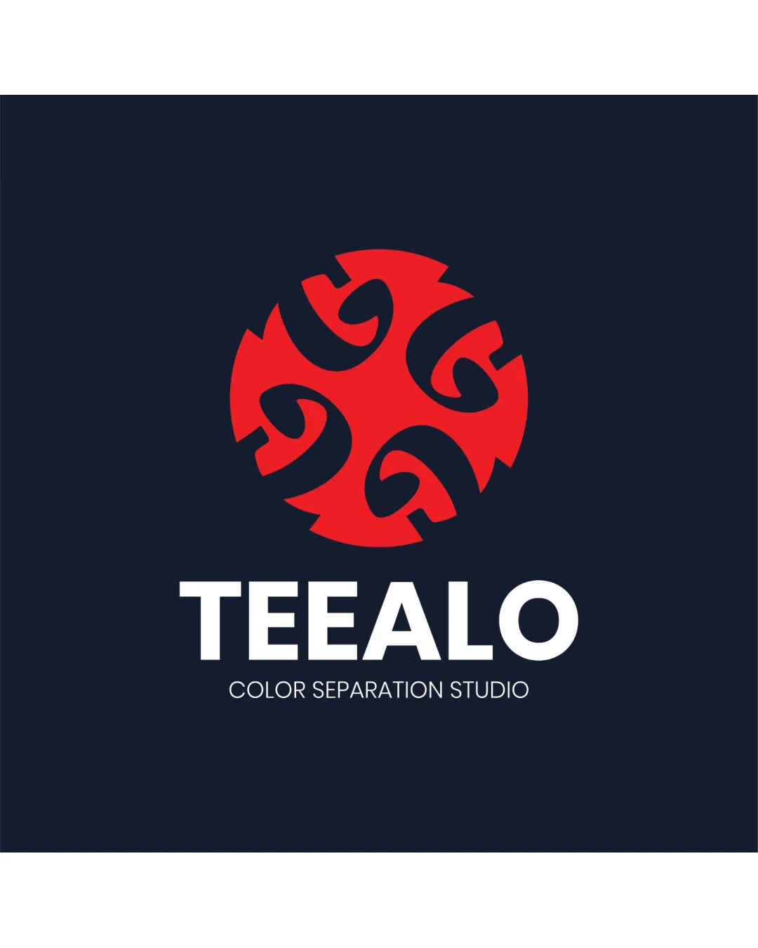
A visually impactful and professional logo that balances creativity and clarity, with only minor refinements needed for maximal versatility.
This logo lockup shows excellent execution, supported by visual balance and distinctive construction.
Focus on the changes that matter. Keep what makes the logo work.
A dynamic, circular abstract symbol paired with a modern, bold wordmark, suggesting creativity and energy appropriate for a studio focused on color separation.
symbol detail
Inner curves in the symbol may merge visually at very small scales.
See the category reviewThe logo clearly projects a creative, professional, and modern tone suitable for a design or color separation studio, though the abstract symbol offers only a loose tie to the brand name.
Wordmark 5/5 · Layout 5/5
Symbol 5/5 · Wordmark 5/5 · Layout 5/5
The symbol is well-centered above the wordmark, and the hierarchy is clear, but the tagline may appear small at reduced sizes.

Inspect spacing with the guide. Optical balance may differ from geometric centering.
Symbol 4/5 · Wordmark 5/5 · Layout 4/5
Inner curves in the symbol may merge visually at very small scales.
Try: Test the logo icon at favicon and small print sizes.
Symbol 4/5 · Wordmark 4/5
The abstract symbol is visually engaging and distinctive, although the interlocking shapes resemble the letters 'G' or '6', which may not directly relate to the brand name TEEALO.
Symbol 4/5 · Wordmark 4/5
The red and navy palette is strong and contemporary, though slightly conventional for creative studios—it is effective but not highly unique.
Estimated colors. Use the original design file for exact values.
Create a full color palette using these colors
Create new paletteGet a clear logo score, key risks, and priority fix ideas before your client or audience sees it.
More credits needed
Add credits to continue without losing your work.
Then $7/month. Cancel anytime.
Essential logo review with AI
Estimated progress