ŘEZNICKTVÍ UZENÁŘSTVÍ PETR POKORNÝ s.r.o. logo logo review
3.9/5
Logo score Combination mark category

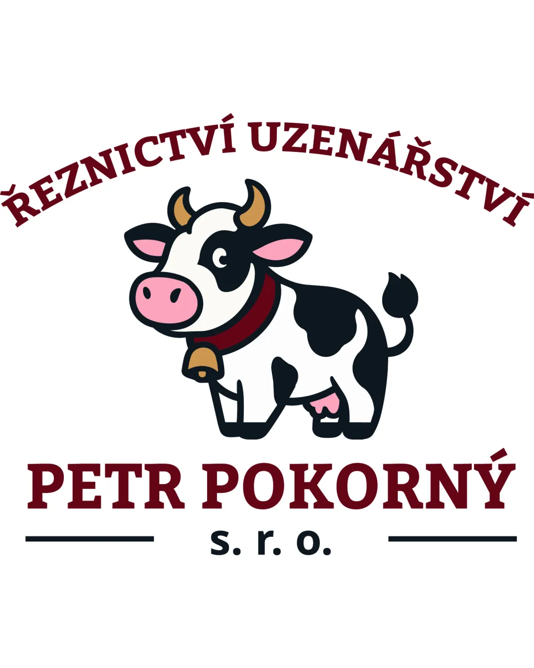
ŘEZNICKTVÍ UZENÁŘSTVÍ PETR POKORNÝ s.r.o. logo

creative755862 Essential logo review

A charming, effective retro butcher’s shop logo with great readability and appealing character, needing only scalability testing to be fully production-ready.

This emblem shows solid execution, supported by text readability and distinctive construction; improving clarity at smaller sizes is the clearest next step.

Symbols recognized:
cartoon cow, horn, bell, spots, curved text, underlines
Legible text:
ŘEZNICKTVÍ UZENÁŘSTVÍ PETR POKORNÝ s. r. o.
Combination Mark Mascot, Retro, Bold, Outlined Butcher Shop, Meat, Food
5/5
Legibility
4/5
Originality
3/5
Balance
3/5
Scale
5/5
Color
Your next steps

What to fix first

Focus on the changes that matter. Keep what makes the logo work.

What to preserve

A friendly cartoon cow mascot paired with bold classic type projects a welcoming and trustworthy feeling appropriate for a family-run retro butcher shop.

Spelling & grammar

Confirm the wording

Diacritic and Czech spelling are likely correct, but should be verified by a native speaker.

1

horizontal_bands[0]

Test mascot clarity at reduced sizes for print and digital.

High priority Worth testing Low effort

Fine outline strokes and facial details in the cow mascot may merge or lose clarity at small sizes, especially on print or signage.

See the category review
Detailed review

Logo performance breakdown

5/5

Brief & logo match

The mascot and retro wordmark directly express a family-run butcher’s shop with approachability and nostalgia, fitting the supplied context well.

5/5

Legibility

  • All text is clear and readable with strong contrast; mascot details do not impair wordmark clarity.
5/5

Color harmony

  • Maroon/burgundy, black and cream evoke retro/food-tradition aura, with friendly touches from yellow horn and pink nose.
maroon#841129
black#000000
white#FFFFFF
light yellow#F7B640
pale pink#E490AC

Estimated colors. Use the original design file for exact values.

Create a full color palette using these colors

Create new palette
5/5

Misinterpretations

  • No ambiguous shapes or unintended meanings apparent.
4/5

Originality

  • Well-crafted mascot in a friendly, memorable style.
  • Cute cartoon cows are popular in butcher/meat shop branding, but the style is well-executed and inviting.

    Optional refinement horizontal_bands[0]
3/5

Balance alignment

  • The weight and density of the large mascot contrasts with the lighter upper arc of text, slightly disrupting vertical balance; the mascot visually dominates the lockup.

    Visible issue horizontal_bands[0]
Uploaded logoAlignment guide overlay

Inspect spacing with the guide. Optical balance may differ from geometric centering.

3/5

Scalability

  • Fine outline strokes and facial details in the cow mascot may merge or lose clarity at small sizes, especially on print or signage.

    Worth testing horizontal_bands[0]

    Try: Test mascot clarity at reduced sizes for print and digital.

Style consistency

  • Mascot and wordmark are visually integrated with unfussy lockup and shared retro cues.
Try your own review

Wondering how your logo performs?

Get a clear logo score, key risks, and priority fix ideas before your client or audience sees it.

Review my logo