What to preserve
The logo integrates a dynamic, angular symbol suggestive of innovation and a geometric wordmark aligned with a tech/innovation sector, conveying a forward-thinking attitude.
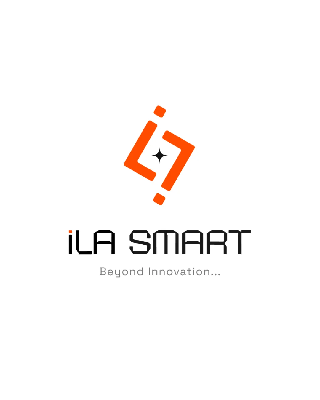
A strong, modern tech identity with distinctive symbolism and clear, appealing text; small adjustments could further enhance visual polish.
This logo lockup shows strong execution, supported by text readability and clarity at smaller sizes; improving distinctiveness is the clearest next step.
Focus on the changes that matter. Keep what makes the logo work.
The logo integrates a dynamic, angular symbol suggestive of innovation and a geometric wordmark aligned with a tech/innovation sector, conveying a forward-thinking attitude.
Logo preview unavailable. The written feedback is still available on this card.
wordmark spacing
Slight unevenness in spacing between letters, especially 'iL' and 'SM', affects overall polish.
See the category reviewDistinctive geometric symbol and tech-style wordmark match a technology/innovation brand, with minor spacing polish needed for optimal presentation.
Wordmark 5/5 · Layout 5/5
Symbol 5/5 · Wordmark 5/5
Estimated colors. Use the original design file for exact values.
Create a full color palette using these colors
Create new paletteSymbol 4/5 · Wordmark 4/5 · Layout 4/5
The mark's dynamic diagonal contrasts subtly with the strictly horizontal wordmark, but both share geometric styling.
Symbol 4/5 · Wordmark 3/5 · Layout 4/5
Slight unevenness in spacing between letters, especially 'iL' and 'SM', affects overall polish.
Try: Refine letter spacing for a more balanced appearance.
Logo preview unavailable. The written feedback is still available on this card.

Inspect spacing with the guide. Optical balance may differ from geometric centering.
Symbol 4/5 · Wordmark 3/5
Get a clear logo score, key risks, and priority fix ideas before your client or audience sees it.
More credits needed
Add credits to continue without losing your work.
Then $7/month. Cancel anytime.
Essential logo review with AI
Estimated progress