Wondering how your logo performs? 🧐
Get professional logo reviews in seconds and catch design issues in time.
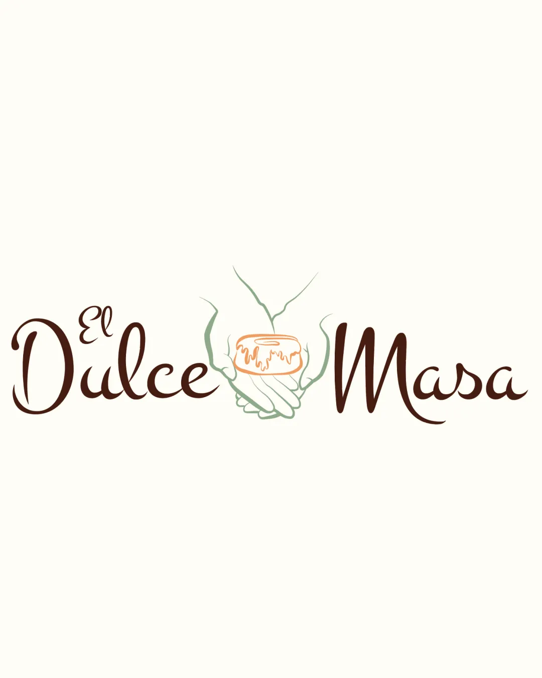
Try it Now!Logo review of El Dulce Masa
 Logo analysis by AI
Recognized style:
Logo type:
Detected symbol:
Detected text:
Business industry:
Review requested by Helene
**If AI can recognize or misinterpret it, so can people.
Structured logo review
Legibility
![]() The script typeface is elegant and readable.
The script typeface is elegant and readable.
![]() The size variation in 'El' could affect quick readability.
The size variation in 'El' could affect quick readability.
Scalability versatility
![]() The design is visually distinct and should scale well for most uses.
The design is visually distinct and should scale well for most uses.
![]() The detailed symbol may lose clarity at very small sizes.
The detailed symbol may lose clarity at very small sizes.
200x250 px
100×125 px
50×62 px
Balance alignment
![]() The text and symbol are well-aligned and balanced.
The text and symbol are well-aligned and balanced.

Originality
![]() The use of hands holding a pastry is a unique touch for a bakery.
The use of hands holding a pastry is a unique touch for a bakery.
![]() The concept of displaying food items is typical in the industry.
The concept of displaying food items is typical in the industry.
Logomark wordmark fit
![]() The symbol and text style complement each other effectively.
The symbol and text style complement each other effectively.
Aesthetic look
![]() The logo has a warm, inviting appearance.
The logo has a warm, inviting appearance.
![]() The script typeface might not appeal to all audiences.
The script typeface might not appeal to all audiences.
Cultural sensitivity dual meaning
![]() No cultural sensitivity issues detected.
No cultural sensitivity issues detected.
Color harmony
![]() The earthy colors are soothing and fit the brand.
The earthy colors are soothing and fit the brand.
![]() The palette is somewhat muted and might lack visibility.
The palette is somewhat muted and might lack visibility.


