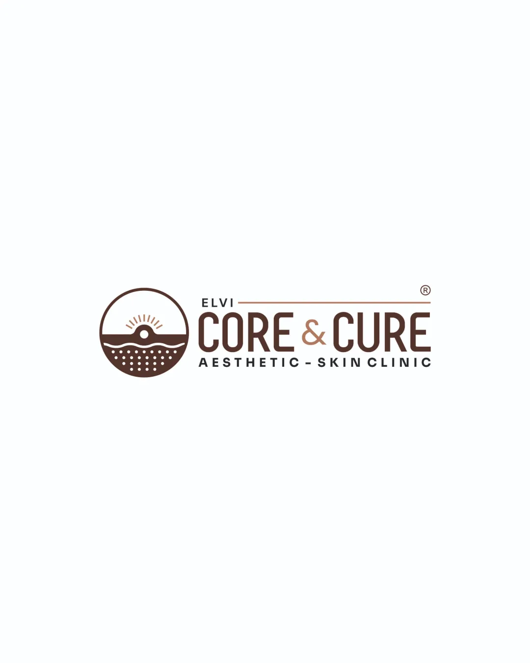
ELVI CORE & CURE AESTHETIC - SKIN CLINIC logo review
3.5/5
Logo score
Logo review of

Elvi Core & Cure Aesthetic Skin Clinic

A strong, clear logo for the sector with minor balance and distinctiveness refinements to consider.

Combination Modern Minimal, Clean Lines Aesthetics / Skincare / Clinic
4/5
Legibility
3/5
Originality
5/5
Misread
3/5
Balance
3/5
Scale
Your next steps

What to fix first

Focus on the changes that matter. Keep what makes the logo work.

1

tagline

Test logo at small scales; consider a bolder or simplified tagline variant if needed.

Worth testing Medium priority Low effort
Area to inspectApproximate location

The tagline text 'AESTHETIC - SKIN CLINIC' may become illegible at small sizes due to thin strokes and reduced spacing.

How to check

Print or render logo at <2 cm height and confirm minimum readable tagline size.

See the category review
2

wordmark and symbol alignment

Adjust vertical alignment for a more cohesive relationship between symbol and wordmark.

Optional refinement Medium priority Low effort
Area to inspectApproximate location

The circular symbol and wordmark have a slight disconnect in vertical alignment, leading to minor imbalance between mark and text.

How to check

Verify mark and wordmark are optically balanced horizontally and vertically.

See the category review
Detailed review

Logo performance breakdown

4/5

Brief & logo match

Based on an inferred industry
Compared with

Aesthetic/skin clinic; expectation of cleanliness, health, and renewal messaging.

Logo clearly communicates the intended field and tone, with room for increased distinctiveness.

  • Industry Alignment

    The sun and horizon motif fits the renewal and health aspect of a skin clinic.

  • Professionalism

    Wordmark is modern, clean, and instills confidence suitable for an aesthetic clinic.

4/5

Legibility

  • Text clear and well-spaced.
3/5

Originality

  • Relevance and conceptual clarity.
  • The sun-and-horizon motif is conceptually apt but somewhat familiar and risks blending in among wellness/aesthetic clinics.

    Optional refinement Standalone mark

    Try: Explore subtle customizations to add a more distinctive or brand-specific element to the symbol.

    Check: Test if the mark is still recognizable but stands out when compared to similar industry logos.

3/5

Balance alignment

  • Logical horizontal grouping.
  • The circular symbol and wordmark have a slight disconnect in vertical alignment, leading to minor imbalance between mark and text.

    Optional refinement wordmark and symbol alignment

    Try: Adjust vertical alignment for a more cohesive relationship between symbol and wordmark.

    Check: Verify mark and wordmark are optically balanced horizontally and vertically.

    Area to inspectApproximate location
Uploaded logoAlignment guide overlay

Inspect spacing with the guide. Optical balance may differ from geometric centering.

3/5

Scalability

  • Simple forms scale well overall.
  • The tagline text 'AESTHETIC - SKIN CLINIC' may become illegible at small sizes due to thin strokes and reduced spacing.

    Worth testing tagline

    Try: Test logo at small scales; consider a bolder or simplified tagline variant if needed.

    Check: Print or render logo at <2 cm height and confirm minimum readable tagline size.

    Area to inspectApproximate location
Uploaded logo at 200 pixels wide
200 × 250 px
Uploaded logo at 100 pixels wide
100 × 125 px
Uploaded logo at 50 pixels wide
50 × 63 px

Compare the detail at different sizes. Labels show the full image dimensions.

5/5

Misinterpretations

  • Mark is clear and difficult to misread.
4/5

Symbol & text fit

  • Symbol and wordmark are visually compatible.

Black & white

Does the shape still work without color?

These tests are available only for logos uploaded in vector (SVG) format.

Background contrast

Find the surfaces where your logo stays clear.

These tests are available only for logos uploaded in vector (SVG) format.

Blur & silhouette

A 3px blur softens fine details so you can check whether the overall shape stays recognizable. If key gaps close or elements merge, the logo may rely too heavily on detail.

These tests are available only for logos uploaded in vector (SVG) format.

Try your own review

Wondering how your logo performs?

Get a clear logo score, key risks, and priority fix ideas before your client or audience sees it.

Review my logo