Wondering how your logo performs? 🧐
Get professional logo reviews in seconds and catch design issues in time.
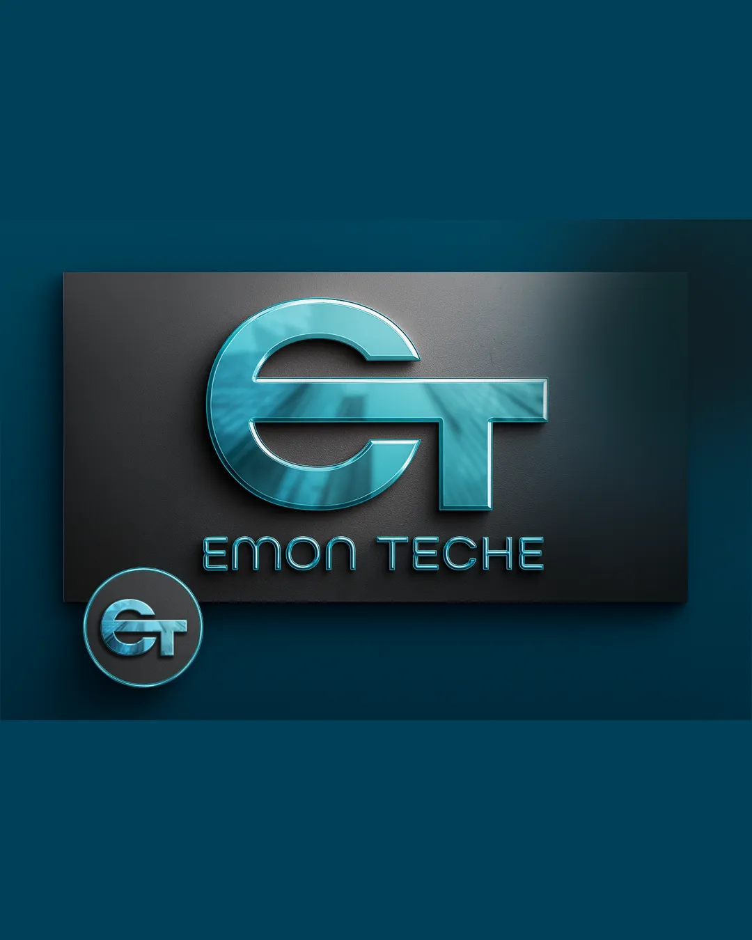
Try it Now!Logo review of EMON TECHE
 Logo analysis by AI
Logo type:
Style:
Detected symbol:
Detected text:
Business industry:
Review requested by Obikc
**If AI can recognize or misinterpret it, so can people.
Structured logo review
Legibility
![]() Text 'EMON TECHE' is clear and fairly easy to read.
Text 'EMON TECHE' is clear and fairly easy to read.![]() Monogram is distinct and the letterforms are identifiable.
Monogram is distinct and the letterforms are identifiable.
![]() 3D effects and heavy gradients can reduce legibility at smaller sizes.
3D effects and heavy gradients can reduce legibility at smaller sizes.![]() Spacing between 'EMON' and 'TECHE' may appear awkward at reduced scales.
Spacing between 'EMON' and 'TECHE' may appear awkward at reduced scales.
Scalability versatility
![]() Logo works well on digital banners and signage.
Logo works well on digital banners and signage.![]() Bold monogram potentially stands out on large format applications.
Bold monogram potentially stands out on large format applications.
![]() Heavy use of gradients and 3D effect will not translate well to embroidery, small-format printing, or black-and-white environments.
Heavy use of gradients and 3D effect will not translate well to embroidery, small-format printing, or black-and-white environments.![]() Details lost in small formats such as favicons and business cards.
Details lost in small formats such as favicons and business cards.![]() Not effective in simple, single-color applications.
Not effective in simple, single-color applications.
200x250 px
100×125 px
50×62 px
Balance alignment
![]() Centrally aligned monogram above the wordmark creates immediate focus.
Centrally aligned monogram above the wordmark creates immediate focus.![]() Monogram has a visually centered aspect.
Monogram has a visually centered aspect.
![]() Vertical/horizontal weight of the monogram overpowers the wordmark.
Vertical/horizontal weight of the monogram overpowers the wordmark.![]() Wordmark feels drowned by the size and visual strength of the symbol.
Wordmark feels drowned by the size and visual strength of the symbol.

Originality
![]() Monogram merges E and T in a unique geometric way.
Monogram merges E and T in a unique geometric way.![]() 3D style is visually distinct if a bit dated.
3D style is visually distinct if a bit dated.
![]() Monograms with merged letters are fairly common in technology branding.
Monograms with merged letters are fairly common in technology branding.![]() No clear unexpected or innovative visual twist.
No clear unexpected or innovative visual twist.
Logomark wordmark fit
![]() Both elements use the same style and color scheme.
Both elements use the same style and color scheme.
![]() The sizing of the monogram in relation to the wordmark feels imbalanced.
The sizing of the monogram in relation to the wordmark feels imbalanced.![]() The wordmark appears weak and secondary to the logomark.
The wordmark appears weak and secondary to the logomark.
Aesthetic look
![]() Color choices are pleasing and fit the tech industry.
Color choices are pleasing and fit the tech industry.![]() 3D metallic style gives it a high-tech, modern appeal.
3D metallic style gives it a high-tech, modern appeal.
![]() Beveled metallic trend is visually dated for modern tech branding.
Beveled metallic trend is visually dated for modern tech branding.![]() Effects make the overall presentation busy.
Effects make the overall presentation busy.
Dual meaning and misinterpretations
![]() No obvious inappropriate or confusing dual-meanings.
No obvious inappropriate or confusing dual-meanings.
Color harmony
![]() Limited, harmonious color palette reinforces the technology vibe.
Limited, harmonious color palette reinforces the technology vibe.![]() High contrast between text, monogram, and background.
High contrast between text, monogram, and background.
![]() Heavy gradients and metallic effect may clash with flat design trends and do not translate across all brand touchpoints.
Heavy gradients and metallic effect may clash with flat design trends and do not translate across all brand touchpoints.
Turquoise
#32A7B1
Gunmetal
#222A34
Light Cyan
#B2D6DF


