Wondering how your logo performs? 🧐
Get professional logo reviews in seconds and catch design issues in time.
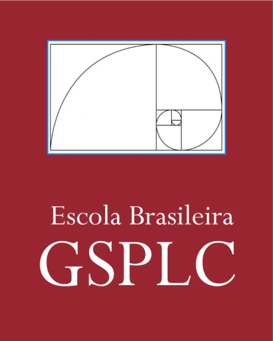
Try it Now!Logo review of Escola Brasileira GSPLC
 Logo analysis by AI
Logo type:
Style:
Detected symbol:
Detected text:
Business industry:
Review requested by ImKakau
**If AI can recognize or misinterpret it, so can people.
Structured logo review
Legibility
![]() Both the school name and initials are highly legible due to the large, serif font with excellent contrast against the background.
Both the school name and initials are highly legible due to the large, serif font with excellent contrast against the background.![]() Letter spacing and sizing are appropriate, making the text easy to read at various distances.
Letter spacing and sizing are appropriate, making the text easy to read at various distances.
Scalability versatility
![]() Geometric spiral mark is simple enough to be recognized in smaller sizes.
Geometric spiral mark is simple enough to be recognized in smaller sizes.![]() Bold text will be readable on signage and print collateral.
Bold text will be readable on signage and print collateral.
![]() The Fibonacci spiral includes thin lines and small squares that may be lost or blurred at small scales, especially as favicons or on pens.
The Fibonacci spiral includes thin lines and small squares that may be lost or blurred at small scales, especially as favicons or on pens.![]() Gradient-heavy colored backgrounds can complicate applications like black-and-white printing or embroidery.
Gradient-heavy colored backgrounds can complicate applications like black-and-white printing or embroidery.
200x250 px
100×125 px
50×62 px
Balance alignment
![]() The symbol and text are vertically aligned for clear hierarchy.
The symbol and text are vertically aligned for clear hierarchy.![]() Text is centered beneath the logo, creating visual stability.
Text is centered beneath the logo, creating visual stability.
![]() The rectangle's strong presence slightly overshadows the text, making the overall layout feel a bit top-heavy.
The rectangle's strong presence slightly overshadows the text, making the overall layout feel a bit top-heavy.

Originality
![]() Utilizing the Fibonacci spiral imparts a sense of academic sophistication and is relevant for an educational institution.
Utilizing the Fibonacci spiral imparts a sense of academic sophistication and is relevant for an educational institution.![]() Pairing the symbol with classic typography adds uniqueness.
Pairing the symbol with classic typography adds uniqueness.
![]() The Fibonacci spiral is a widely used symbol for mathematics or science-related fields, so its use might not be considered highly distinctive within education.
The Fibonacci spiral is a widely used symbol for mathematics or science-related fields, so its use might not be considered highly distinctive within education.
Logomark wordmark fit
![]() The classical typeface pairs well with the mathematical/geometric logomark, maintaining an academic tone.
The classical typeface pairs well with the mathematical/geometric logomark, maintaining an academic tone.![]() Both elements are professional and clean.
Both elements are professional and clean.
![]() The symbol's thin lines contrast with the boldness of the wordmark, slightly reducing harmony.
The symbol's thin lines contrast with the boldness of the wordmark, slightly reducing harmony.
Aesthetic look
![]() The aesthetic is clean and elegant, with a distinguished academic feel.
The aesthetic is clean and elegant, with a distinguished academic feel.![]() Color scheme and arrangement communicate sophistication.
Color scheme and arrangement communicate sophistication.
![]() Red background may feel heavy and could limit broader applications or evoke unintended emotional responses.
Red background may feel heavy and could limit broader applications or evoke unintended emotional responses.![]() Overall composition could benefit from minor refinement in proportion between mark and text.
Overall composition could benefit from minor refinement in proportion between mark and text.
Dual meaning and misinterpretations
![]() No dual meanings or inappropriate symbols detected.
No dual meanings or inappropriate symbols detected.
Color harmony
![]() Restrained palette (maroon, white, black, minimal blue) supports an elegant and formal appearance.
Restrained palette (maroon, white, black, minimal blue) supports an elegant and formal appearance.![]() Strong contrast between text and background aids recognition.
Strong contrast between text and background aids recognition.
![]() The maroon background is dominant and could appear overbearing or dated in some contexts.
The maroon background is dominant and could appear overbearing or dated in some contexts.![]() The fine blue outline around the spiral could cause visual noise and distract from the overall harmony.
The fine blue outline around the spiral could cause visual noise and distract from the overall harmony.
Pomegranate
#8B222A
White
#FFFFFF
Black
#000000