essence logo review
3.3 / 5
Logo score
Logo review of

Essence

Review the detailed scores below to see what is working and what should be refined first.

Objective AI feedback. Your creative decision.

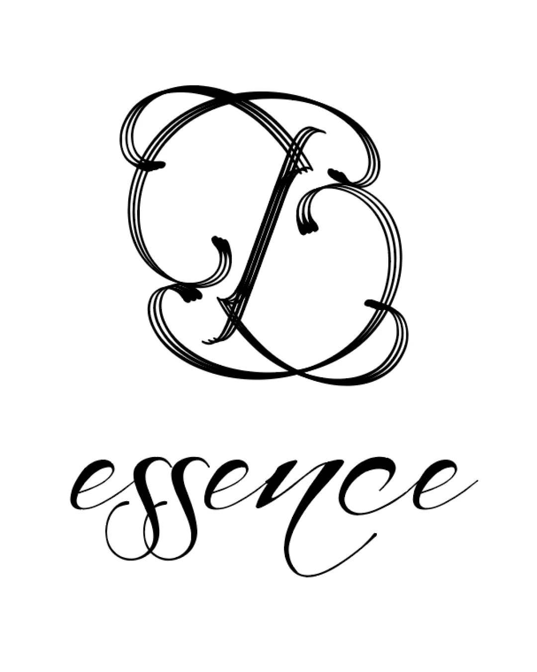
Combination Mark (monogram + Wordmark) Luxury Script, Calligraphic, Elegant Beauty
2/5
Legibility
3/5
Originality
5/5
Misread
3/5
Balance
2/5
Scale
Detailed review

Logo performance breakdown

2/5

Legibility

Checkmark icon The wordmark 'essence' is semi-legible at large sizes and conveys sophistication.

Warning icon The monogram is extremely hard to decipher and could be misread or not read at all.
Warning icon The intricate script makes the brand name less accessible, especially in small sizes or from a distance.
Warning icon Overly decorative flourishes hinder quick recognition and comprehension.

3/5

Originality

Checkmark icon Custom, elaborate monogram with a unique calligraphic personality.
Checkmark icon Distinct visual identity for a luxury or beauty-related brand.

Warning icon Ornate monogram style is common in luxury branding, limiting true distinctiveness.
Warning icon No clever negative space or symbolism beyond letter intertwining.

5/5

Color harmony

Checkmark icon Classic, timeless black-on-white palette suited to luxury.

Black
#000000

White
#FFFFFF

3/5

Balance alignment

Checkmark icon Rough visual centering between the monogram and wordmark.
Checkmark icon Script styles loosely relate.

Warning icon The density and complexity of the monogram creates visual heaviness versus the lighter, more flowing wordmark.
Warning icon Vertical alignment feels awkward and disconnected.

logo 200x250 pixels scalability test alignment grid overlay
2/5

Scalability

Checkmark icon May retain some presence on large packaging or luxury signage.

Warning icon Ornate details completely break down at small sizes, such as on business cards or digital favicons.
Warning icon The thin lines make it unsuitable for embroidery or embossing.
Warning icon Complexity reduces versatility across mediums, especially in monochrome applications.

logo 200x250 pixels scalability test

200x250 px

logo 100x125 pixels scalability test

100×125 px

logo 50x62 pixels scalability test

50×62 px

5/5

Misinterpretations

Checkmark icon No evident inappropriate shapes or negative associations.

3 / 5

Symbol & text fit

Checkmark icon Both elements use calligraphic, script motifs which are generally cohesive for a luxury brand.

Warning icon Monogram and wordmark have inconsistent line weights and levels of ornamentation, leading to mild stylistic mismatch.
Warning icon Wordmark's relative simplicity clashes with the excessive detail of the monogram.

Try your own review

Wondering how your logo performs?

Get a clear logo score, key risks, and priority fix ideas before your client or audience sees it.

Review my logo