ESSENCIALS Multi Cares A Multispeciality Physical .. logo review
2.9 / 5
Logo score

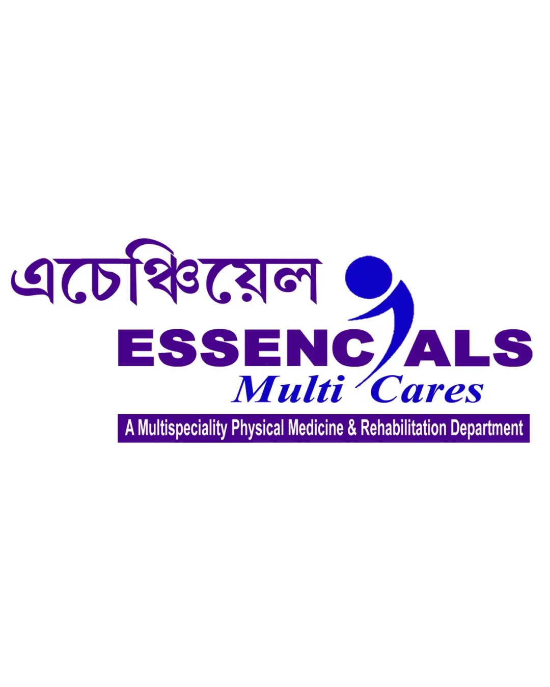
Logo review ofEssencials Multi Cares A Multispeciality Physical ..

Requires revision—avoid icon fusion that hurts type clarity and introduce more distinct branding cues.

Combination Mark Corporate Sans-serif With Script Accent Healthcare
3.5/5
Legibility
2/5
Originality
4/5
Misread
3/5
Balance
2.5/5
Scale
Review next
Action plan

What to fix first

The most important fixes to handle before polishing the full presentation.

1

Redesign human symbol/text integration for clarity and cleaner letterforms in 'ESSENCIALS'.

High priority

Icon-in-letter approach currently causes legibility and balance issues.

Impact: High · Effort: Medium

2

Simplify subtitle and refine hierarchy for better readability at small sizes.

Medium priority

Dense subtitle text loses clarity in reduced formats.

Impact: Medium · Effort: Low

Detailed review

Logo performance breakdown

3.5/5

Legibility

Checkmark icon Main English text (ESSENCIALS) is large and bold

Warning icon 'Multi Cares' script overlaps and competes with the human symbol, reducing clarity
Warning icon Dense type in the subtitle affects small scale legibility
Warning icon Bengali script at top is complex and may be hard to read quickly

2/5

Originality

Checkmark icon Human symbol adds some personality

Warning icon Generic healthcare human symbol; lacks distinctiveness
Warning icon Familiar ‘person-in-motion’ motif widely used

4/5

Color harmony

Checkmark icon Consistent purple/blue palette creates a professional impression

Warning icon Color contrast between some text elements could be improved for hierarchy

Purple
#421592

Royal Blue
#2437A3

White
#FFFFFF

Your palette is close. Explore sharper color combinations with Colorfly.design before updating the logo.

Explore palettes
3/5

Balance alignment

Checkmark icon Central alignment of main elements
Checkmark icon Horizontal arrangement of blocks creates hierarchy

Warning icon Human mark disrupts even flow of 'ESSENCIALS' text
Warning icon Script font offsets visual weight

logo 200x250 pixels scalability test alignment grid overlay
2.5/5

Scalability

Checkmark icon Main shapes are bold and won't disappear entirely at small size

Warning icon Fine subtitle text is not readable at small sizes
Warning icon Human icon integration loses clarity when reduced

logo 200x250 pixels scalability test

200x250 px

logo 100x125 pixels scalability test

100×125 px

logo 50x62 pixels scalability test

50×62 px

4/5

Misinterpretations

Checkmark icon No inappropriate or offensive visual resemblance

2.5 / 5

Logo structure & brief match

Checkmark icon Mark tries to integrate with logotype

Warning icon Human mark is forced into the word, negatively affecting letterform clarity
Warning icon Awkward interaction between icon and text

Checkmark icon Healthcare, Physical Medicine & Rehabilitation: Linked human symbol and professional color choices are conceptually aligned with the healthcare field, but execution lacks distinctiveness and polish expected in medical branding.

Try your own review

Wondering how your logo performs?

Get a clear logo score, key risks, and priority fix ideas before your client or audience sees it.

Review my logo