Wondering how your logo performs? 🧐
Get professional logo reviews in seconds and catch design issues in time.
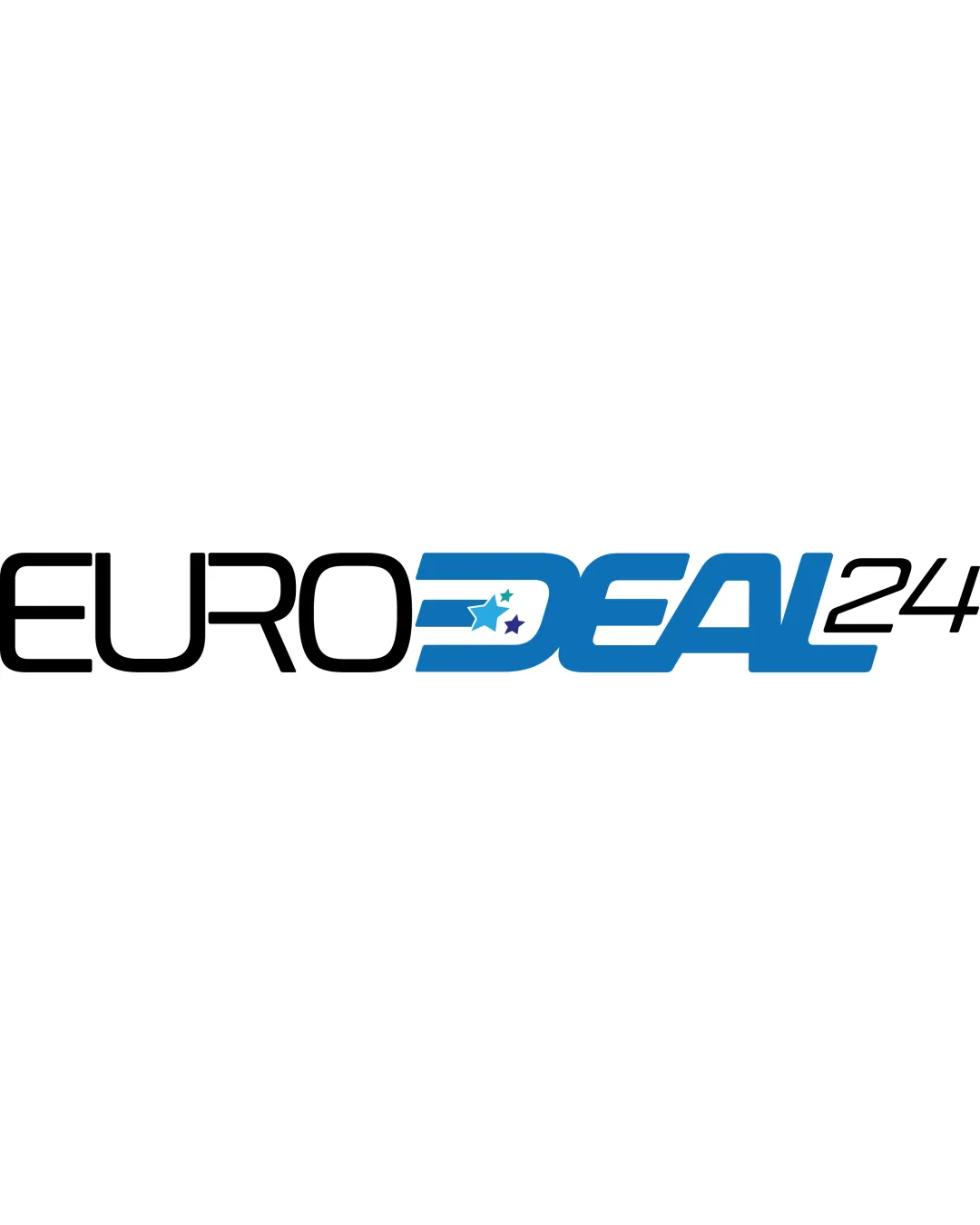
Try it Now!Logo review of EURODEAL24
 Logo analysis by AI
Logo type:
Style:
Detected symbol:
Negative space:
Detected text:
Business industry:
Review requested by Damian
**If AI can recognize or misinterpret it, so can people.
Structured logo review
Legibility
![]() Main text is clear and highly readable.
Main text is clear and highly readable.![]() Stylistic italicization on 'DEAL' adds emphasis without greatly impeding clarity.
Stylistic italicization on 'DEAL' adds emphasis without greatly impeding clarity.
![]() Star elements inside the 'D' slightly interfere with the letterform, creating minor confusion at small sizes.
Star elements inside the 'D' slightly interfere with the letterform, creating minor confusion at small sizes.![]() '24' in thin font appears less prominent and might reduce legibility on some backgrounds.
'24' in thin font appears less prominent and might reduce legibility on some backgrounds.
Scalability versatility
![]() Logo is mostly bold and could work well on digital media and large signage.
Logo is mostly bold and could work well on digital media and large signage.![]() Minimal color palette enhances adaptability.
Minimal color palette enhances adaptability.
![]() Star details within the 'D' may be lost or become unreadable when scaled down for small formats (e.g., business cards, favicons).
Star details within the 'D' may be lost or become unreadable when scaled down for small formats (e.g., business cards, favicons).![]() '24' is too thin for embroidery or very small-scale print.
'24' is too thin for embroidery or very small-scale print.
200x250 px
100×125 px
50×62 px
Balance alignment
![]() 'EURO' and 'DEAL' are visually distinguished yet paired in a unified wordmark.
'EURO' and 'DEAL' are visually distinguished yet paired in a unified wordmark.![]() Center placement of stars focuses the viewer's attention.
Center placement of stars focuses the viewer's attention.
![]() '24' feels detached and unbalanced, as it’s thin compared to the rest of the text.
'24' feels detached and unbalanced, as it’s thin compared to the rest of the text.![]() Stars slightly distort the natural form of the 'D,' disrupting typographic balance.
Stars slightly distort the natural form of the 'D,' disrupting typographic balance.

Originality
![]() Stars incorporated into the 'D' add a touch of personality.
Stars incorporated into the 'D' add a touch of personality.![]() Color division between 'EURO' and 'DEAL' provides brand separation.
Color division between 'EURO' and 'DEAL' provides brand separation.
![]() Use of italicized sans-serif for an e-commerce/retail brand is common and lacks distinctiveness.
Use of italicized sans-serif for an e-commerce/retail brand is common and lacks distinctiveness.![]() Adding stars to denote 'EURO' (potentially for Europe) is a recurring motif in similar business sectors.
Adding stars to denote 'EURO' (potentially for Europe) is a recurring motif in similar business sectors.
Logomark wordmark fit
![]() 'D' mark with stars integrates with the wordmark, attempting synergy.
'D' mark with stars integrates with the wordmark, attempting synergy.
![]() The stars are more decorative than functional, and can appear as an afterthought rather than an integral part of the typography.
The stars are more decorative than functional, and can appear as an afterthought rather than an integral part of the typography.![]() The weight of '24' is inconsistent with the rest of the logo, breaking visual harmony.
The weight of '24' is inconsistent with the rest of the logo, breaking visual harmony.
Aesthetic look
![]() Modern look with dynamic blue provides a sense of urgency and action, fitting for retail.
Modern look with dynamic blue provides a sense of urgency and action, fitting for retail.
![]() Overall look is a bit generic and lacks a signature creative element.
Overall look is a bit generic and lacks a signature creative element.![]() Inconsistent font weights and internal decoration ('D' with stars) make the aesthetic less cohesive.
Inconsistent font weights and internal decoration ('D' with stars) make the aesthetic less cohesive.
Dual meaning and misinterpretations
![]() No inappropriate or potentially embarrassing dual meanings detected.
No inappropriate or potentially embarrassing dual meanings detected.
Color harmony
![]() Blue and black deliver strong contrast.
Blue and black deliver strong contrast.![]() Secondary star colors add slight brand differentiation without overwhelming the palette.
Secondary star colors add slight brand differentiation without overwhelming the palette.
![]() Three different star colors could feel unnecessary; risk of being distracting.
Three different star colors could feel unnecessary; risk of being distracting.
Black
#000000
Cerulean Blue
#2294D6
Jungle Green
#33A271
Purple
#312783
White
#FFFFFF


