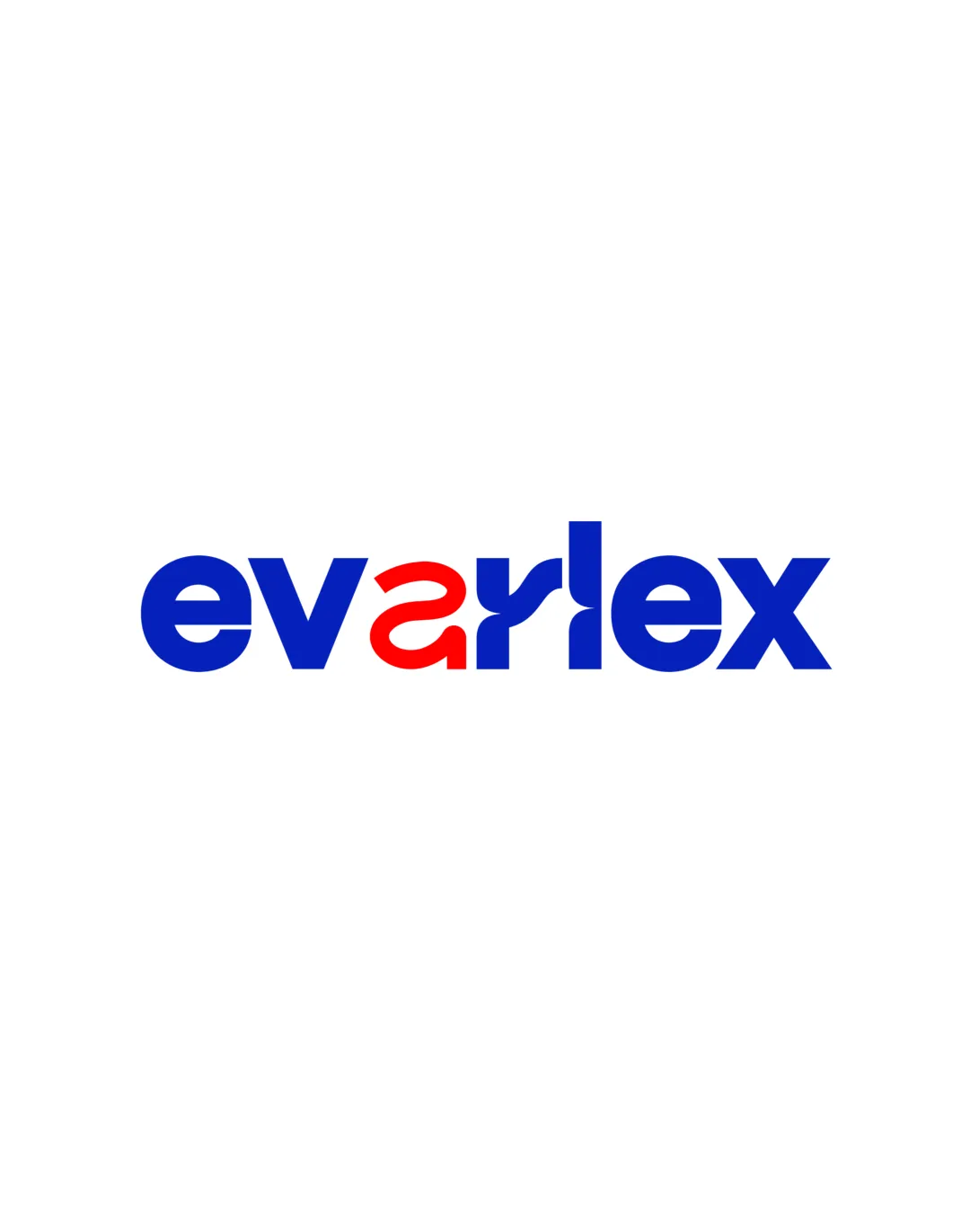
evarlex logo review
3.5/5
Logo score
Logo review of

Evarlex

A visually modern wordmark with a creative letter fusion but needs refinement for readability and color unity.

Wordmark Modern Geometric Sans-serif
3/5
Legibility
4/5
Originality
5/5
Misread
4/5
Balance
4/5
Scale
Your next steps

What to fix first

Focus on the changes that matter. Keep what makes the logo work.

1

fusion of letters 'a' and 'r'

Refine the connection between 'a' and 'r' or explore separating them for clearer letter recognition.

Visible issue High priority Medium effort
Area to inspectApproximate location

The custom ligature between 'a' and 'r' reduces immediate readability, potentially causing the name to be misread at a glance.

How to check

Test readability in small and quick-glance scenarios.

See the category review
2

wordmark

Explore a subtler color approach or better integrate the highlight.

Optional refinement Medium priority Low effort

The single red 'ar' segment creates a strong focal point but disrupts color unity with the otherwise blue mark.

How to check

Verify if the accent is intentional and supports brand goals.

See the category review
Detailed review

Logo performance breakdown

Not scored

Brief & logo match

More context needed

There isn't enough brand context to assess the match.

3/5

Legibility

  • Clear main typography
  • The custom ligature between 'a' and 'r' reduces immediate readability, potentially causing the name to be misread at a glance.

    Visible issue fusion of letters 'a' and 'r'

    Try: Refine the connection between 'a' and 'r' or explore separating them for clearer letter recognition.

    Check: Test readability in small and quick-glance scenarios.
    Area to inspectApproximate location
4/5

Originality

  • Distinctive fused letter treatment
  • Modern feel
3/5

Color harmony

  • Effective, limited palette
  • The single red 'ar' segment creates a strong focal point but disrupts color unity with the otherwise blue mark.

    Optional refinement wordmark

    Try: Explore a subtler color approach or better integrate the highlight.

    Check: Verify if the accent is intentional and supports brand goals.

Blue#0633AE
Red#D51414

Estimated colors. Use the original design file for exact values.

Create a full color palette using these colors

Create new palette
4/5

Balance alignment

  • Even letter spacing
  • Consistent weight overall
Uploaded logoAlignment guide overlay

Inspect spacing with the guide. Optical balance may differ from geometric centering.

4/5

Scalability

  • Bold strokes scale well
  • Limited detail aids reproduction
Uploaded logo at 200 pixels wide
200 × 250 px
Uploaded logo at 100 pixels wide
100 × 125 px
Uploaded logo at 50 pixels wide
50 × 63 px

Compare the detail at different sizes. Labels show the full image dimensions.

5/5

Misinterpretations

  • No unintended readings detected

Black & white

Does the shape still work without color?

These tests are available only for logos uploaded in vector (SVG) format.

Background contrast

Find the surfaces where your logo stays clear.

These tests are available only for logos uploaded in vector (SVG) format.

Blur & silhouette

A 3px blur softens fine details so you can check whether the overall shape stays recognizable. If key gaps close or elements merge, the logo may rely too heavily on detail.

These tests are available only for logos uploaded in vector (SVG) format.

Try your own review

Wondering how your logo performs?

Get a clear logo score, key risks, and priority fix ideas before your client or audience sees it.

Review my logo