 View review
Logo score
Logo review ofExoveon
Review the detailed scores below to see what is working and what should be refined first.
Legibility
Originality
Misread
Balance
Scale
Detailed review
Logo performance breakdown
Legibility
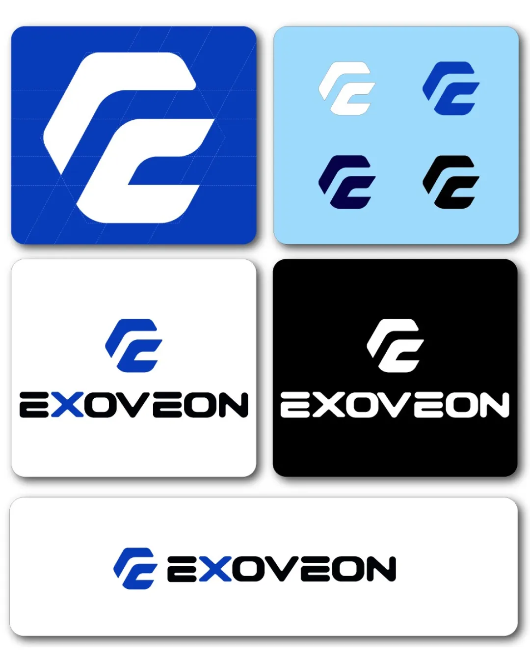
![]() The wordmark 'EXOVEON' is clear and very readable.
The wordmark 'EXOVEON' is clear and very readable.![]() Monospaced style creates a consistent visual rhythm.
Monospaced style creates a consistent visual rhythm.
![]() The connected 'E' in the monogram could be misread as a 'C' for some viewers due to its geometric reduction.
The connected 'E' in the monogram could be misread as a 'C' for some viewers due to its geometric reduction.![]() Custom geometric typeface might be slightly less accessible at small sizes.
Custom geometric typeface might be slightly less accessible at small sizes.
Originality
![]() Modern geometric approach to the EC monogram adds minimal uniqueness.
Modern geometric approach to the EC monogram adds minimal uniqueness.![]() Consistent theme between symbol and type.
Consistent theme between symbol and type.
![]() Geometric interlocking initials are common in technology logos and not highly distinctive.
Geometric interlocking initials are common in technology logos and not highly distinctive.![]() Execution is clean, but the concept may blend in with existing tech branding.
Execution is clean, but the concept may blend in with existing tech branding.
Color harmony
![]() Limited color palette with strong contrast for clarity.
Limited color palette with strong contrast for clarity.
Science Blue
#1857C2
Black
#131313
White
#FFFFFF
Balance alignment
![]() Good alignment between the monogram and wordmark—neither overpowers the other.
Good alignment between the monogram and wordmark—neither overpowers the other.![]() Geometric structure supports visual stability.
Geometric structure supports visual stability.
![]() Slight perceived visual weight imbalance between the bolder mark and the lighter wordmark, especially at small scales.
Slight perceived visual weight imbalance between the bolder mark and the lighter wordmark, especially at small scales.

Scalability
![]() Logo holds up well in monochrome and color variations, supporting print and digital use.
Logo holds up well in monochrome and color variations, supporting print and digital use.![]() Simple forms of the monogram scale effectively for icons, favicons, and small-format applications.
Simple forms of the monogram scale effectively for icons, favicons, and small-format applications.![]() Wordmark and mark work separately and together, providing high versatility.
Wordmark and mark work separately and together, providing high versatility.
200x250 px
100×125 px
50×62 px
Misinterpretations
![]() No inappropriate or confusing shapes detected; mark is abstract yet clear.
No inappropriate or confusing shapes detected; mark is abstract yet clear.
Symbol & text fit
![]() Both elements share matching geometric aesthetics and weight.
Both elements share matching geometric aesthetics and weight.
![]() Coherent visual relationship between symbol and typography.
Coherent visual relationship between symbol and typography.
Try your own review
Review my logo
Wondering how your logo performs?
Get a clear logo score, key risks, and priority fix ideas before your client or audience sees it.
Keep exploring


