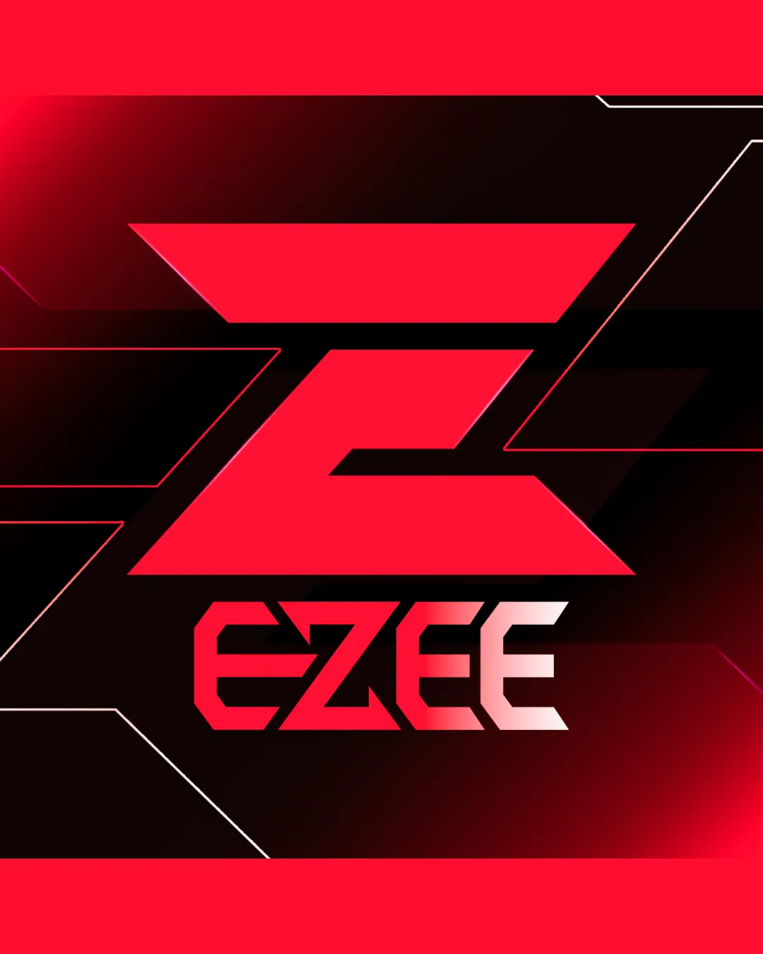
EZEE logo review
3.7 / 5
Logo score

Logo review ofEzee

Suitable for internal/early use, refinement needed for top-tier competitive brand applications.

Combination Mark Futuristic Geometric Esports
4/5
Legibility
3/5
Originality
5/5
Misread
4/5
Balance
3/5
Scale
Review next
Action plan

What to fix first

The most important fixes to handle before polishing the full presentation.

1

Refine background and mark gradients for better clarity at small sizes.

High priority

Current thin lines and gradients may blur at scale-down, affecting recognition.

Impact: Improves Versatility For Social Icons, Print, And Merch. · Effort: Medium

2

Experiment with adjusting 'Z' mark weight or integrating more subtle angular cues in wordmark for greater cohesion.

Medium priority

Provides subtle polish and sets the logo apart from more generic gaming marks.

Impact: Could Increase Uniqueness And Reinforce Unity Between Mark And Type. · Effort: Medium

Detailed review

Logo performance breakdown

4/5

Legibility

Checkmark icon Text is bold and generally easy to read
Checkmark icon Letter spacing is comfortable

Warning icon Gradient effect on 'E's may slightly affect quick readability

3/5

Originality

Checkmark icon Futuristic angles match esports vibe

Warning icon Large 'Z' form is somewhat generic and commonly used in gaming logos

4/5

Color harmony

Checkmark icon Red and black create high energy, dramatic contrast

Warning icon Red may overpower in some applications

Vivid Red
#FF0033

Black
#000000

White
#FFFFFF

Your palette is close. Explore sharper color combinations with Colorfly.design before updating the logo.

Explore palettes
4/5

Balance alignment

Checkmark icon Main 'Z' symbol is optically strong and centered
Checkmark icon Wordmark aligns well beneath mark

Warning icon Slight visual imbalance from heavy top section

logo 200x250 pixels scalability test alignment grid overlay
3/5

Scalability

Checkmark icon Bold, geometric shapes maintain form at medium sizes

Warning icon Thin lines on background and gradient may lose clarity at small scale

logo 200x250 pixels scalability test

200x250 px

logo 100x125 pixels scalability test

100×125 px

logo 50x62 pixels scalability test

50×62 px

5/5

Misinterpretations

Checkmark icon No inappropriate or confusing visual misread detected

4 / 5

Logo structure & brief match

Checkmark icon 'Z' mark and 'EZEE' wordmark use consistent geometric style

Warning icon Slight disconnect in angle dynamics between main 'Z' and wordmark

Checkmark icon Personality: The dynamic, high-contrast design and sharp geometry project a bold, competitive personality suitable for esports.
Checkmark icon Esport Logo: Futuristic, angular shapes and strong color contrast are on-trend and appropriate for esports branding.

Try your own review

Wondering how your logo performs?

Get a clear logo score, key risks, and priority fix ideas before your client or audience sees it.

Review my logo