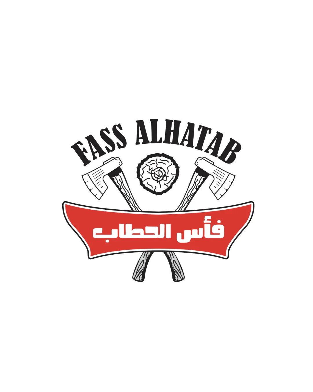
FASS ALHATAB
فأس الحطاب logo review
3/5
Logo score
Logo review of

Fass Alhatab فأس الحطاب

Lacks uniqueness for a food business despite robust bilingual execution; consider refining the graphic and lockup for clearer differentiation.

Combination Vintage Badge Food
4/5
Legibility
2.5/5
Originality
5/5
Misread
3/5
Balance
3/5
Scale
Your next steps

What to fix first

Focus on the changes that matter. Keep what makes the logo work.

1

Standalone mark

Explore a more unique visual approach or integrate bespoke details reflecting the specific cuisine or food experience.

Visible issue High priority Medium effort
Area to inspectApproximate location

The crossed axes and wood emblem is a common motif in rustic or grill/BBQ brands, reducing distinctiveness in the food sector.

How to check

Test alternative symbols or styles for stronger brand recall.

See the category review
2

overall

Create and test a small-size variant to ensure legibility of mark and text.

Worth testing Medium priority Medium effort

The detailed illustration of the axes and wood may lose clarity at small sizes, especially in digital icons or print applications.

How to check

Verify performance at icon and favicon scales.

See the category review
Detailed review

Logo performance breakdown

3.5/5

Brief & logo match

Based on your brief
Compared with

food

Partially fits a food brand with its rustic symbols and bilingual text, but the axes/woodmark concept is a generic solution.

  • Food Brand Relevance

    Axes and wood imply traditional cooking or grilling, but the symbol risks confusion with non-food industries.

  • Bilingual Accessibility

    The inclusion of both English and Arabic supports a broad audience and aligns with multicultural food branding needs.

4/5

Legibility

  • Both English and Arabic wordmarks are readable.
2.5/5

Originality

  • Bilingual presentation adds some distinction.
  • The crossed axes and wood emblem is a common motif in rustic or grill/BBQ brands, reducing distinctiveness in the food sector.

    Visible issue Standalone mark

    Try: Explore a more unique visual approach or integrate bespoke details reflecting the specific cuisine or food experience.

    Check: Test alternative symbols or styles for stronger brand recall.
    Area to inspectApproximate location
4/5

Color harmony

  • Bold red and black palette stands out and enhances readability.
Black#000000
White#FFFFFF
Red#E03A30

Estimated colors. Use the original design file for exact values.

Create a full color palette using these colors

Create new palette
3/5

Balance alignment

  • Clear separation of sections.
  • The alignment between the curved English text, central emblem, and red Arabic banner feels slightly disconnected, impacting visual flow.

    Optional refinement wordmark and banner

    Try: Refine element alignment or adjust hierarchy for more cohesion between text and emblem.

    Check: Check eye movement across the lockup for harmonious visual flow.

Uploaded logoAlignment guide overlay

Inspect spacing with the guide. Optical balance may differ from geometric centering.

3/5

Scalability

  • Central symbol readable at moderate size.
  • The detailed illustration of the axes and wood may lose clarity at small sizes, especially in digital icons or print applications.

    Worth testing overall

    Try: Create and test a small-size variant to ensure legibility of mark and text.

    Check: Verify performance at icon and favicon scales.

Uploaded logo at 200 pixels wide
200 × 250 px
Uploaded logo at 100 pixels wide
100 × 125 px
Uploaded logo at 50 pixels wide
50 × 63 px

Compare the detail at different sizes. Labels show the full image dimensions.

5/5

Misinterpretations

  • No negative or unintended resemblances detected.
3.5/5

Symbol & text fit

  • Emblem and wordmark are tied together with logical hierarchy.

Black & white

Does the shape still work without color?

These tests are available only for logos uploaded in vector (SVG) format.

Background contrast

Find the surfaces where your logo stays clear.

These tests are available only for logos uploaded in vector (SVG) format.

Blur & silhouette

A 3px blur softens fine details so you can check whether the overall shape stays recognizable. If key gaps close or elements merge, the logo may rely too heavily on detail.

These tests are available only for logos uploaded in vector (SVG) format.

Try your own review

Wondering how your logo performs?

Get a clear logo score, key risks, and priority fix ideas before your client or audience sees it.

Review my logo