FBC FESTIVAL BIKERS DU CONGO logo review
4/5
Logo score Combination category

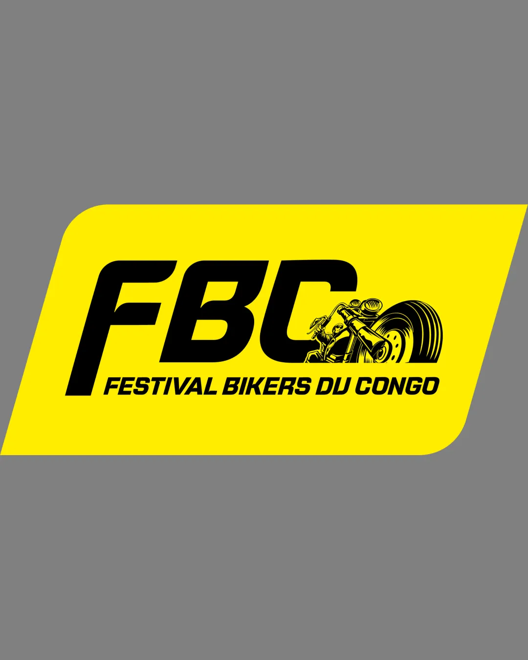
FBC FESTIVAL BIKERS DU CONGO

creative720507 Essential logo review

A dynamic, well-themed logo—refining illustration detail and balance will further strengthen impact.

Combination Bold, Dynamic, Event-focused Event/festival, Motorcycle
4/5
Legibility
4/5
Originality
3/5
Balance
3/5
Scale
Your next steps

What to fix first

Focus on the changes that matter. Keep what makes the logo work.

1

Standalone mark and text

Simplify the motorcycle illustration for small-scale use or provide a secondary, minimal mark.

High priority Visible issue Medium effort

The detailed motorcycle illustration may lose clarity when scaled down, risking legibility at smaller sizes.

See the category review


2

wordmark and mark overall

Review horizontal balance and adjust spacing or scale to create more visual equilibrium.

Medium priority Optional refinement Low effort

The weight of the bold FBC and dense illustration create a slightly right-heavy feel inside the slanted frame.

See the category review
Detailed review

Logo performance breakdown

5/5

Brief & logo match

Logo successfully visualizes both the biker theme and the festival's vibrancy, perfectly matching the brief.

4/5

Legibility

  • Main text is readable and bold.
4/5

Originality

  • Distinct integration of motorbike illustration and angled box.
4/5

Color harmony

  • High contrast between yellow and black suits a bold event identity.
Yellow#FFED00
Black#1A1A1A

Estimated colors. Use the original design file for exact values.

Create a full color palette using these colors

Create new palette
3/5

Balance alignment

  • Dynamic forward-leaning shape fits the motorcycle theme.
  • The weight of the bold FBC and dense illustration create a slightly right-heavy feel inside the slanted frame.

    Optional refinement wordmark and mark overall

    Try: Review horizontal balance and adjust spacing or scale to create more visual equilibrium.

Uploaded logoAlignment guide overlay

Inspect spacing with the guide. Optical balance may differ from geometric centering.

3/5

Scalability

  • Strong presence at medium to large sizes.
  • The detailed motorcycle illustration may lose clarity when scaled down, risking legibility at smaller sizes.

    Visible issue Standalone mark and text

    Try: Simplify the motorcycle illustration for small-scale use or provide a secondary, minimal mark.

5/5

Misinterpretations

  • No unwanted alternate readings supported.
4/5

Symbol & text fit

  • Motorcycle graphic flows from the 'C' initial attractively.
Try your own review

Wondering how your logo performs?

Get a clear logo score, key risks, and priority fix ideas before your client or audience sees it.

Review my logo