FILIPE C Branding e Design logo logo review
3.7/5
Logo score Combination mark (symbol + wordmark) category

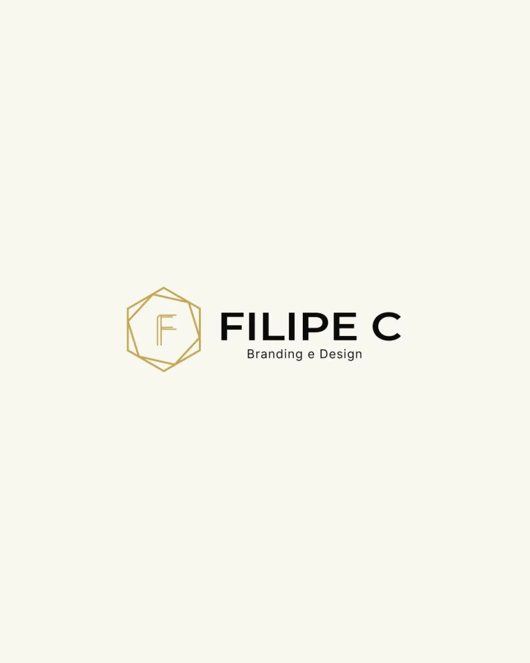
FILIPE C Branding e Design logo

creative552893 Essential logo review

A strong, modern logo with excellent readability and solid style integration, though minor balancing and scalability tweaks are recommended.

This logo lockup shows solid execution, supported by text readability and text hierarchy; improving distinctiveness is the clearest next step.

Combination Mark (symbol + Wordmark) Modern, Geometric, Minimal Design Services/creative
5/5
Legibility
3/5
Originality
3.5/5
Balance
4/5
Scale
4/5
Color
4/5
Style consistency
Your next steps

What to fix first

Focus on the changes that matter. Keep what makes the logo work.

1

entire lockup

Refine the hexagon mark or adjust its scale/thickness to better balance with the bold wordmark.

High priority Visible issue Low effort

The gold hexagonal mark is visually lighter and less bold compared to the strong black type, creating a mild imbalance in visual weight between the two elements.

See the category review


Detailed review

Logo performance breakdown

4/5

Brief & logo match

This logo clearly signals a professional branding/design service through its geometric mark and clean typography, but the hexagon motif is fairly common in the industry.

5/5

Legibility

Wordmark 5/5 · Layout 5/5

  • Clear sans-serif text, readable at normal sizes.
5/5

Misinterpretations

  • No plausible misinterpretation risk detected.
4/5

Color harmony

Symbol 4/5 · Wordmark 4/5

  • Gold and black palette adds sophistication and contrast.
Gold#C6A55A
Black#000000

Estimated colors. Use the original design file for exact values.

Create a full color palette using these colors

Create new palette
4/5

Scalability

Symbol 3/5 · Wordmark 5/5 · Layout 4/5

  • Simple mark, but thin lines in hexagon require size testing.
  • Thin gold lines in the hexagon mark may become hard to read at small sizes or on some backgrounds.

    Worth testing Standalone mark
4/5

Style consistency

  • Modern geometry links mark and wordmark style well.
3.5/5

Balance alignment

Symbol 3/5 · Wordmark 4/5 · Layout 4/5

Available in Advanced logo reviews
3/5

Originality

Symbol 3/5 · Wordmark 3/5

Available in Advanced logo reviews
Try your own review

Wondering how your logo performs?

Get a clear logo score, key risks, and priority fix ideas before your client or audience sees it.

Review my logo